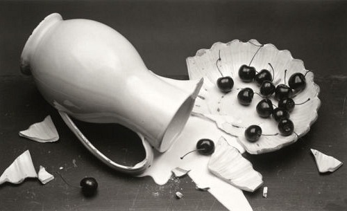
THE SURFACE OF THINGS
|
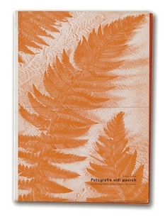
Jaromir Funke (collaboration with Ladislav Sutnar) published a book in 1935 called 'Fotografie vidí povrch' (Photography sees the surface). He had created one of the first Czechoslovak books relating to Neue Sachlichkeit (The New Objectivity). It was the only volume published from a series of eight that were planned, the set was to be called 'Fotografovaný svět' (The photographed world).
"The images in the book included 'A brocade damaged by age and decomposition; Cross-sections of Wood; Underside of a south-Brazilian butterfly; A sheet of postage stamps; Glass as a transparent illuminated surface; Human skin; Metal richly articulated through treatment and lighting, retaining traces of modelling by the sculptor's hand; Calendar from a Breviary; Details of a painting by Albrecht Dürer; Limestone quarry; A plant's structure; The surface of a river." |
The New Vision
Andre Kertesz
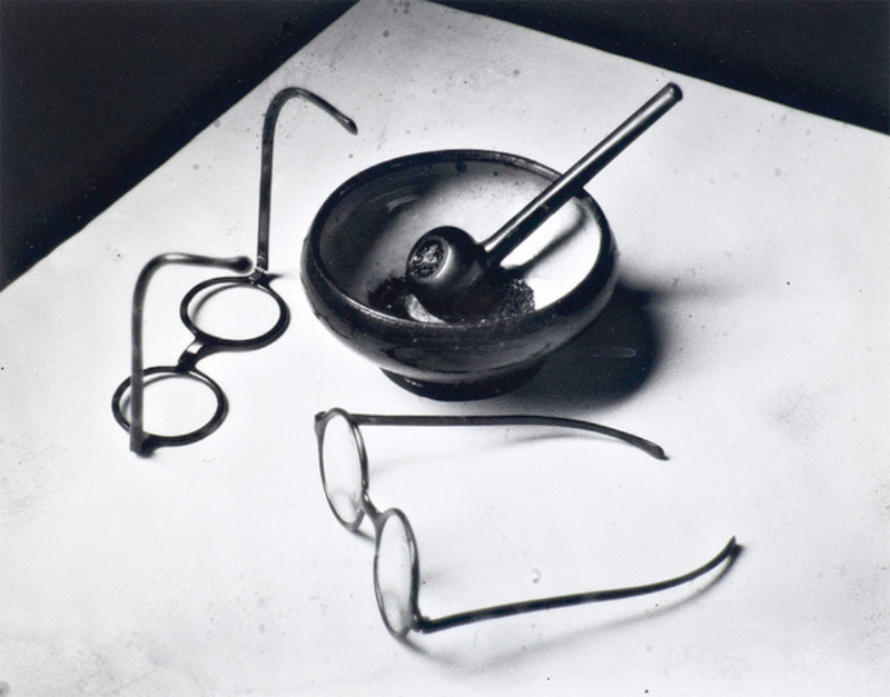
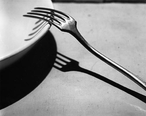
Kertesz was known for his 'groundbreaking contributions to photographic composition'. His family expected him to become a stockbroker but he independently pursued photography. His early work was published mainly in magazines, this continued for many years until he eventually stopped taking commissions. After briefly serving in World War One, he moved to Paris against the wishes of his family and he worked for France's first illustrated magazine, VU.
When the threat of World War Two came, he emigrated to the United States in 1936, where he had to create his reputation again by doing commissioned work.
When the threat of World War Two came, he emigrated to the United States in 1936, where he had to create his reputation again by doing commissioned work.
"For Kertész, taking a photograph involved encapsulating an atmosphere but also solving compositional problems linking form to content."
|
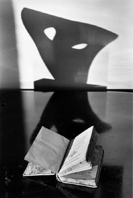
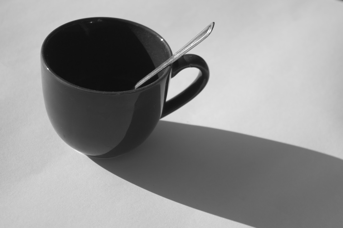
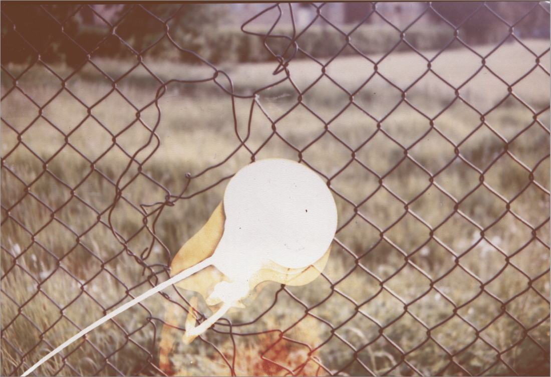
This is an image taken by Andre Kertesz of a book on a table and with what looks like the shadow of a chair in the background and on the table. I really like this image as it can be interpreted many different ways. I think the way that the object in the background is placed directly in front of the book and that it has two holes that could look similar to the way children think ghosts look like, so it could look like the "ghost" is emerging from the book. I think this would have been a really good idea as the book looks like it has been well loved and the bottom of the pages in the book look a little tatty. If i wanted to create a photograph similar to this I would take the same idea and similar objects but put the book closer so it looks like the shadow is coming up from the inside of the book. |

|
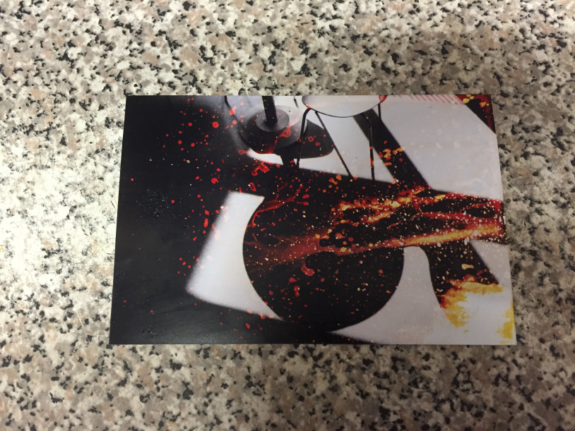
Irving Penn
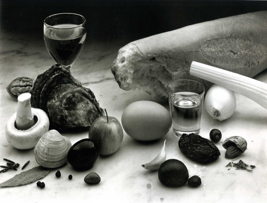
His photographic career was created when he was working with Alexander Liberman (working at Vouge as his assistant). The photographers who he actually worked with at Vouge, didn't like his ideas but he was asked by Liberman to take the photographs himself. He made a still life including 'a big brown leather bag, beige scarf and gloves, lemons, oranges, and a huge topaz' and a drawing on his art experience. This image was Published as Vouge's October 1st, 1943 issue cover.
First experment

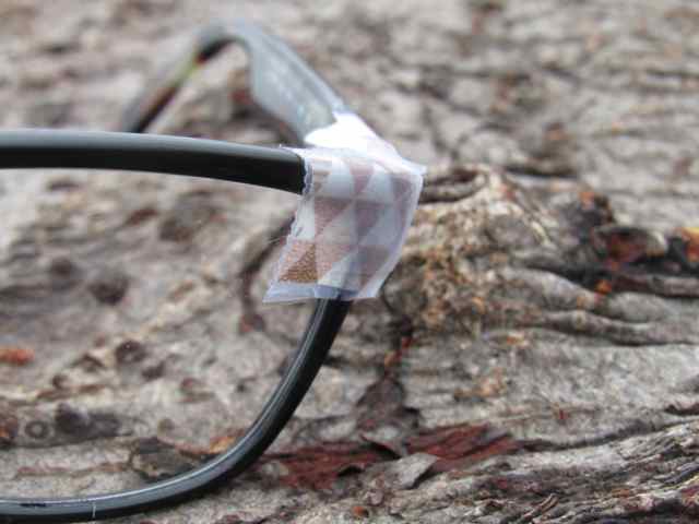
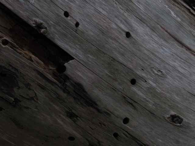
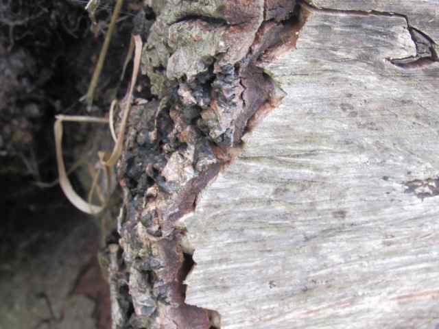
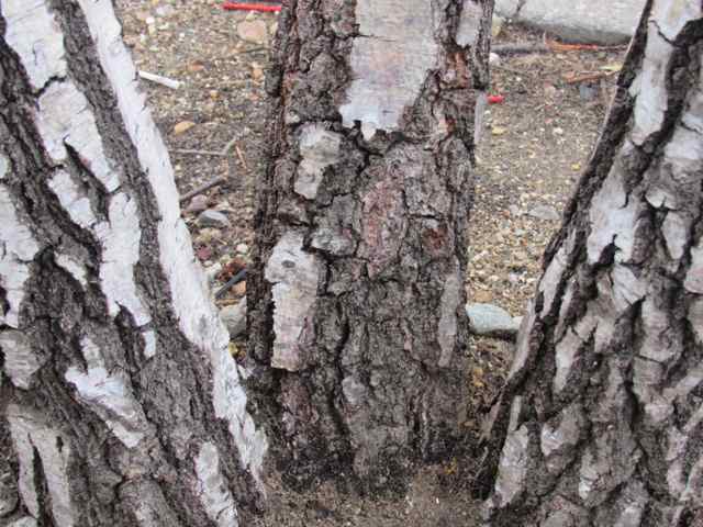
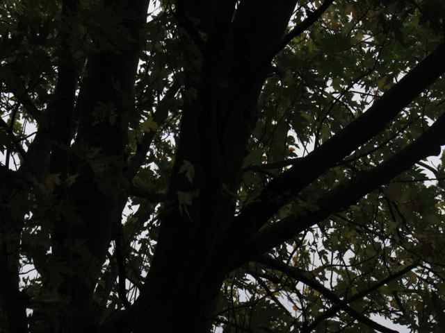
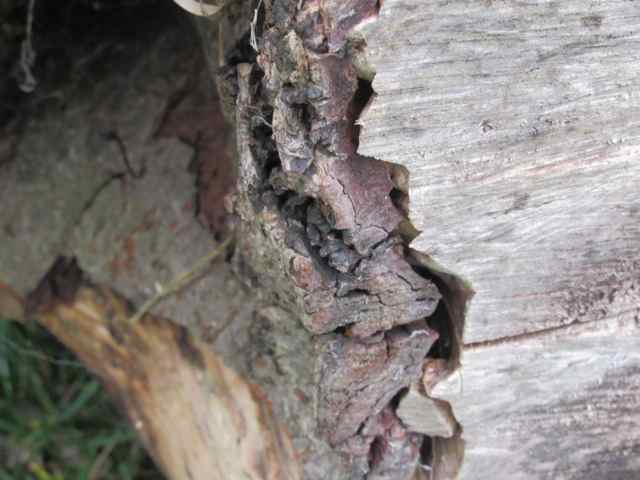
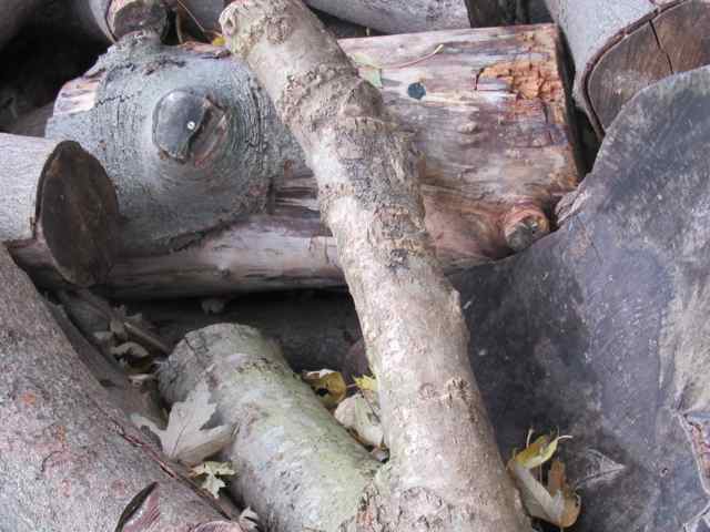
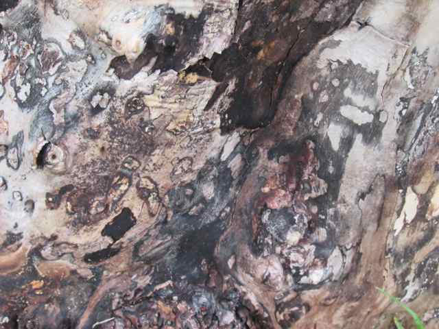
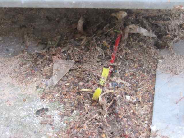
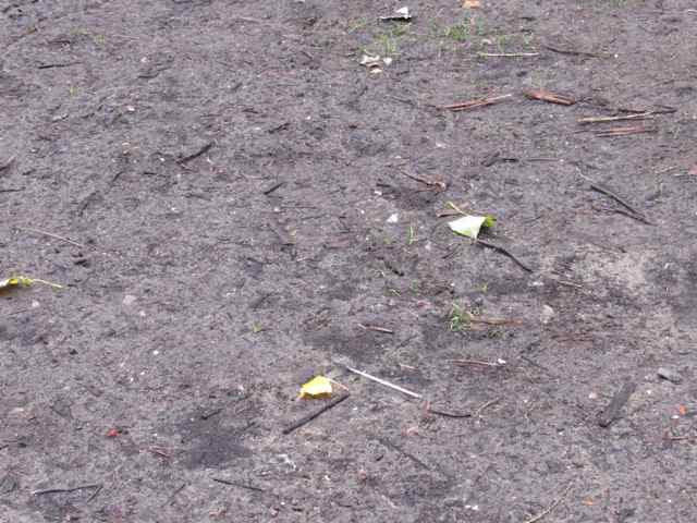
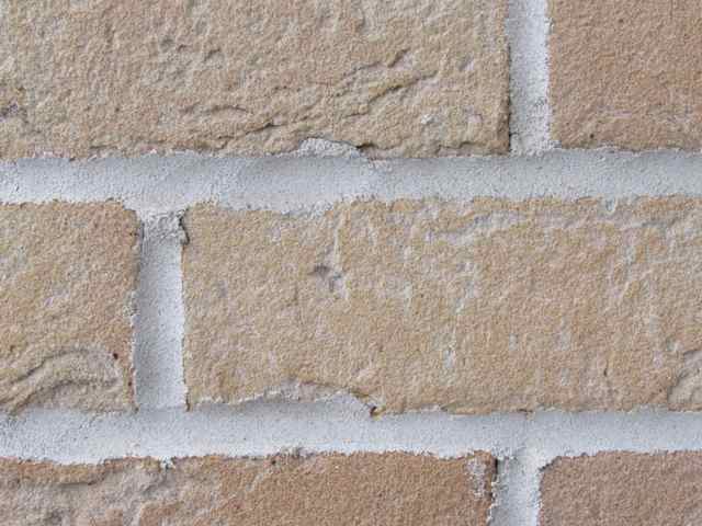
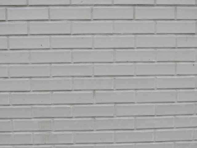

These are some images I have taken in school that I think show the surface of things. These are images I had taken without doing any research, so they are just surfaces that I thought were interesting. I focused mainly on photographing the "natural" surfaces because I thought that they would give me the best range of surface. I think that I should have taken images of whatever surface I had seen that interested me because I think I was thinking about it too much. I also would have liked to take images of reflection in windows as it would have shown more than one surface in the image.
If I do this experiment again, I would like to go out and take photographs of whatever surfaces interest me, even if some of the images don't turn out as I would like them to.
If I do this experiment again, I would like to go out and take photographs of whatever surfaces interest me, even if some of the images don't turn out as I would like them to.
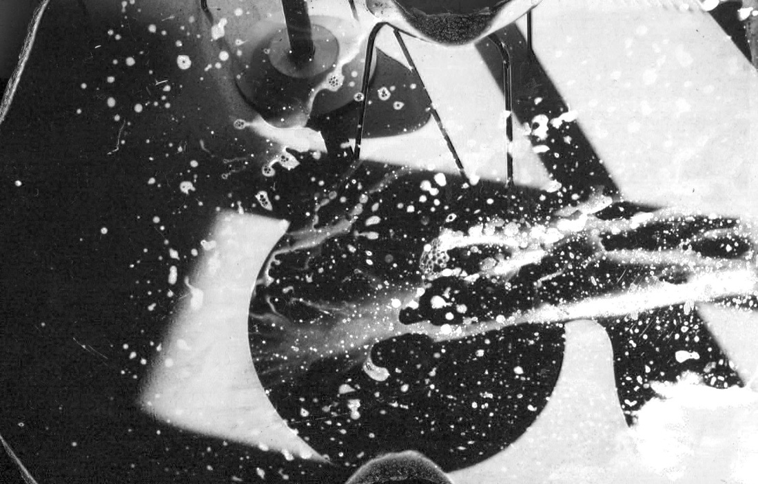
Making the slide
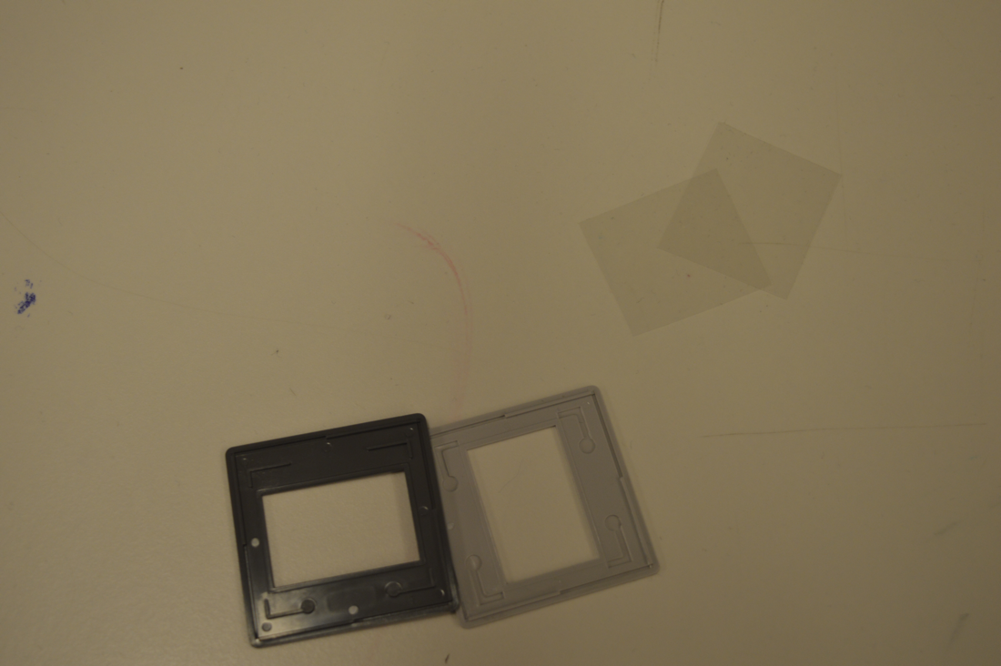

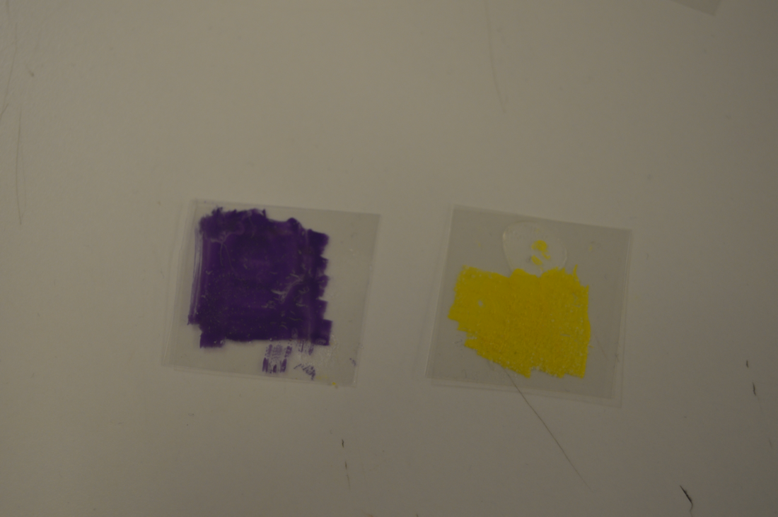
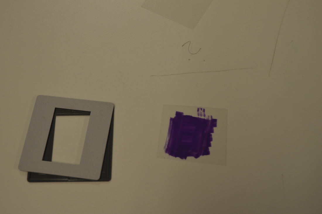
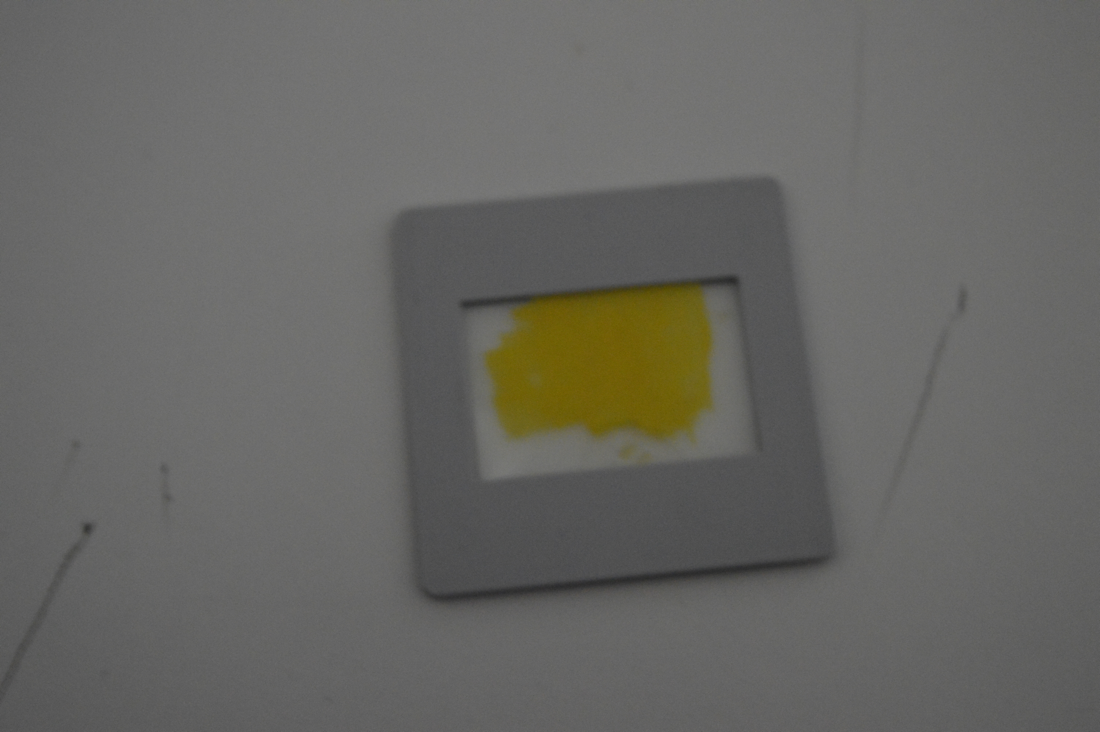
We were told to make a slide that we could use to project onto a wall and to use to make enlargements in the darkroom. To make the slides I had to cut two pieces of acetate to fit between the case and sandwich materials between it. I chose to put nail polish, food colouring and salt on my slide. I chose these materials because I thought that they would create an interesting pattern when projected. However, before I put the slide into the projector I added food colouring to the yellow one to make sure the projection would have different colours.
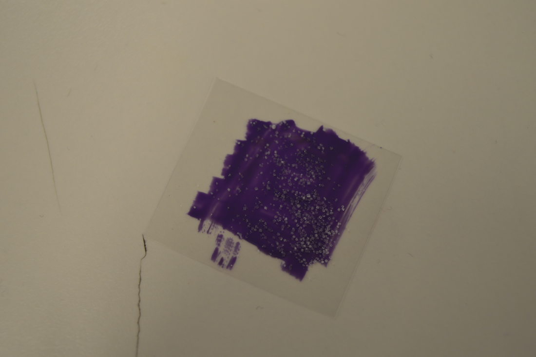
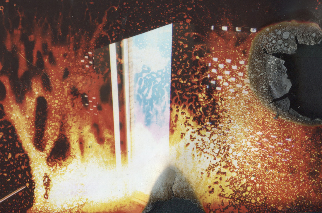
Projecting
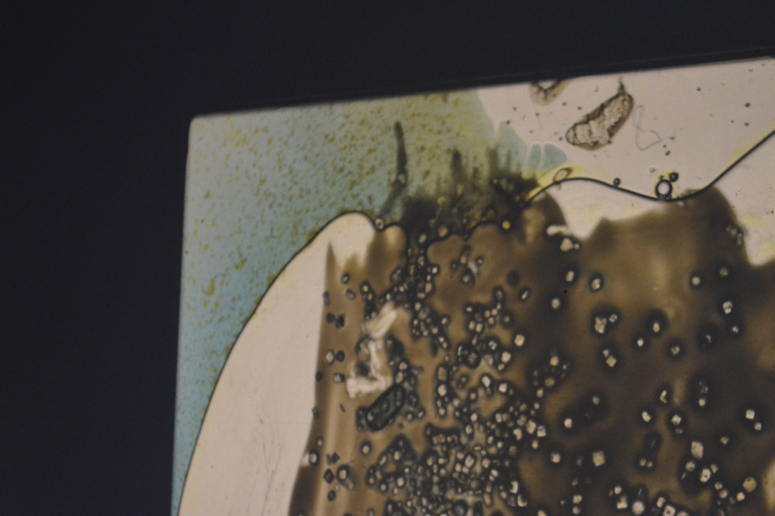
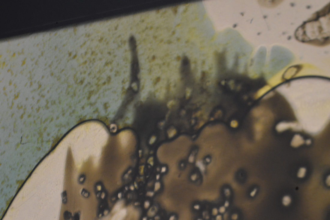
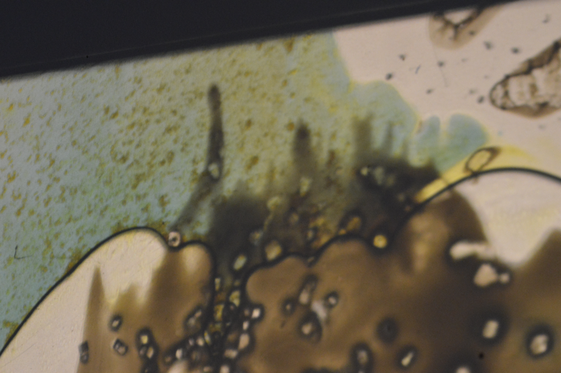

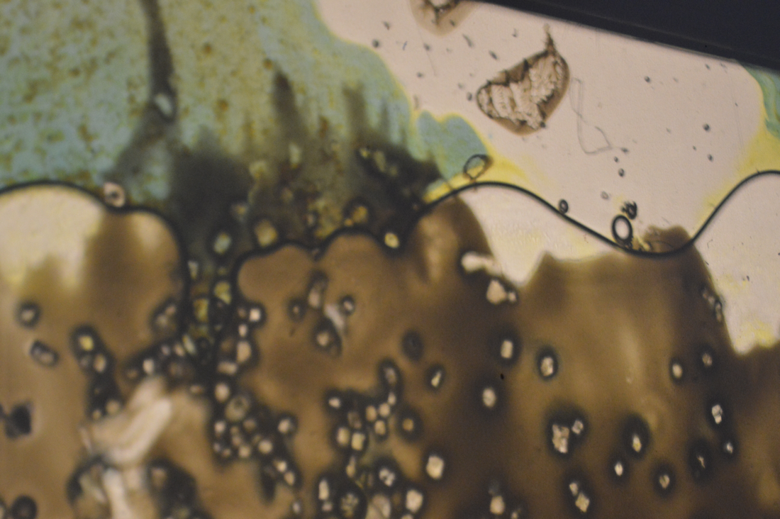
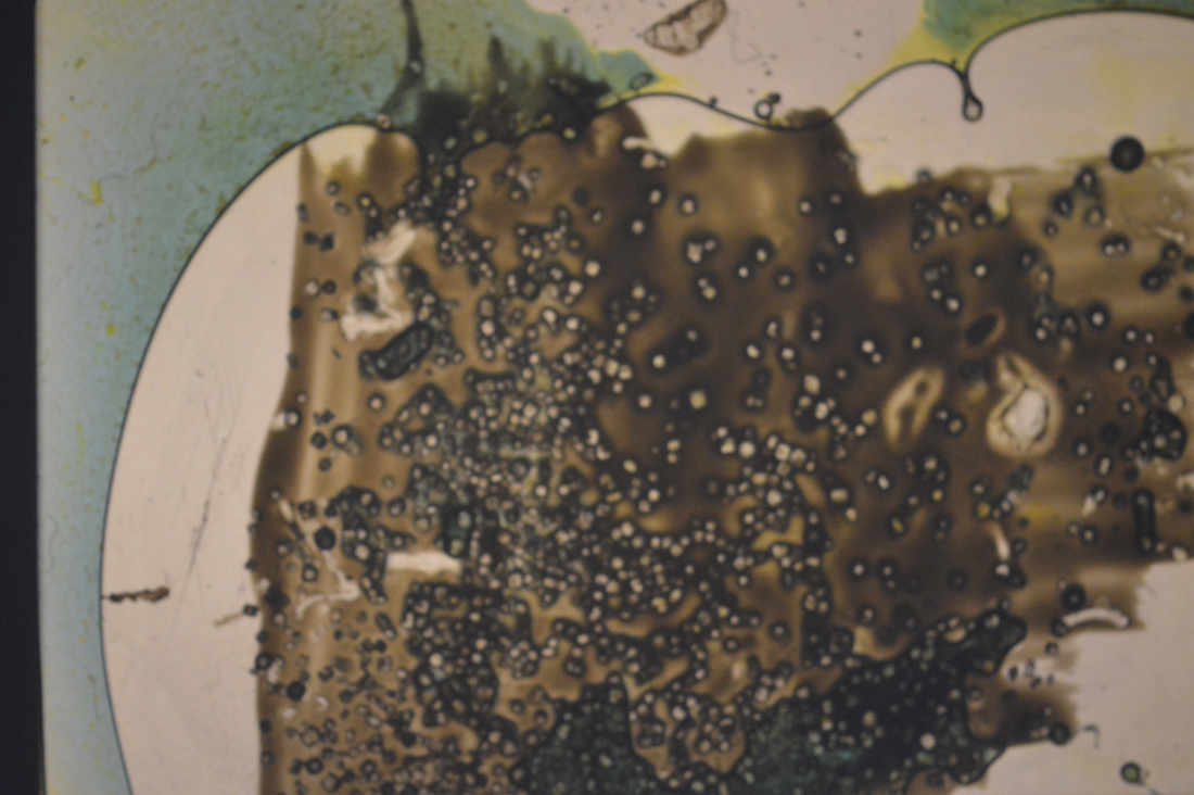
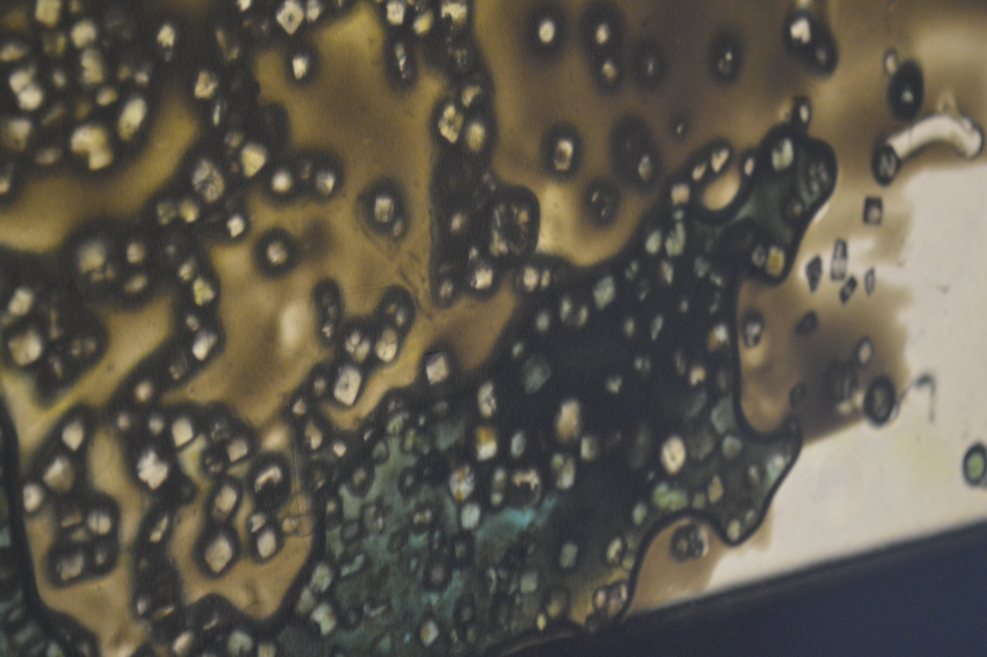
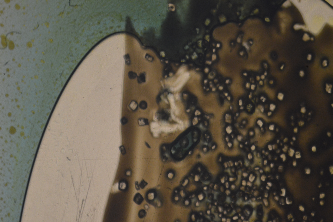

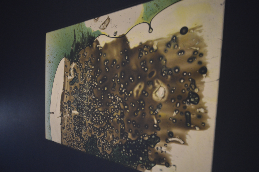
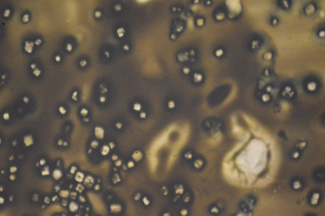

This is what my slide looked like when it was projected. I had used the slide wth yellow nail varnish, salt and food colouring. I am overall very pleased with the way my projection turned out as it wasn't the same all over, for example it had parts that had a little bit of salr on and parts that had a lot on. Although I do wish I had covered all of the slide so there were no parts that were white/plain.
Photographing a reflective sculpture
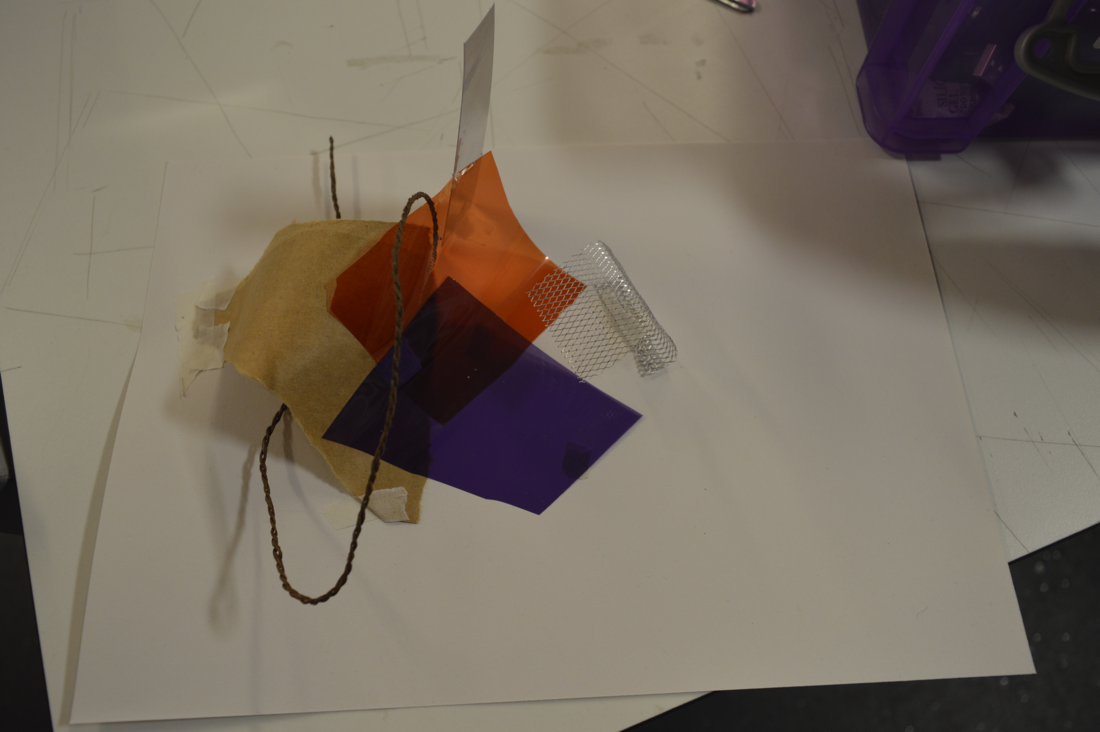
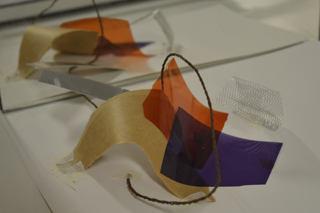
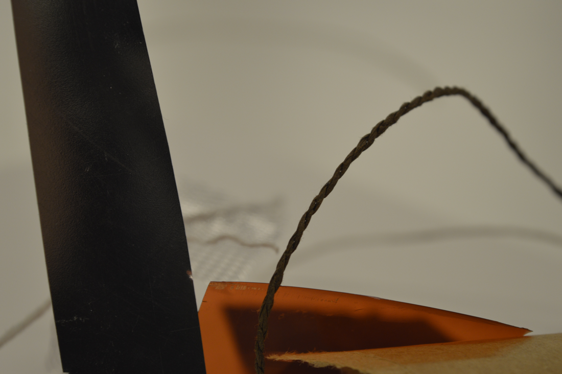
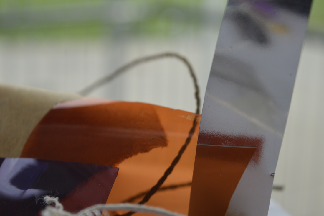
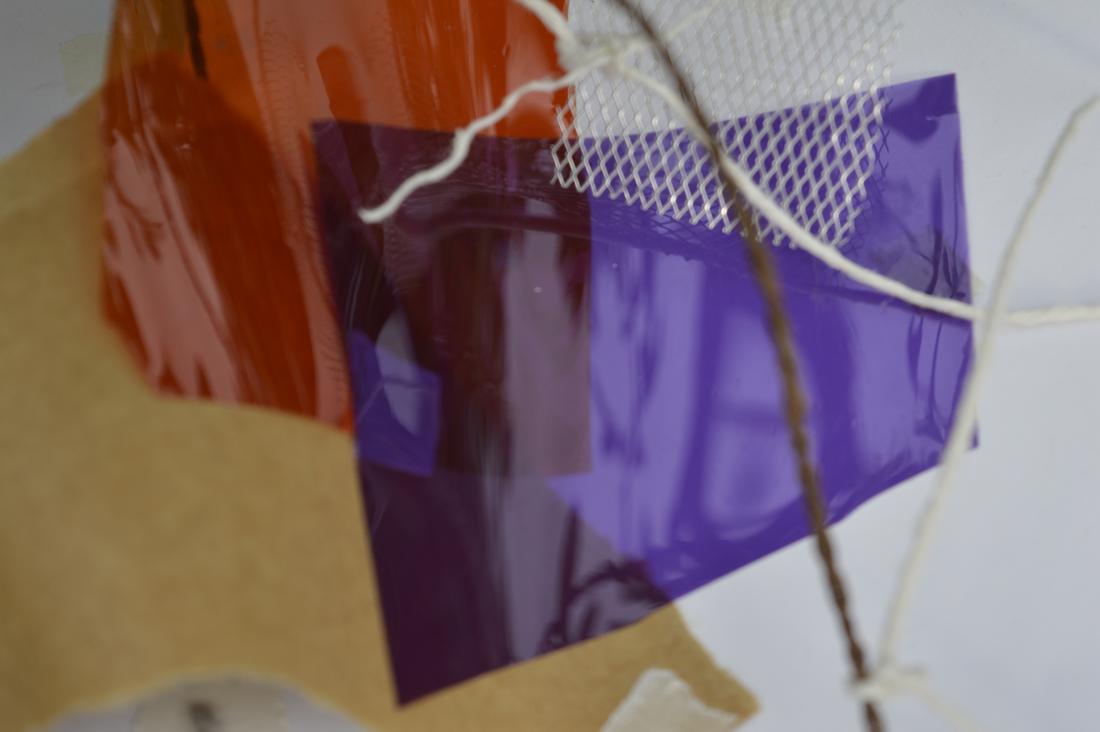
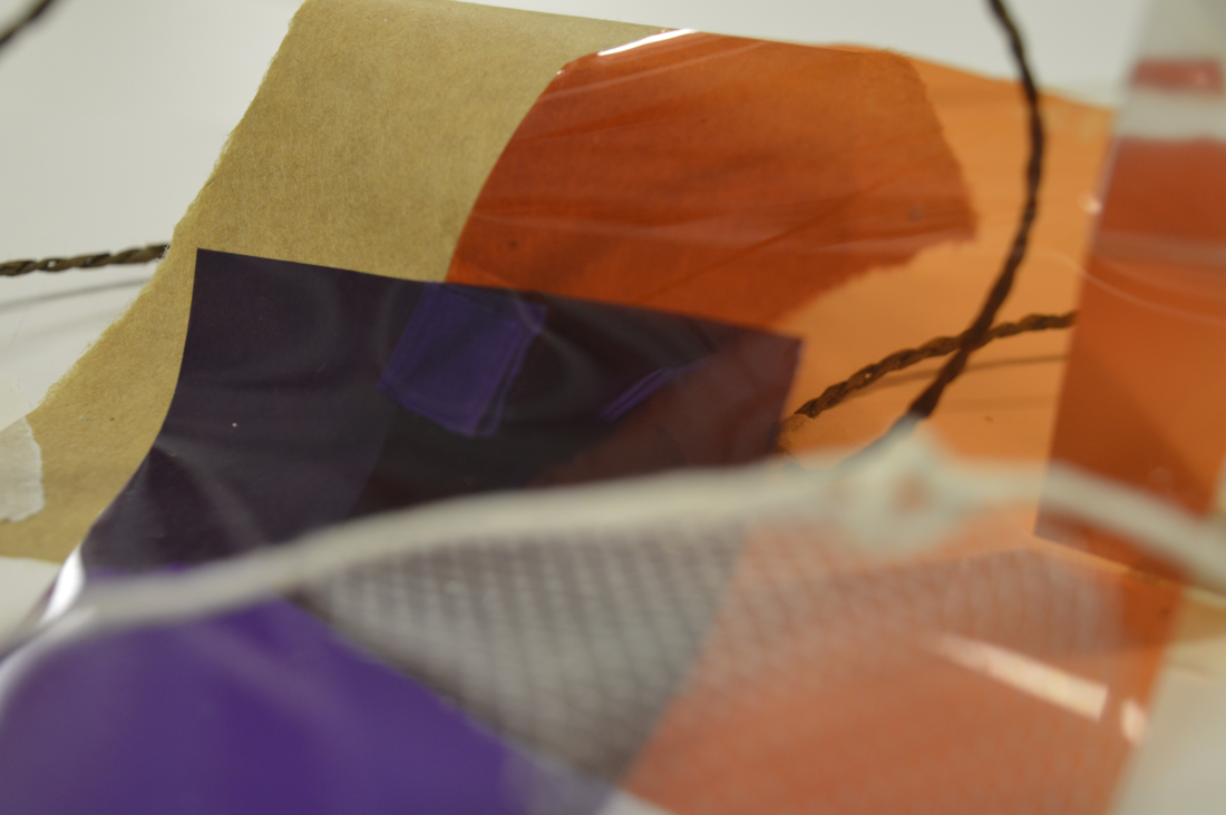
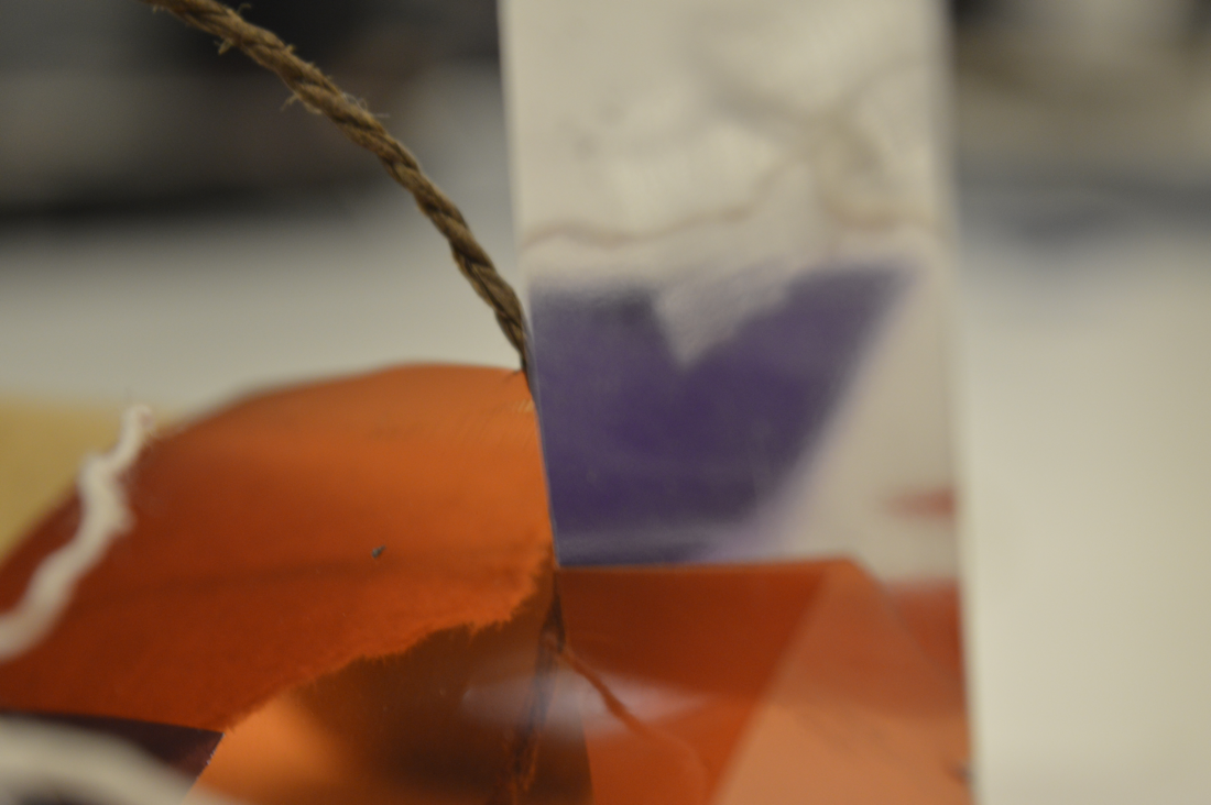
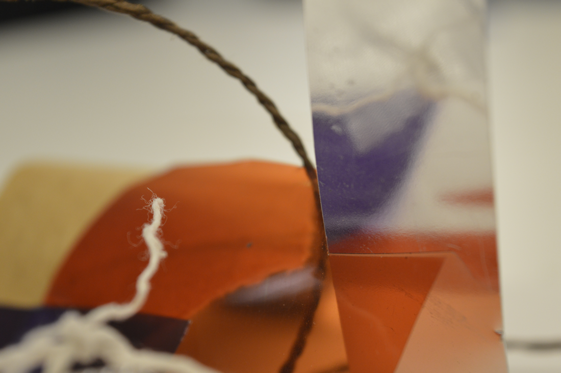
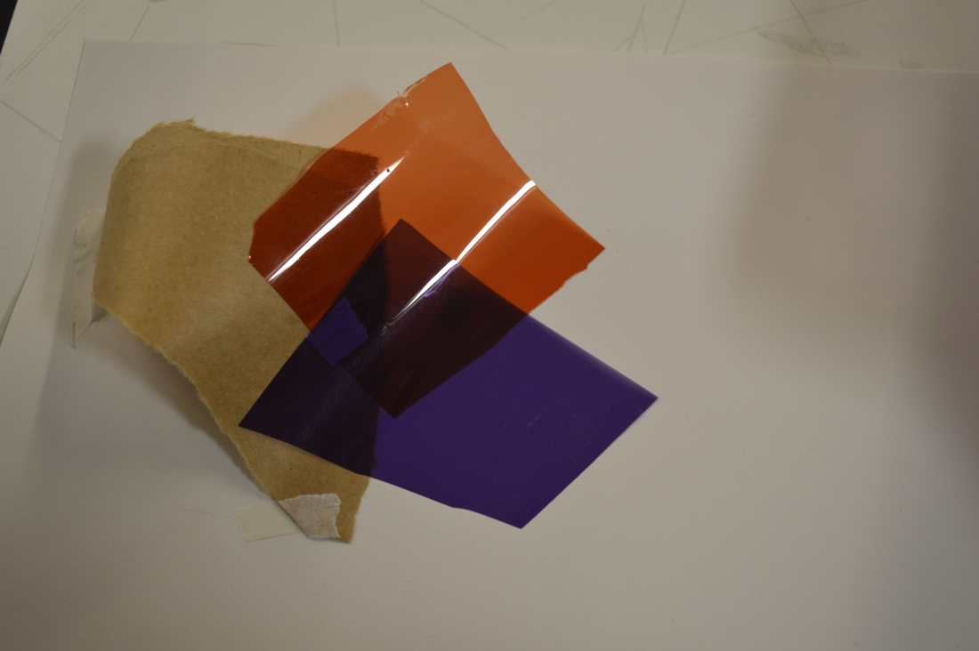
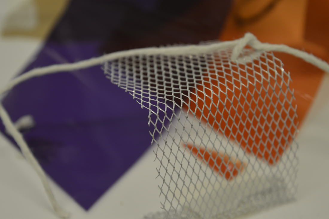
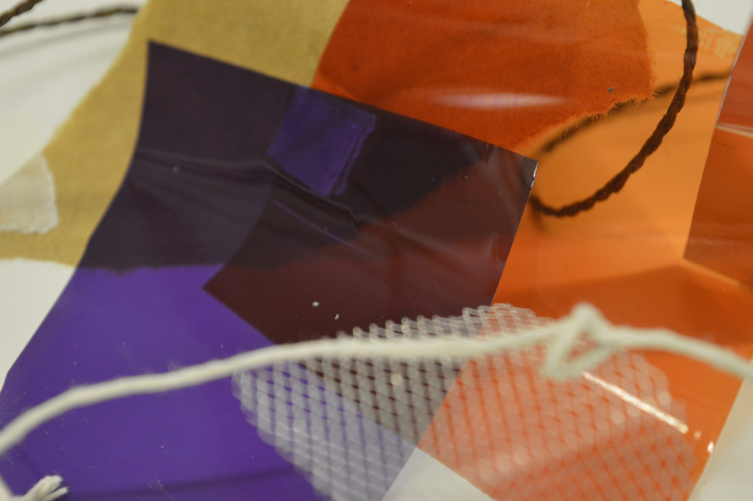
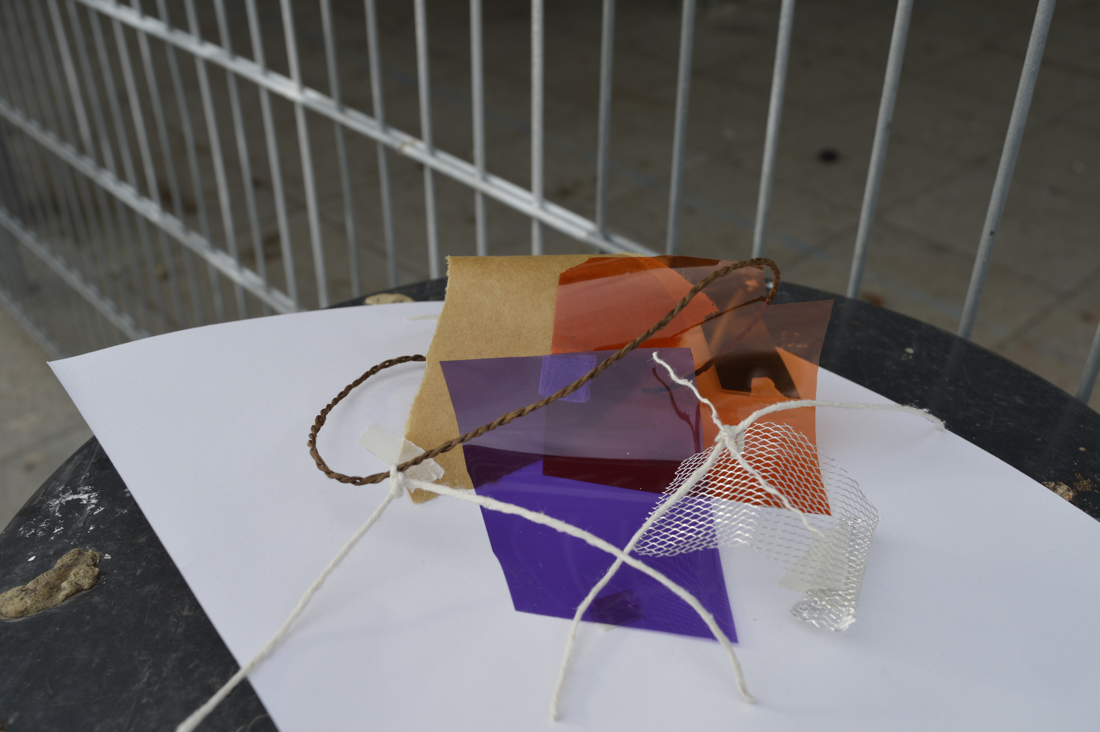
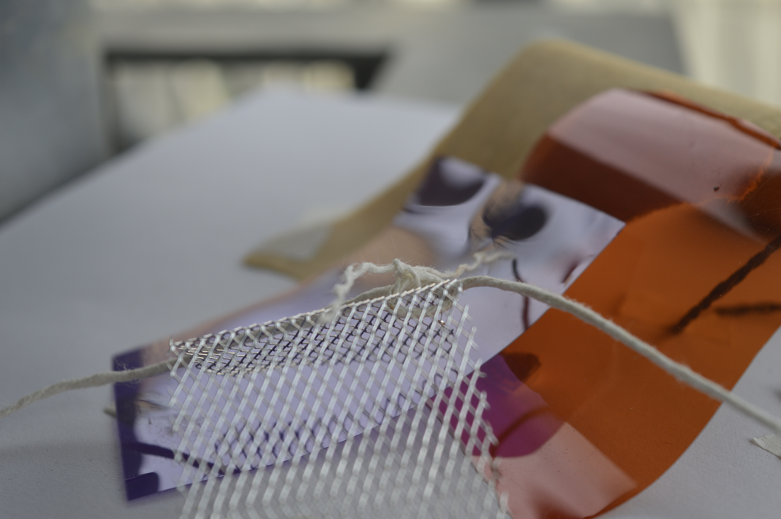
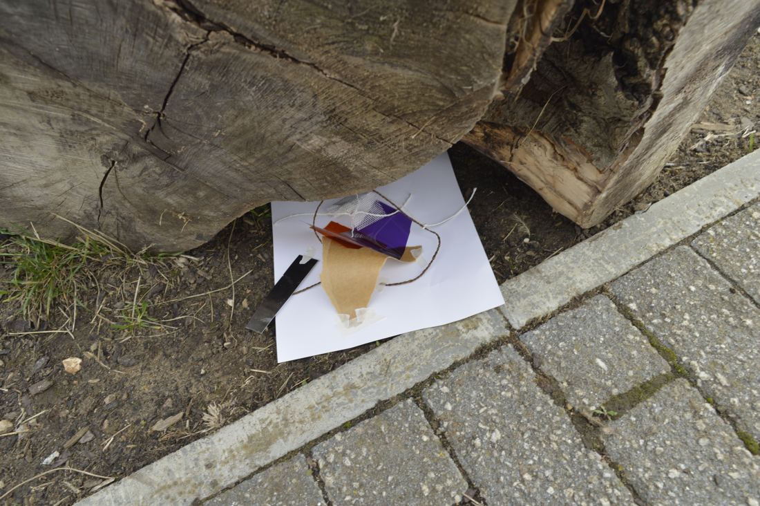

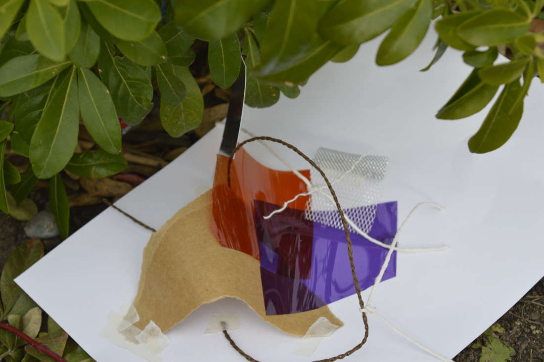

Here I have photographed a sculpture I made using mostly reflective/shiny materials. I took some images of my sculpture while I was inside so I could compare how the surface of the sculpture will change as different kinds of light hit it. I think that when I took images of the sculpture outside it was more successful than inside because I could capture some refections on the shiny materials.
My favourite image is the last one because I like that it has light shining on both the orange and purple material and they show two different perspectives of the same thing.
My favourite image is the last one because I like that it has light shining on both the orange and purple material and they show two different perspectives of the same thing.
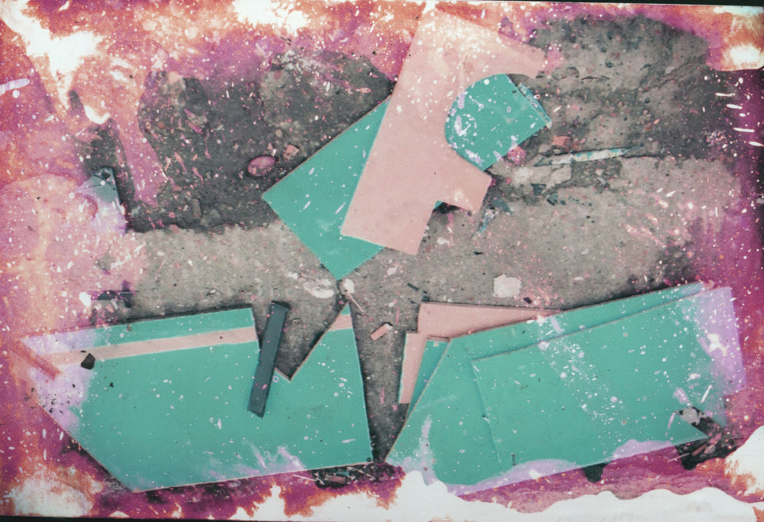
Using bleach
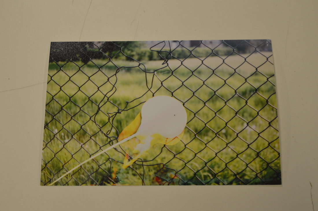
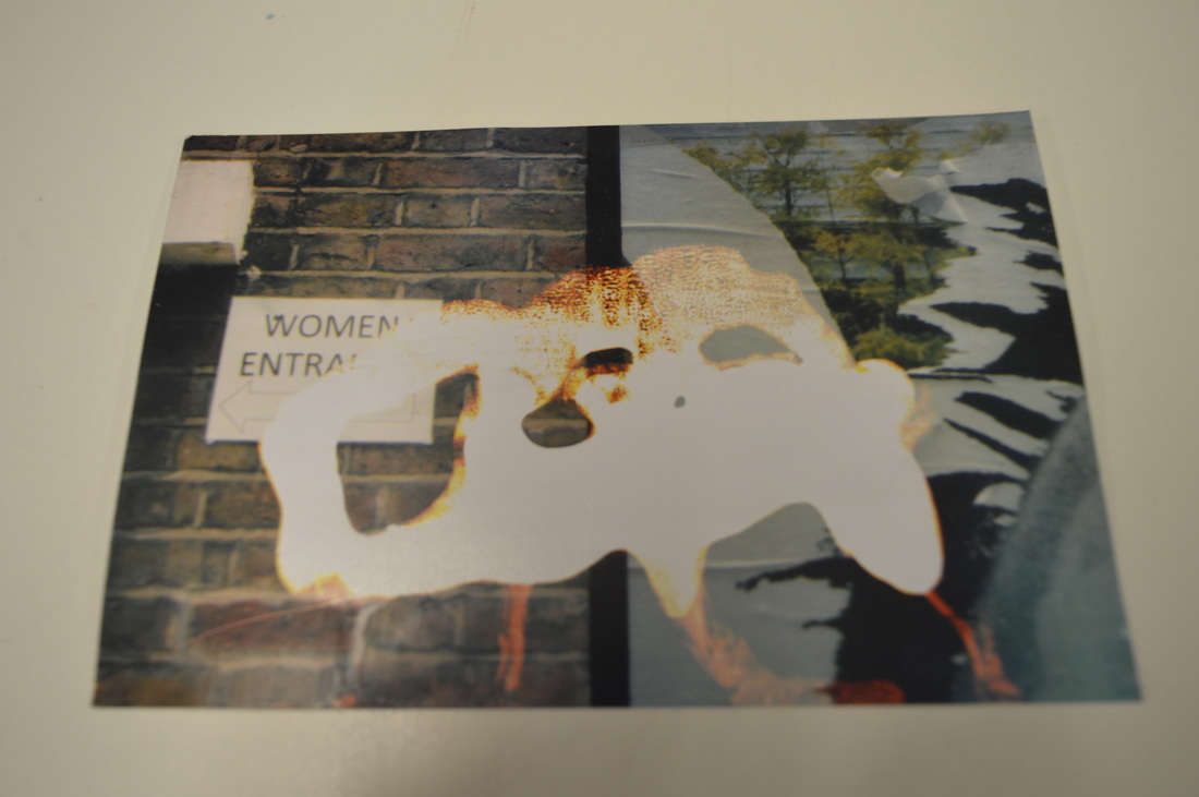
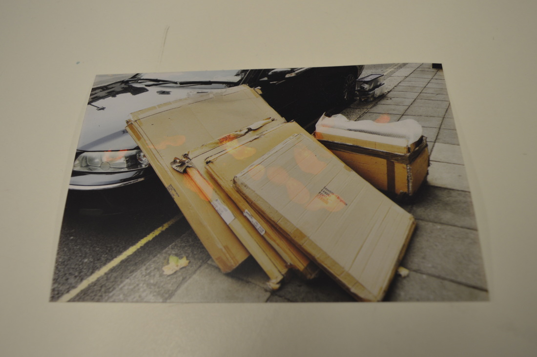
To produce these images I put household bleach on the surface of the image. When the bleach was applied, it reacted with the images colour and removed it. I wanted some parts of the image to be white and some to be discoloured as I thought it would look more interesting than just having a white spot. I really like the second image here as it looks like its been burnt without making a hole in the middle of it. I also like this image because the bleach was spread around the middle of the image and not just in a blob/dot in the centre.
I think if I were to do this experiment again I would try adding the bleach around the edges and try to make it fade into the middle. This would have to be done in sections as if I do it all together it would probably remove all of the images colour. I also think that it would look interesting if I took an image and used the bleach to write something about the image on its surface. I think this would be interesting because I think it will look different to what I thought would look good at first.
I think if I were to do this experiment again I would try adding the bleach around the edges and try to make it fade into the middle. This would have to be done in sections as if I do it all together it would probably remove all of the images colour. I also think that it would look interesting if I took an image and used the bleach to write something about the image on its surface. I think this would be interesting because I think it will look different to what I thought would look good at first.
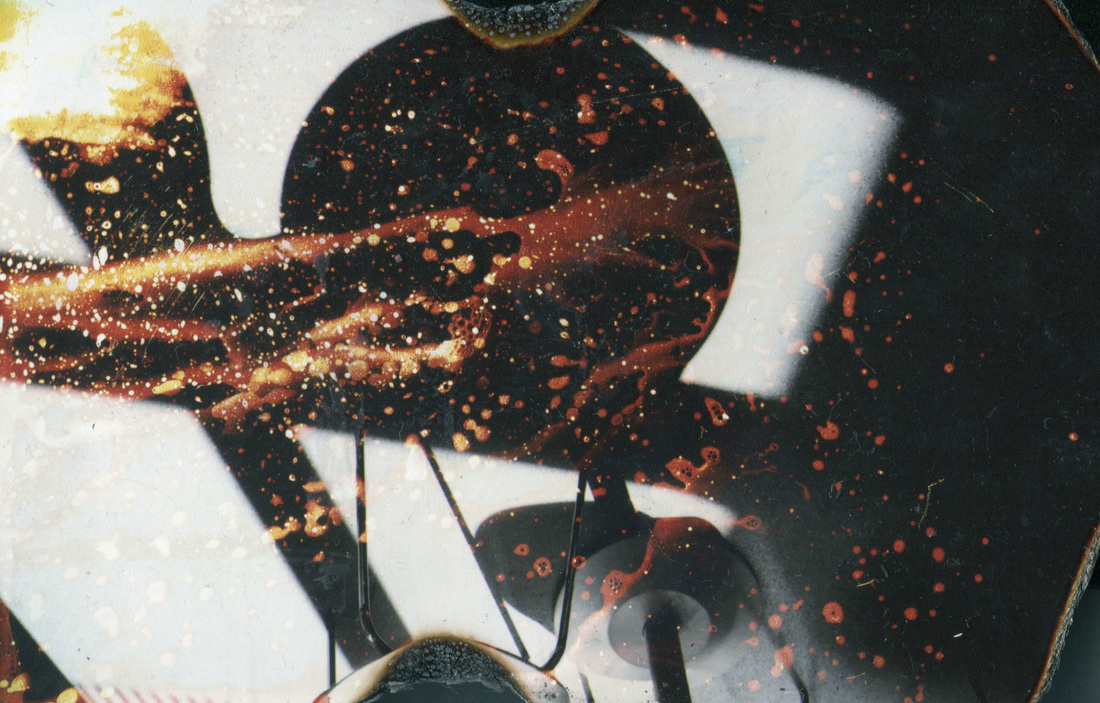
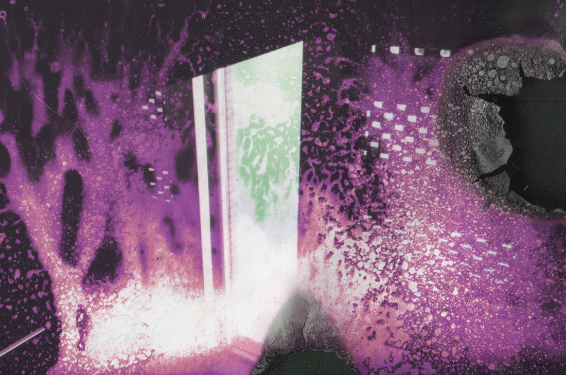
Using mould spray
Instead of using bleach, I decided to use a mould spray to do these experiments as it was in a spray container. I wanted to use the spray container as I thought it would allow me to get a different effect to the other experiments I have done. I am actually very happy with the way that these have turned out as not many of the images have large spaces where it has gone completely white where the other ones did. I did an experiment where I only used the spray around the outside and I really like the way that it looks. I had to do it in sections as I already knew it would go nearly completely white. I think that I should have added more or left the spray on for longer on the right side as the colour only lifted a small bit instead of like the other sides that lifted a lot. I also really like the second image as it looks a little bit like an image of fire. I don't actually know how I did this because I only put the spray on the middle, I think it happened when I washed the spray off.
Burning the edges of the image
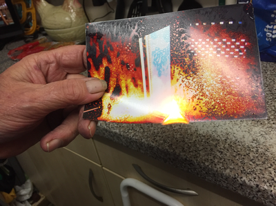
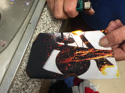
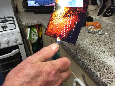
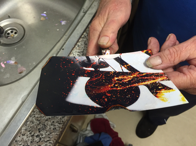
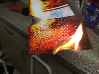
After using the mould spray on the image, I decided I wanted to burn them as I thought it would make them more interesting while adding another surface to the image. I think that burning an image printed on regular paper would have worked better and given me the results I wanted as regular printer paper burns better than this kind of paper. If I were to do this experiment again I would use my own images printed on regular printer paper so I can get a better result from burning.
The burnt images
Editing in Photoshop
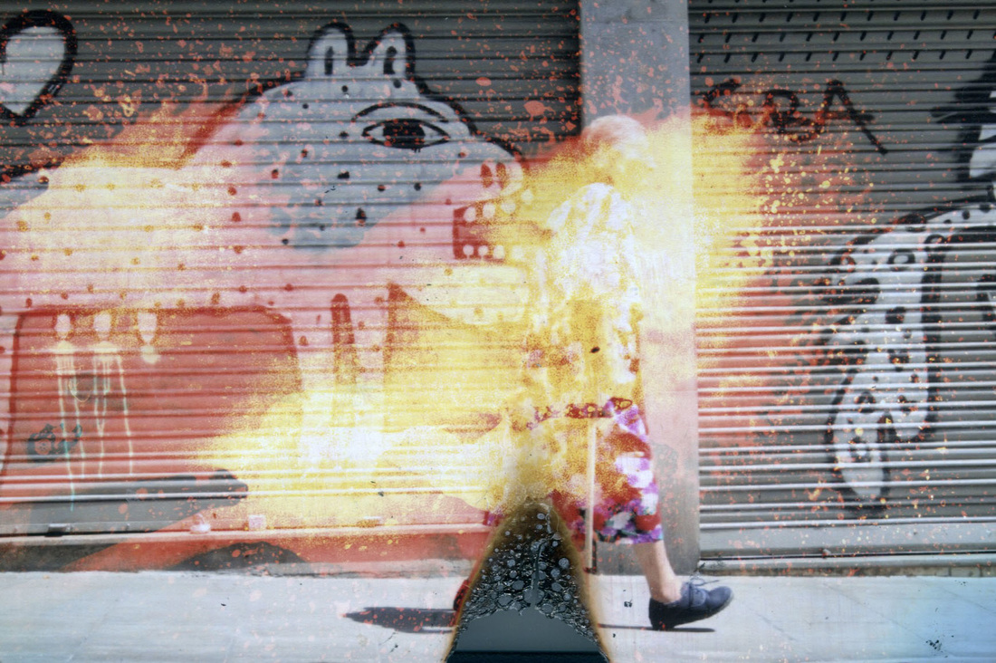
Here I have taken all of the images I have made by disturbing the surface so far and I have edited them in Photoshop. I changed the hue/saturation and put them into different modes to give them a different looking surface. I think that by changing the colours and contrast of the images they look much better as you can see some textures that you couldn't see before.
Making grids in Illustrator
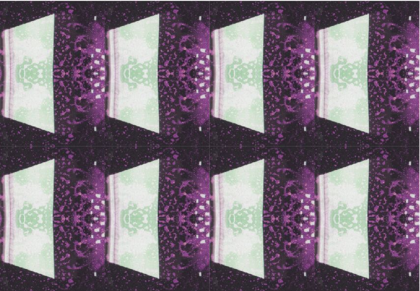
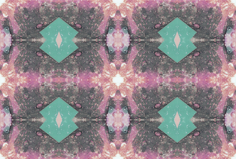
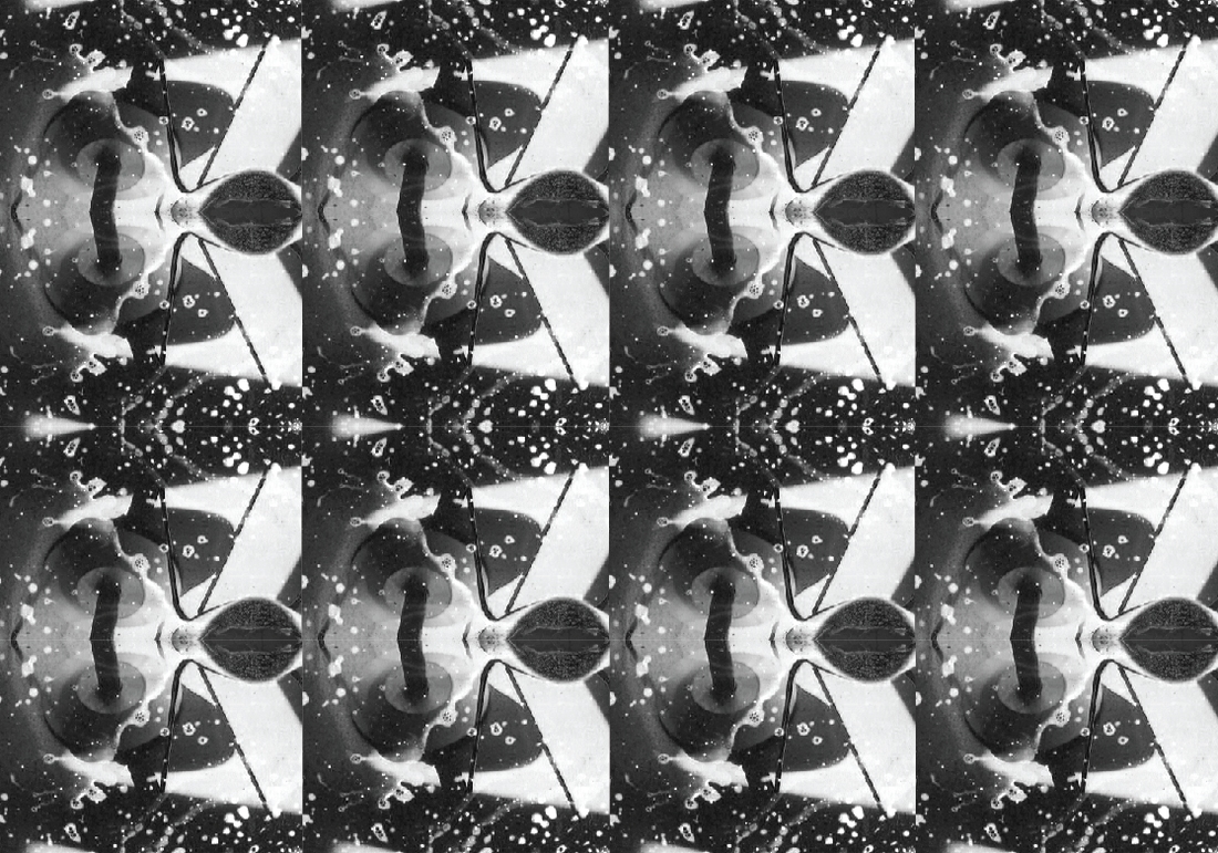
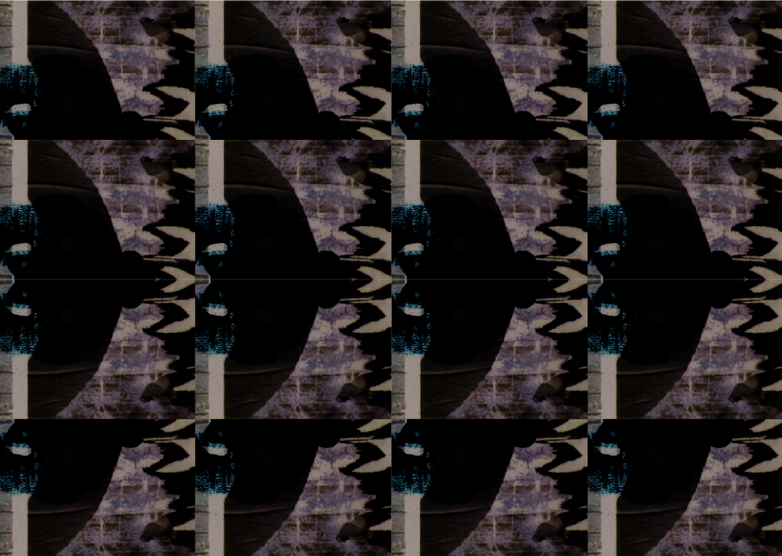
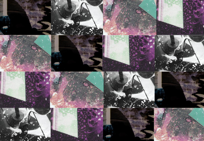
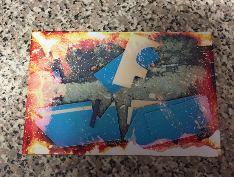
To make these grids I opened the original image in Photoshop and chose a section i liked. I then copied this section and pasted this into Illustrator. When I had made a line of these images, I selected them all and copied and pasted them underneath the first line to create a 4x4 grid. I also decided to horizontally flip every other row to create a pattern.
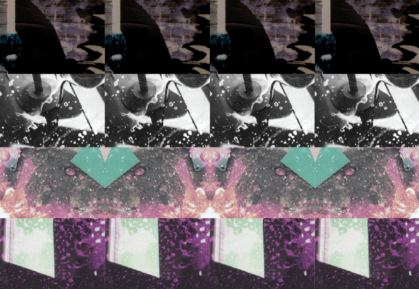
Flipping and rotating parts in Illustrator

Here I have copied and pasted some parts of this image and rotated or flipped it to make the image look completely different. I think that the image looks more interesting than it did before as you can clearly tell that parts have been rearranged. If I do this experiment again, I would like to use a coloured image and take a section, turn it black and white then rotate that so it stands out even more than it usually would.
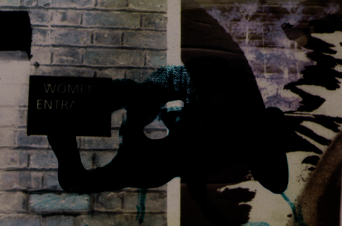
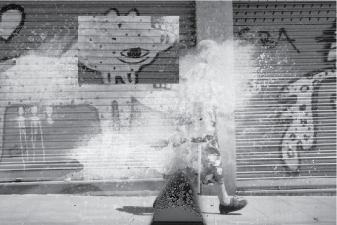
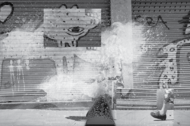
Using ink
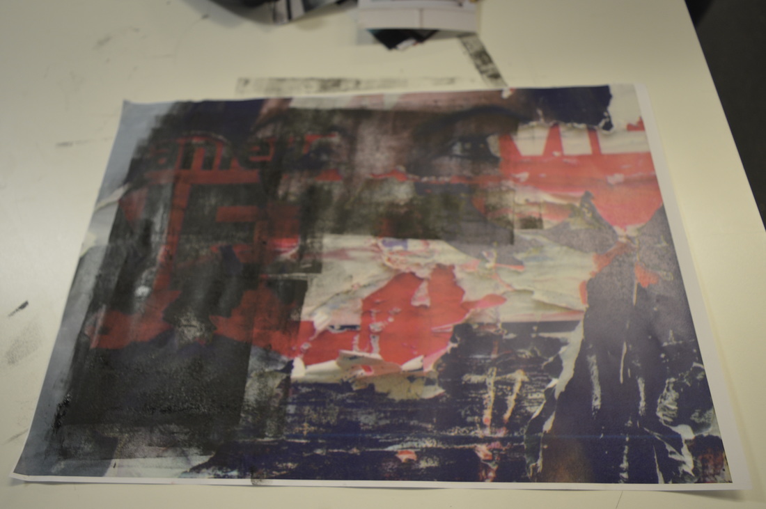
Here I have used printing ink to altar the surface of this image. I used the ink to cover part of the image as I thought it would give it two different textures. I think instead of covering the eyes I should have covered everything but the eyes. This would have copied the original image but also made it look almost completely different. If i were to do this experiment again, I would use an image I had taken that already had different surfaces and textures in it and create different textures with the ink.
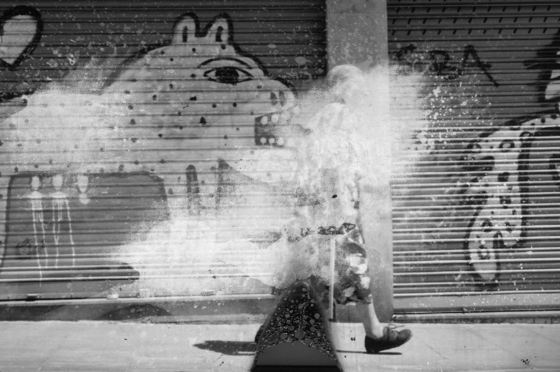
Eileen Quinlan
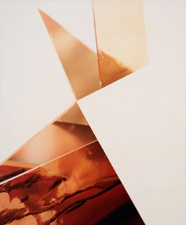
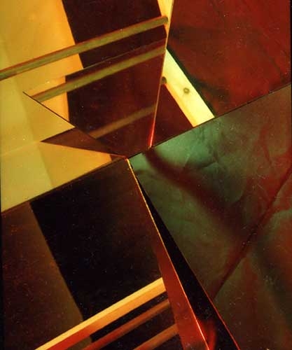
Eileen Quinlan is a still life photographer who shoots with medium format and large format cameras. She uses these cameras to take abstract photographs that are designed like constructions which she then disturbs the film "via steel wool or long chemical processing". Some of her photographic subjects include: mirrors, smoke, coloured lights and other photographs. "The result is photographic images that are reminiscent ofcolor field painting and op art thus furthering the contemporary conversation between photography and painting."
"Overall, there is an unexpected sincerity to her process. Everything you see happened just the way it appears. The wizardry is all in the setup. Quinlan plays hide-and-seek with the camera (I’ve never seen it, but I know the camera is there, deep in some reflected shadow) and invites us to play along. To look at her pictures is to parse their construction—a game for puzzlers yielding endless pleasure." |
