BLACK LIGHT
KELD HELMER-PETERSEN
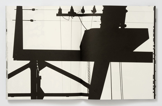
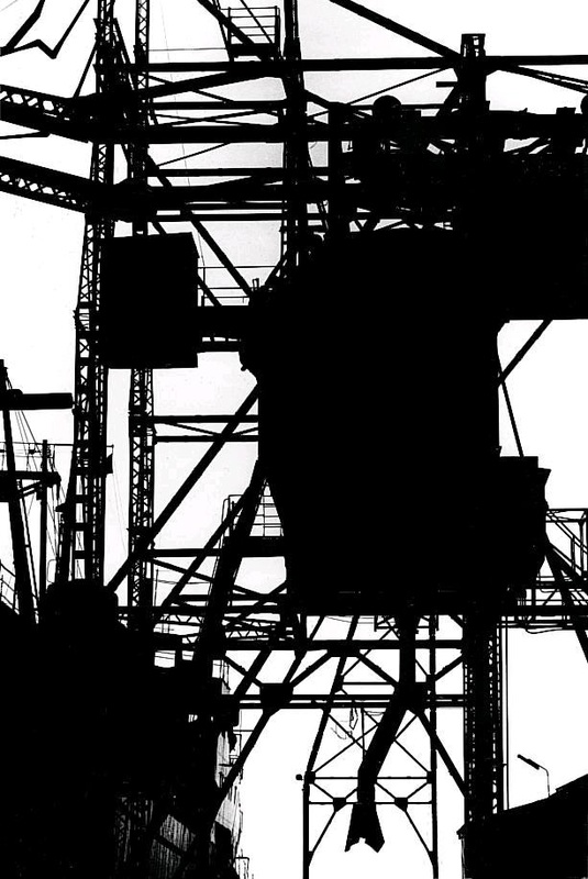
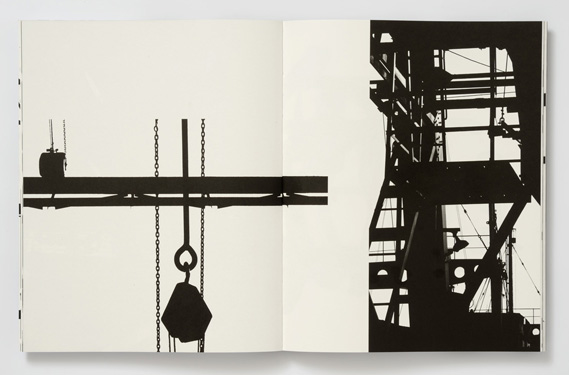
Helmer-Petersen is a Danish photographer who became famous due to his 122 colour photographs that were published in 1948. These were images that were experiments using shapes inspired by Albert Renger-Patzsch and the realism of the Neue Sachlichkeit movement. His aim as a photographer was to only take images that would only work in colour and not black and white. However he has also created a book of images from the 1960's that are high contrast black and white with little to no grey tone.
"Black Noise, published by the Rocket Gallery, features flatbed and negative scans of black and white negatives, ink drawings, cut-up line negatives, even dead spiders, plants, old tape and misprinted supermarket receipts. |
Editing in Photoshop
|
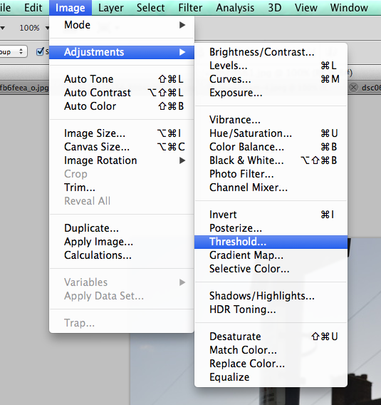
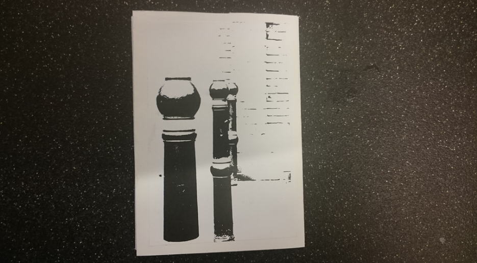
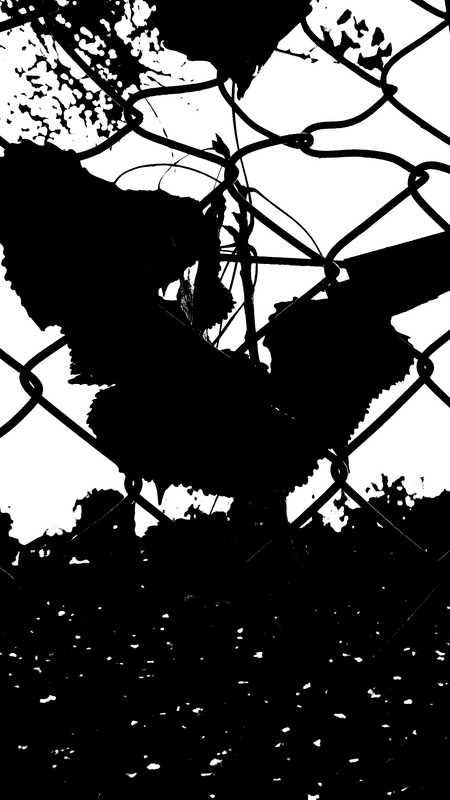
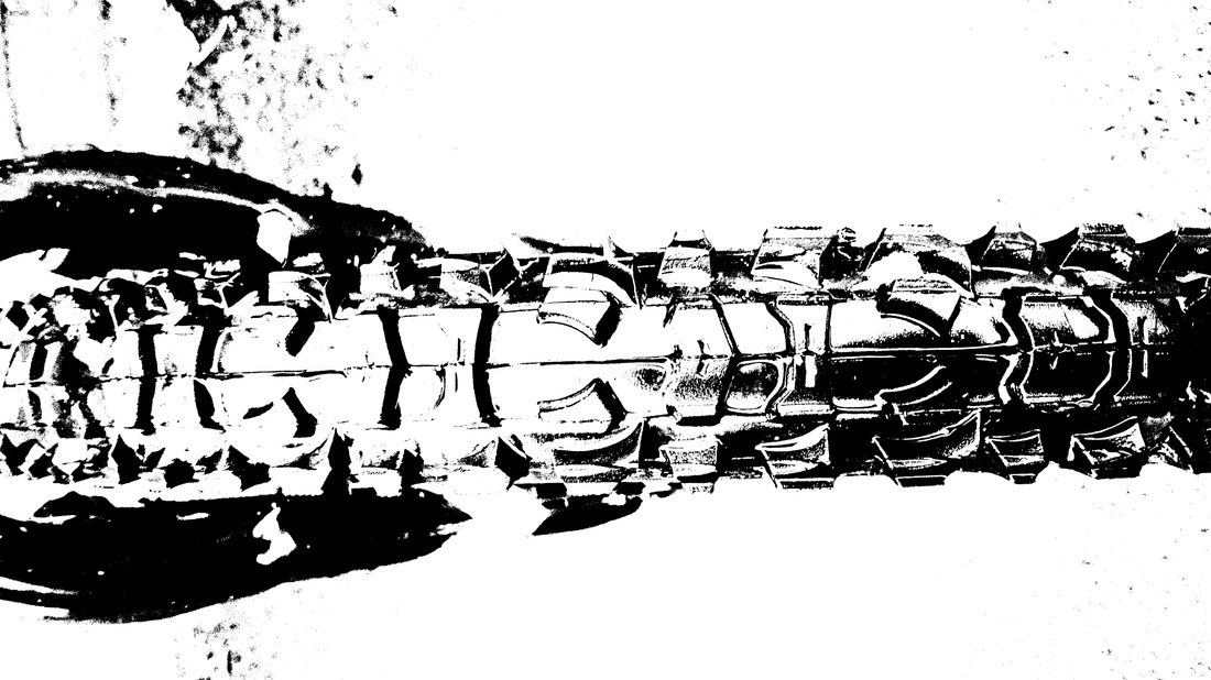
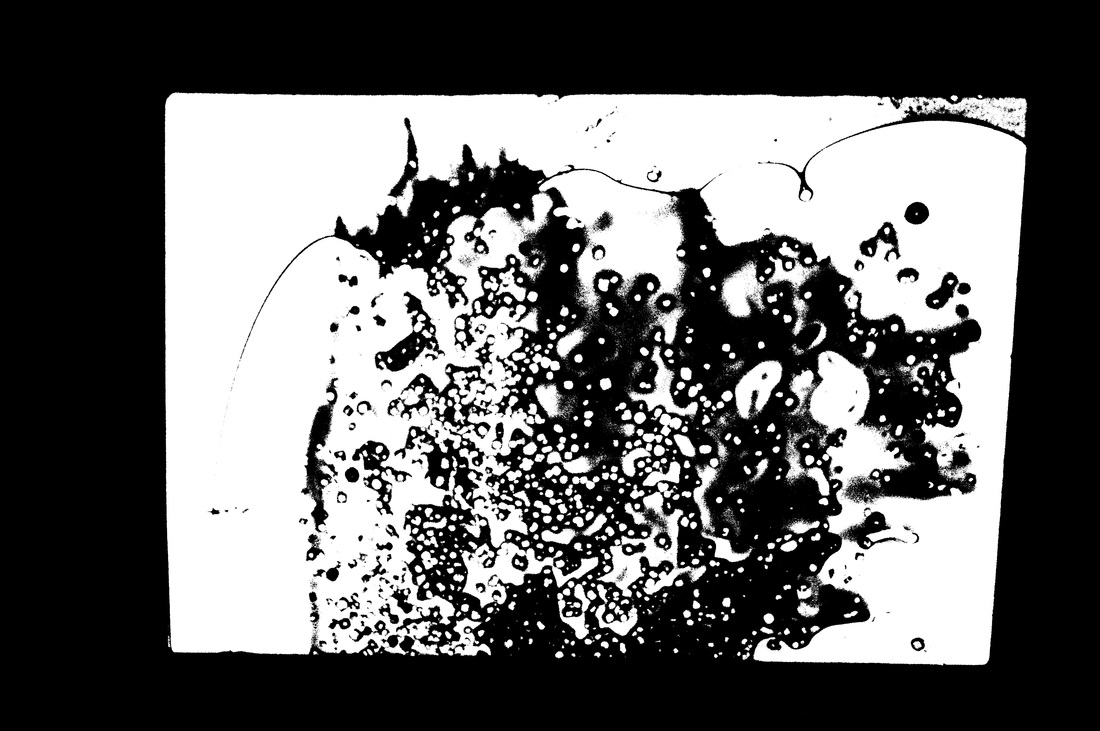
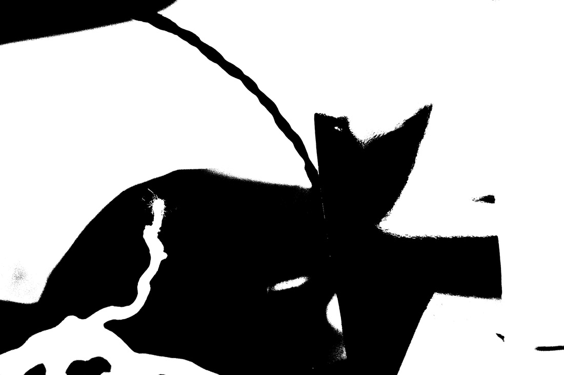
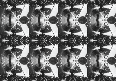
To create images similar to Helmer-Petersen's I chose 8 images and opened them in Photoshop. Once in Photoshop I went into the image menu. After opening the image menu I went to adjustments then threshold. (Image>Adjustments>Threshold...)
|
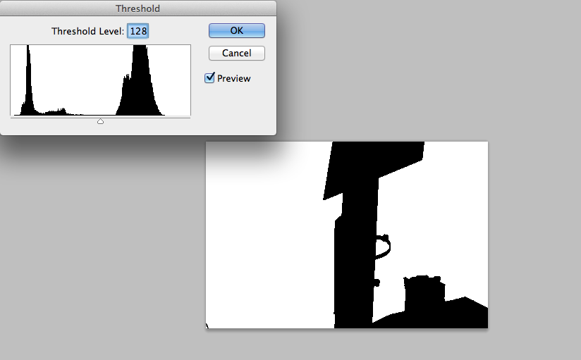
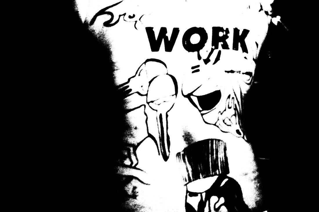
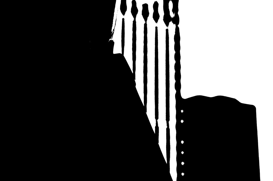
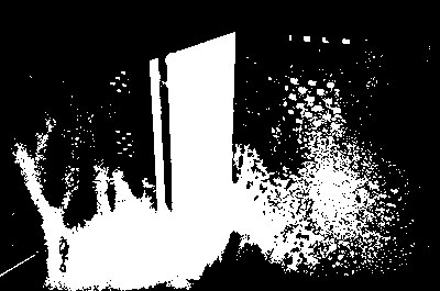
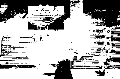
When threshold is opened the image will change colour and be a variation of black and white. I think that keeping the threshold in the middle looks really good because it mostly makes the main subject black and the background white. I really like when there are no grey tones either as I think the image looks more interesting just black and just white.
|
|
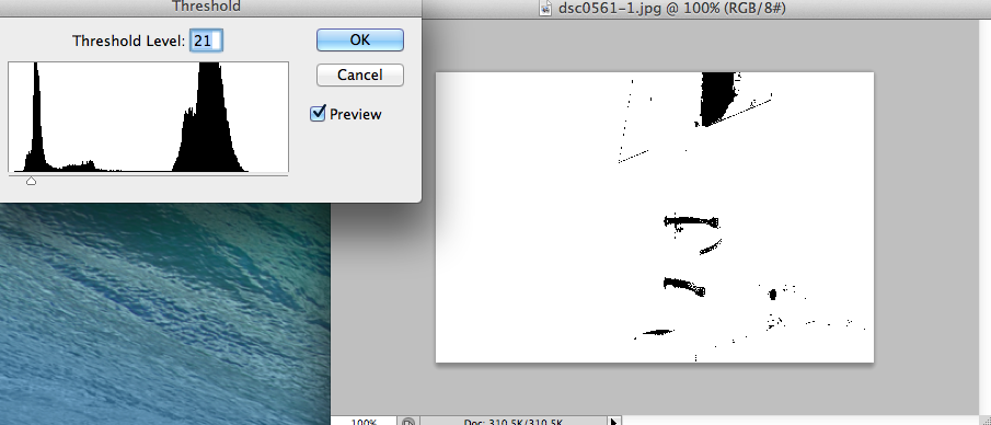
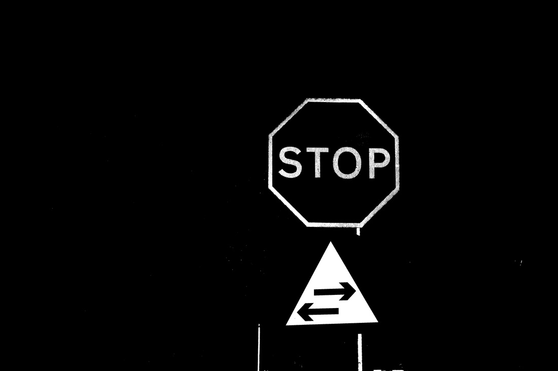
The lower the threshold, the lighter and less black the image will be. This is good for when you want the image to have very little context. I don't really like the images when they look like this as there isn't much to see and sometimes the image just becomes completely white with a few black dots in a line.
|
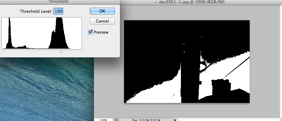
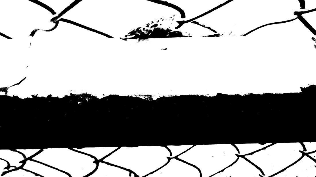
However even when the threshold is higher, the image will be darker and more black. Again, this is good for removing some/most of the images context and meaning. I think that images look better when they are darker rather than lighter as they show more contrast. I also like that the majority of the lines are bold and stand out against the white background.
|
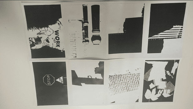
Edited images
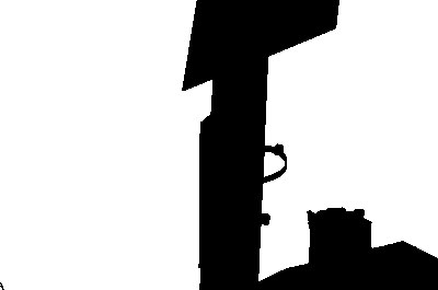
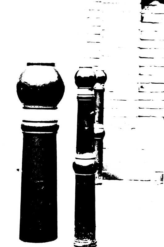
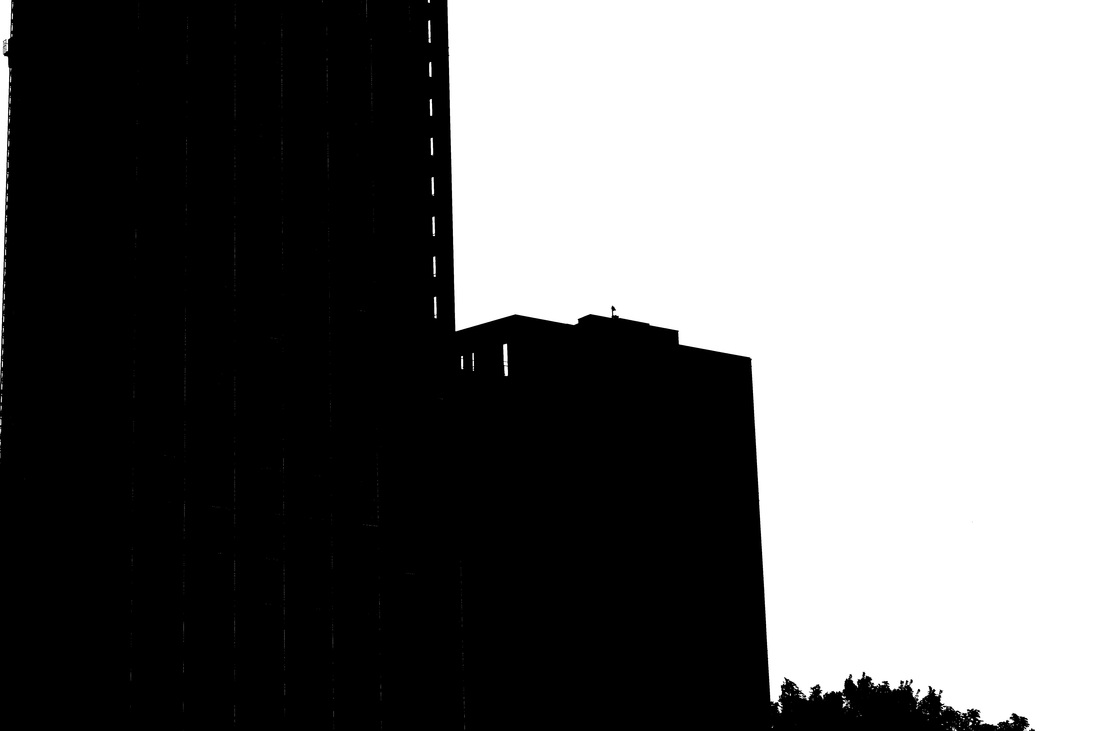
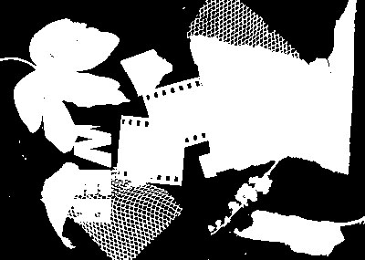
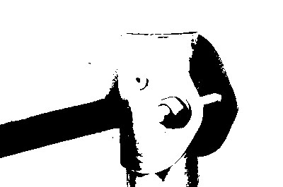
These are the 8 images I have changed in Photoshop using the threshold adjustment. I think that these images are successful because they have very little information shown about what they are. This makes the images suitable for this project because Helmer-Petersen's
Black Light book is made up of similar images, scans and ink drawings. I think that I should have used more processes other than photographs as I only included one of my photograms. This is because it would have allowed my photobook to show a range of processes I have learnt. If I were to do this again, I would like to use different types of images so I can show the onctrast and how different images look when changed into two colours.
Black Light book is made up of similar images, scans and ink drawings. I think that I should have used more processes other than photographs as I only included one of my photograms. This is because it would have allowed my photobook to show a range of processes I have learnt. If I were to do this again, I would like to use different types of images so I can show the onctrast and how different images look when changed into two colours.
My First Photobook
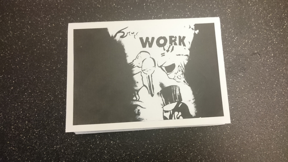
this is the first photobook i had made. I am very happy with the way that this photobook turned out because i think that all of the images are very contrasting and i think that i had laid and planned where i wanted them to go well. I wanted each double page spread to have one image where it was primarily black and one where it was primarily white. I thinkthat this makes the book more intersting but causes it to lack any element of surprise for the next image.
My Second Photobook

for these 8 images i wanted to get away from having very black and very white images as i thought there should be some sort of balance between the two, however these images didn't produce the effect i was searching for.
My Third Photobook
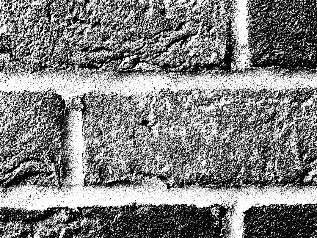
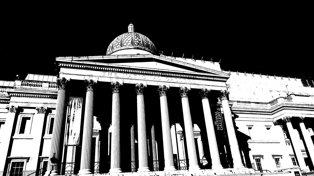
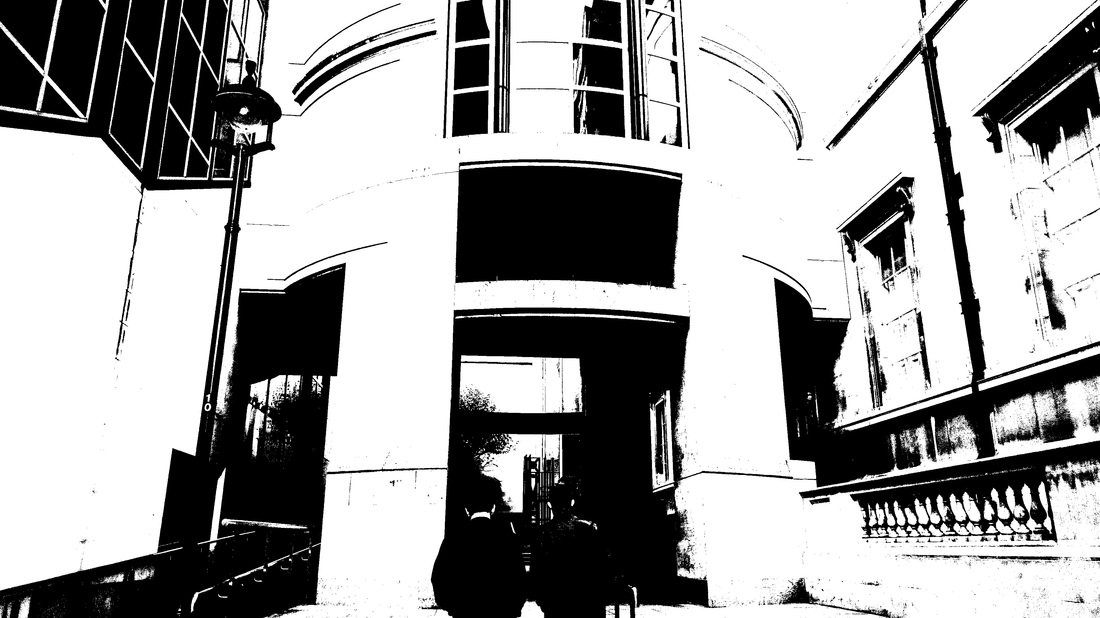
these images had almost exactly what i was looking for, a good balance between black and white so the viewer of my photobook can't predict what will be coming next. However i do wish that i had made some of these images more dark or light as what they are can be clearly seen, for example the fourth image is clearly the National Gallery.
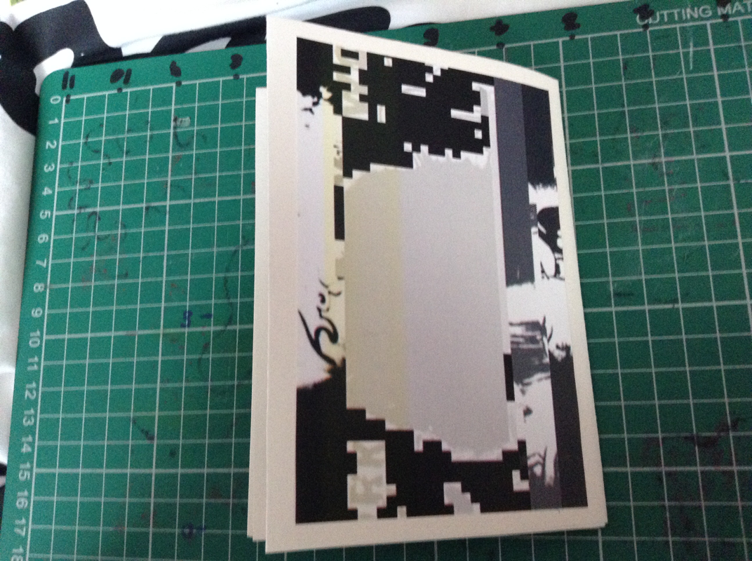
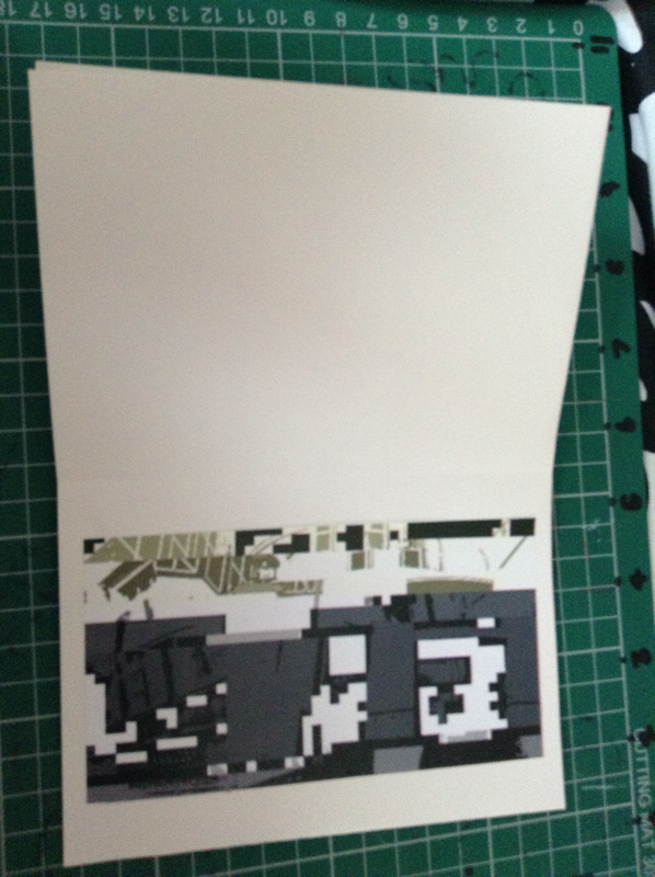
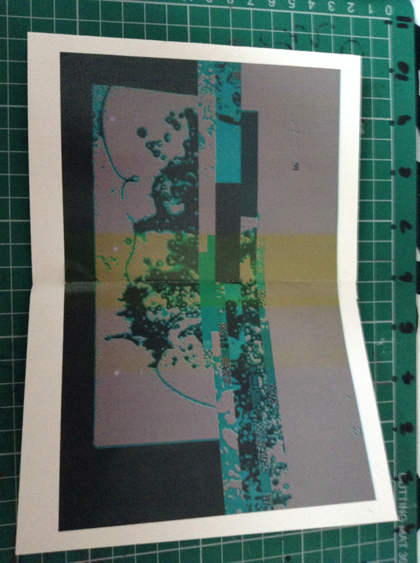
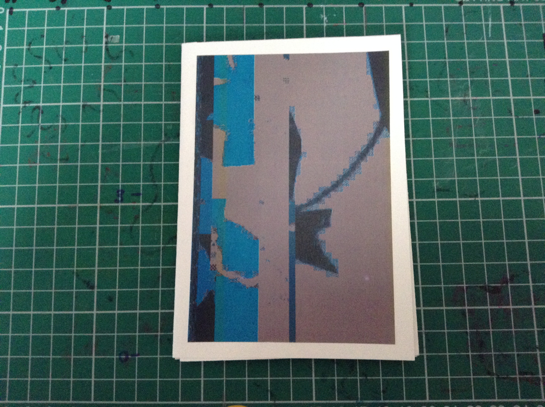
My Fourth Photobook
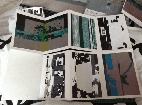
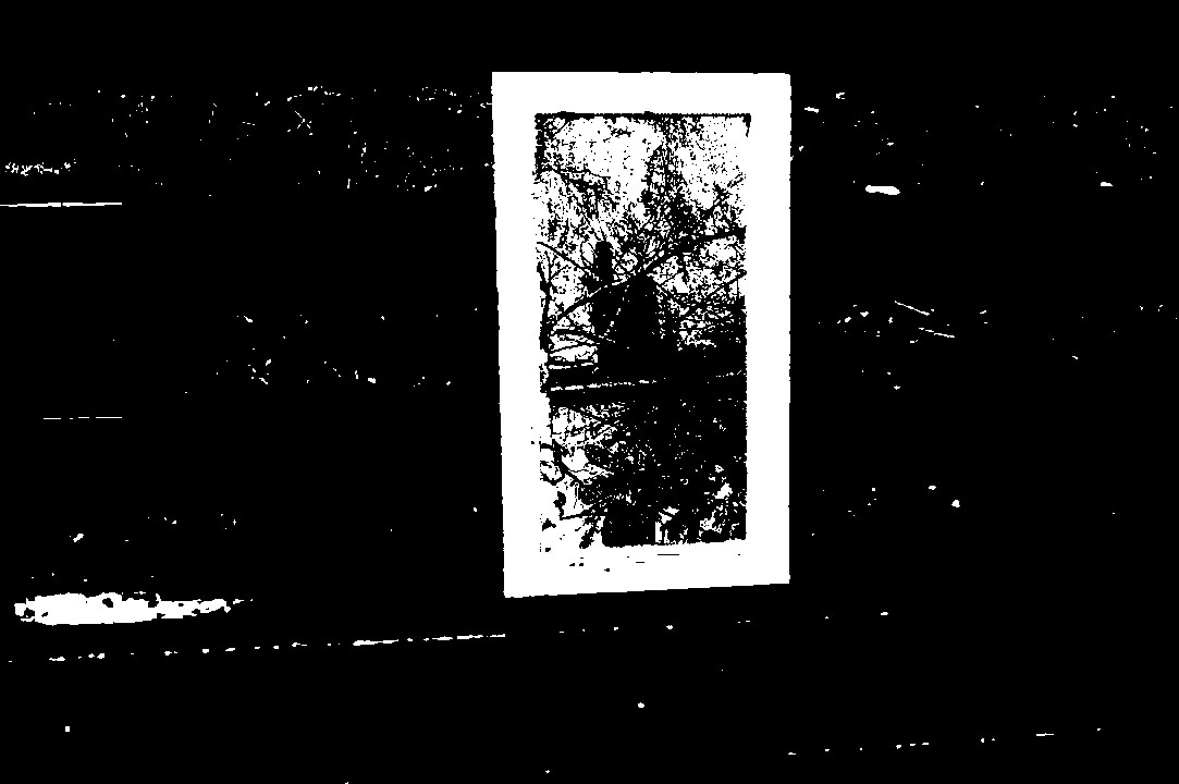
for my fourth photobook i decided to use TextEdit to glitch my images so they would become more abstract. After a bit of trial and error, i realised that i had to use images that had already been changed using threshold otherwise it would create a coloured glich that would look exactly the same as when it hasnt been glitched.
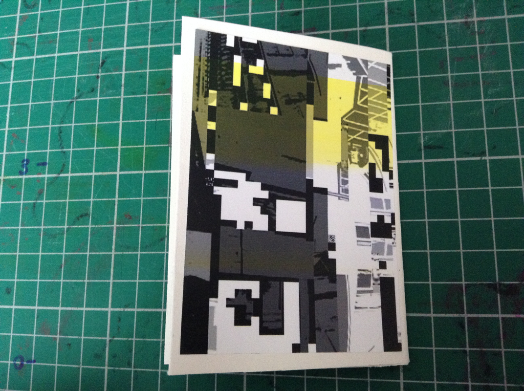
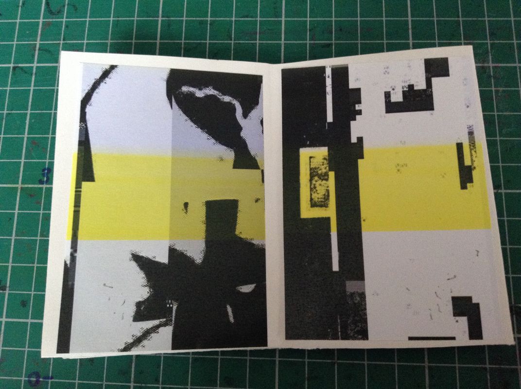
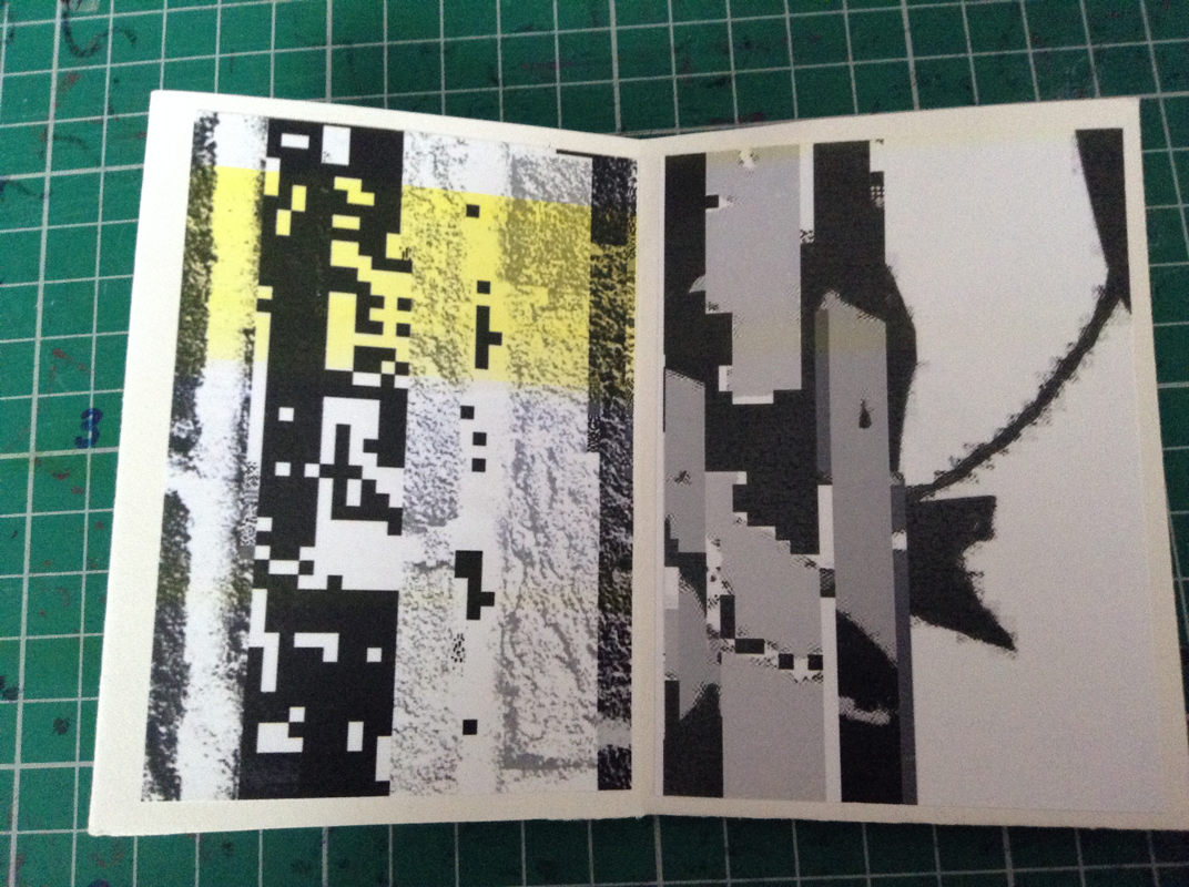
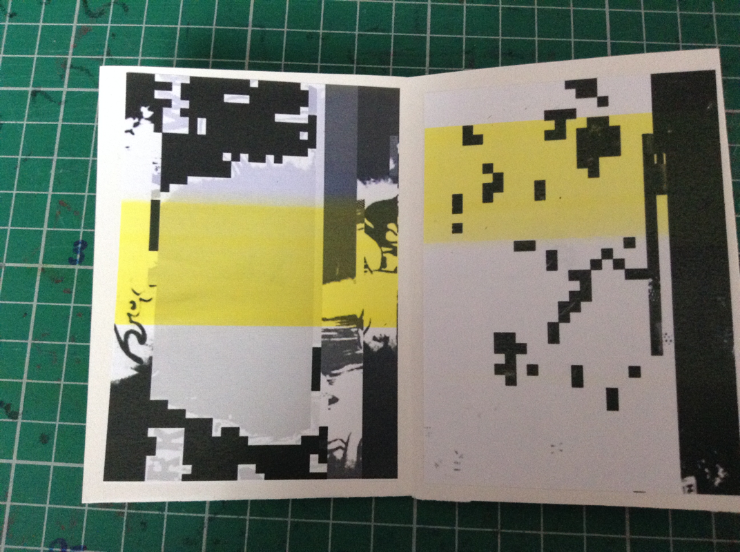
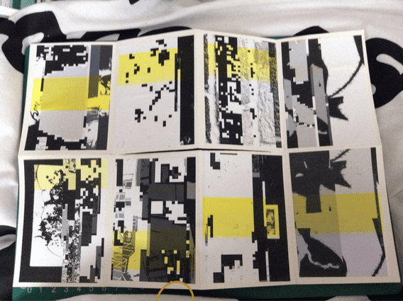
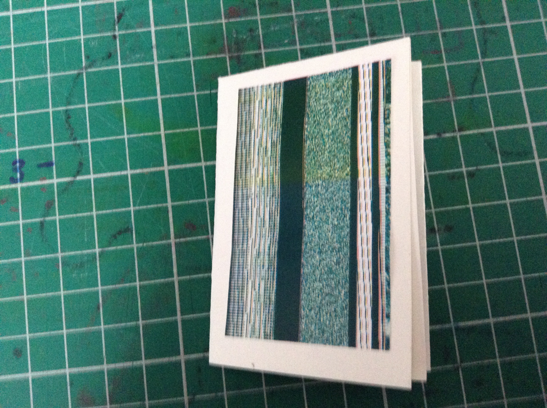
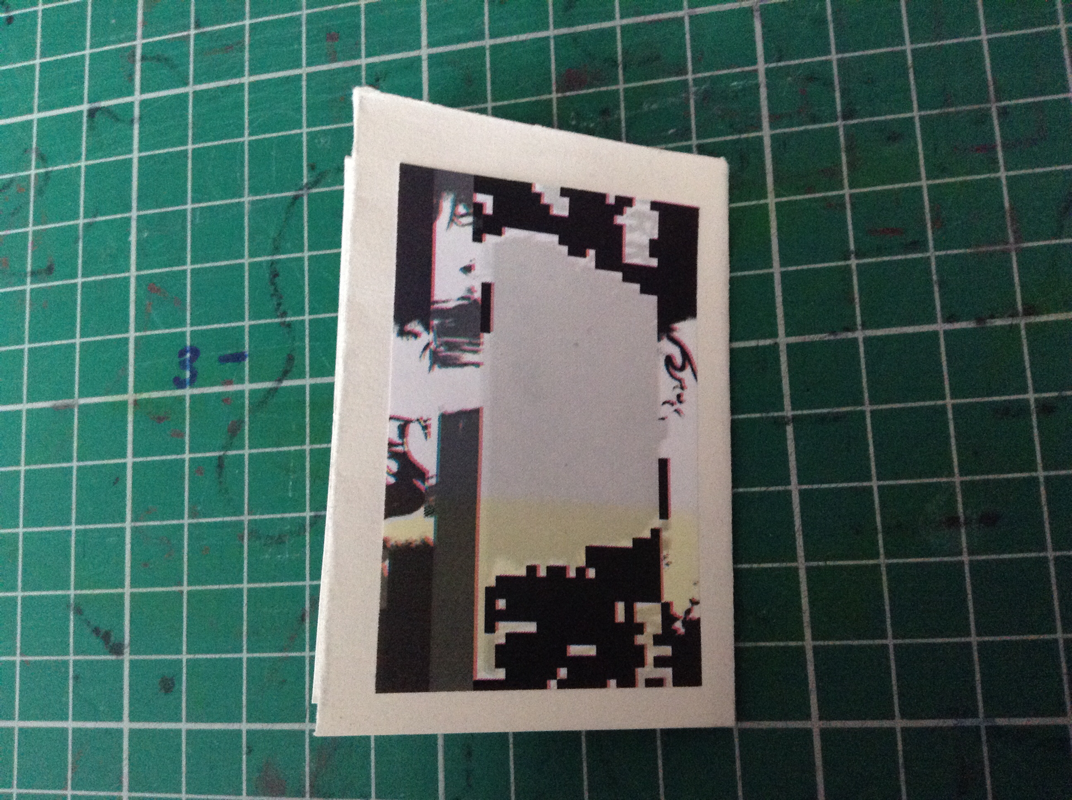
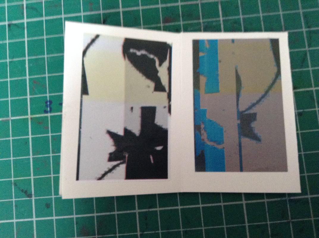
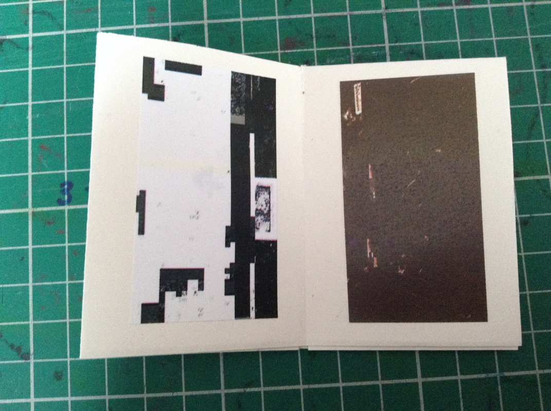
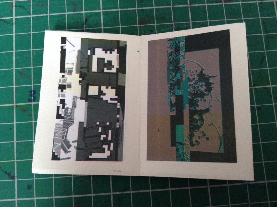
this is the first photobook i have made using my glitched images. I think that the glitched images work well as the look very abstract and somewhat unrecognisable. The yellow stripe came out on the paper when I printed the images, however I think this can be considered a 'happy accidedent' as it doesn't necessarily ruin the image.
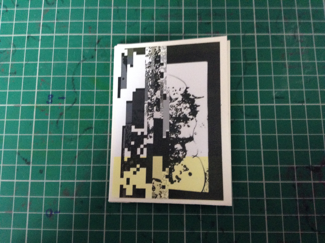
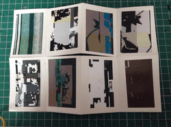
this is the second photobook i made using my glitched images. I decided to make a very small one as i hadn't experimented with size yet. I actually really like how small this one was because it allows the images to have less information as they are a little harder to see and it is extrememly different to the other sized books.