The Photobook
|
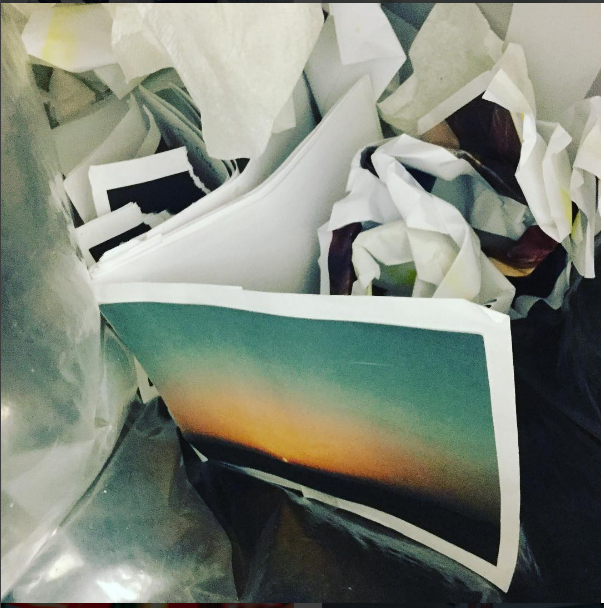
Photobooks were once one of the limited ways photographers and artists could share their work. Photography hadn't been shown in galleries and museums before as it wasn't considered an art form. As the internet has developed photobooks have become more popular as it is easier to self-publish. The creator can choose the layout of the book and decide weather there is text or not, they can decide what images work well together. |
|
THEORY OF MONTAGE
|
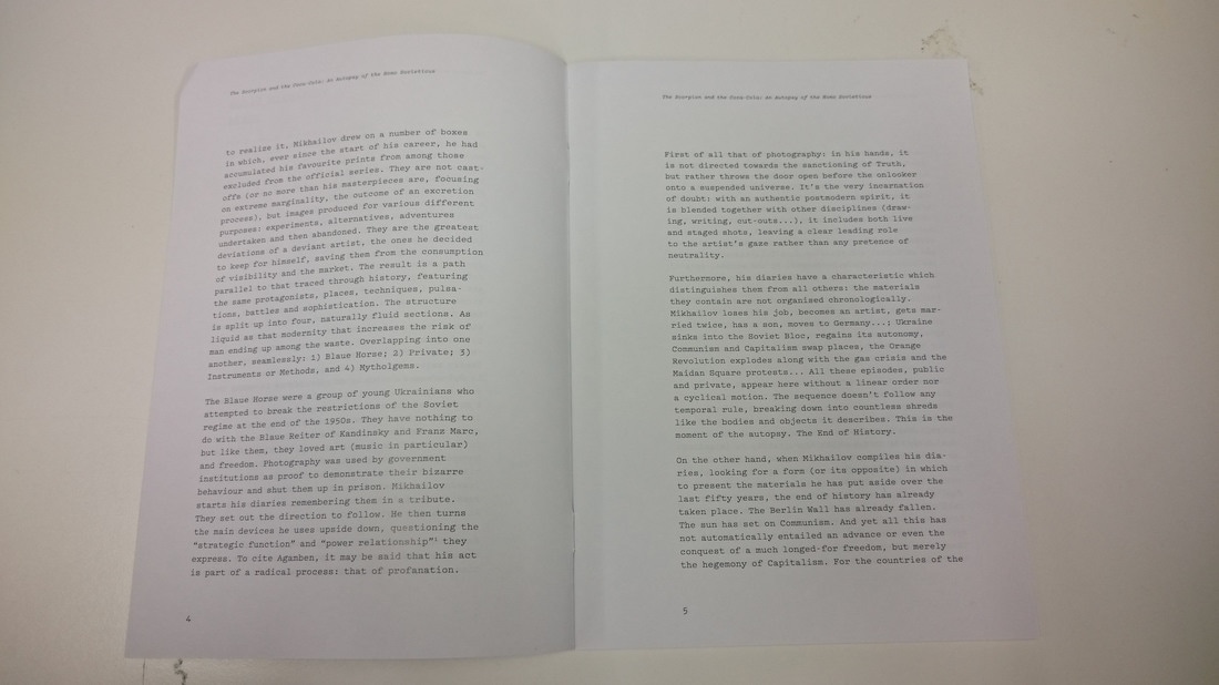
The theory of montage was an advanced theory that first came about in Soviet Russia around the birth of the film. The order of shots were experimented with first by Lev Kuleshov, he wanted to see how the meaning of film is changed. Sergi Eisenstein finalised the montage theory, believing two single shots that could form to create new ideas and concepts.
Five types of montage: METRIC- Editing follows a number of frames, based purely on physical nature of time, cutting the next shot no matter what is happening. This gets an emotional reaction from the audience. RHYTHMIC- Cutting for the sake of continuity, creating visual continuity but it may be used to keep up the pace of the film. TONAL- Uses emotional meaning of the shots. This elicits a reaction that is more complex than rhythmic or metric. OVERTONAL/ASSOCIATIONAL- A mix of all of the above is used to synthesise its effect on the audience. INTELLECTUAL- Uses a combination of shots from outside the film in order to create a meaning. |
TWO FRAME FILMS
LUKE FOWLER
'Two-Frame Films 2006-2012' Published:2014
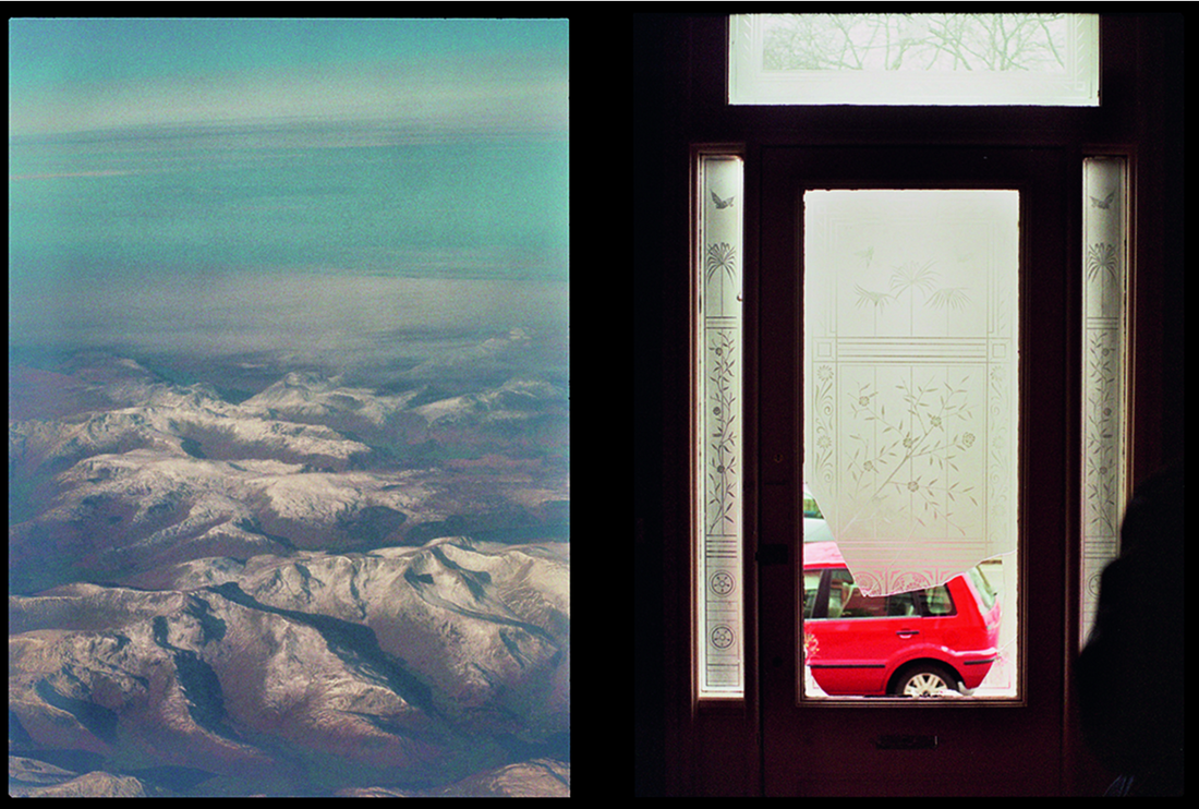
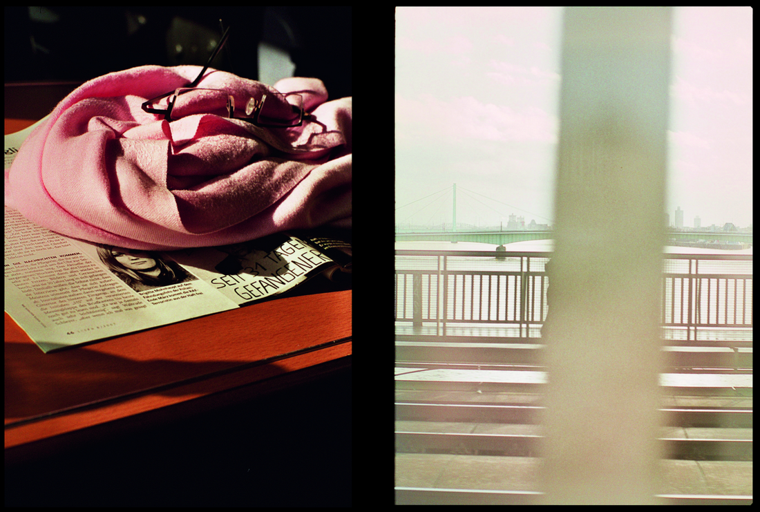
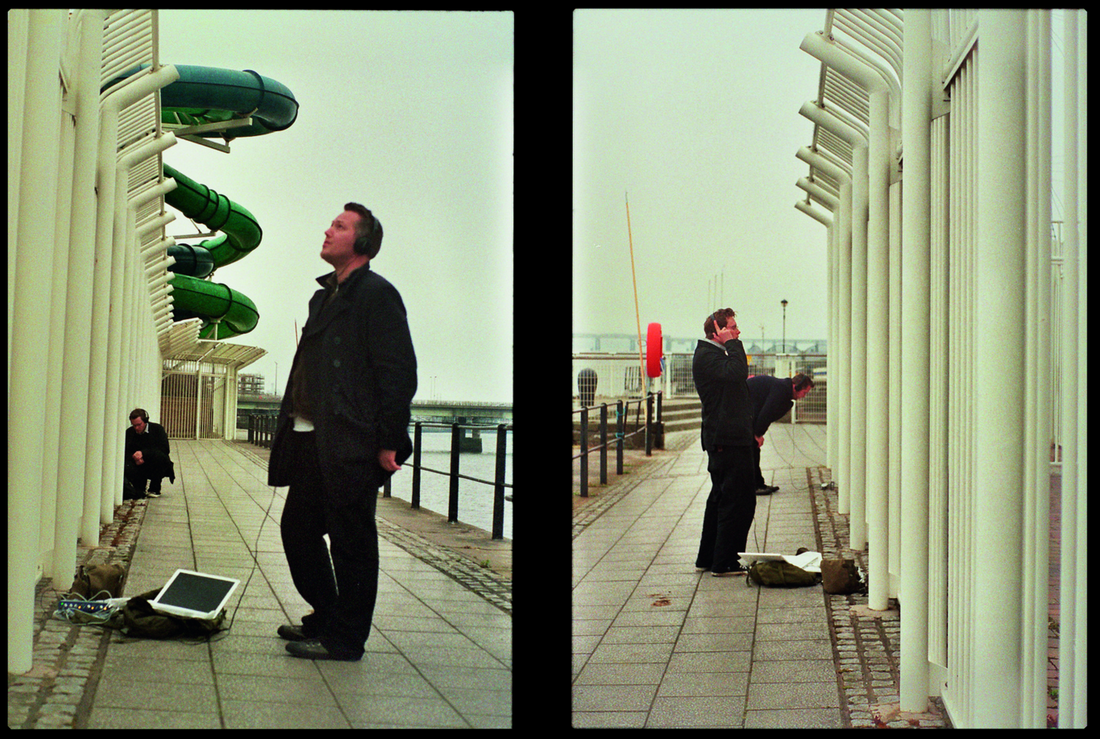
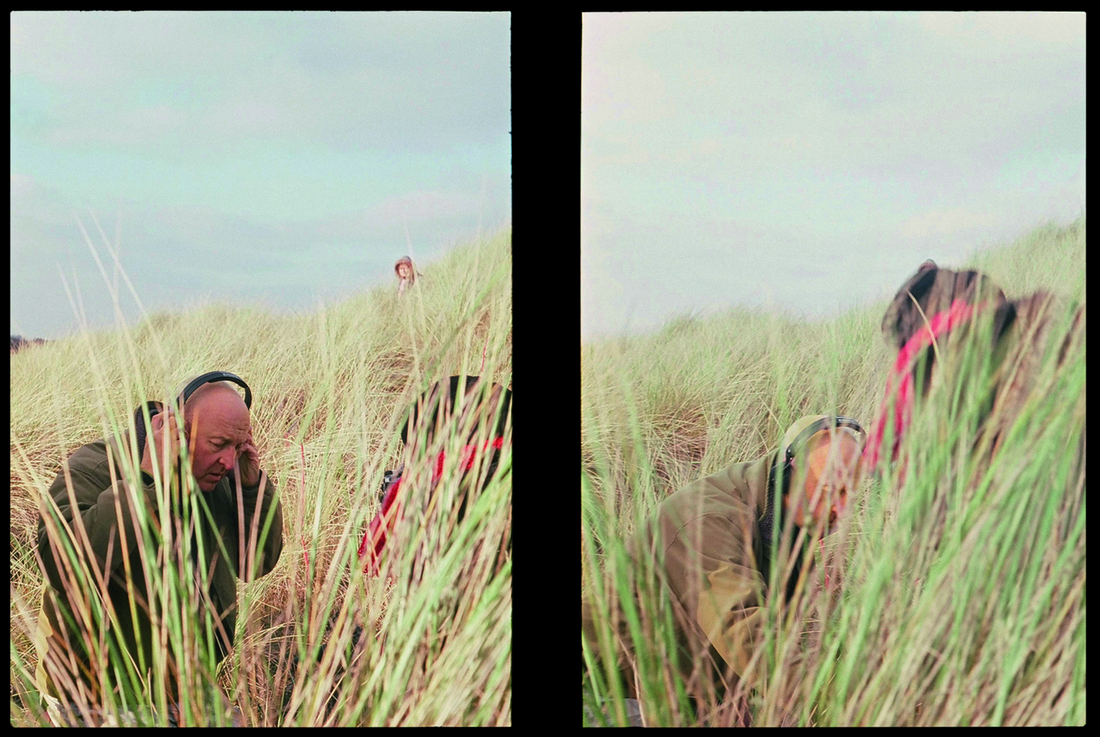
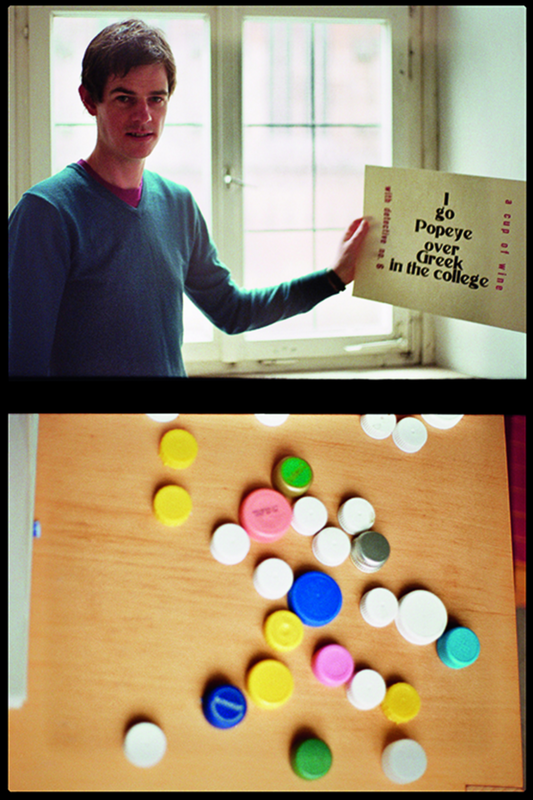
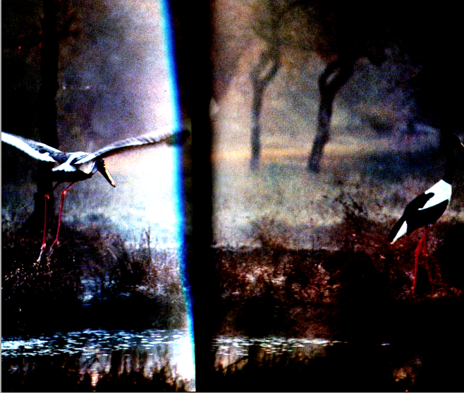
Luke Fowler has created these images by using a half-frame camera where two images are exposed in one 35mm frame. He was intrigues by the role that chance played in his diptychs that he had created before and this inspired him to start a new project which then resulted in his book two frame films.
The paired images were taken seconds or minutes apart in some cases but some were taken at completely different times and places. For example one diptych shows a man holding up a sign and the image underneath is of some buttons or bottle caps on a table. These images look to be taken at completely different times as they both are of unrelated things and the lighting looks different. Another example could be the diptych they shows some people standing behiend some tall grass and the image next to it is of the same people but they are bending down behiend the grass. These images were obviously taken a few seconds or minutes apart.

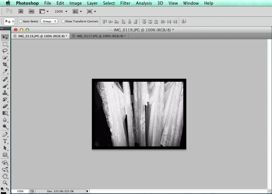
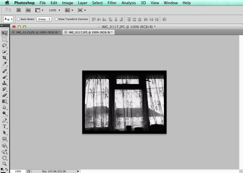
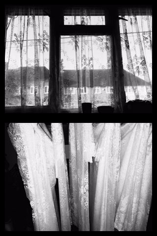
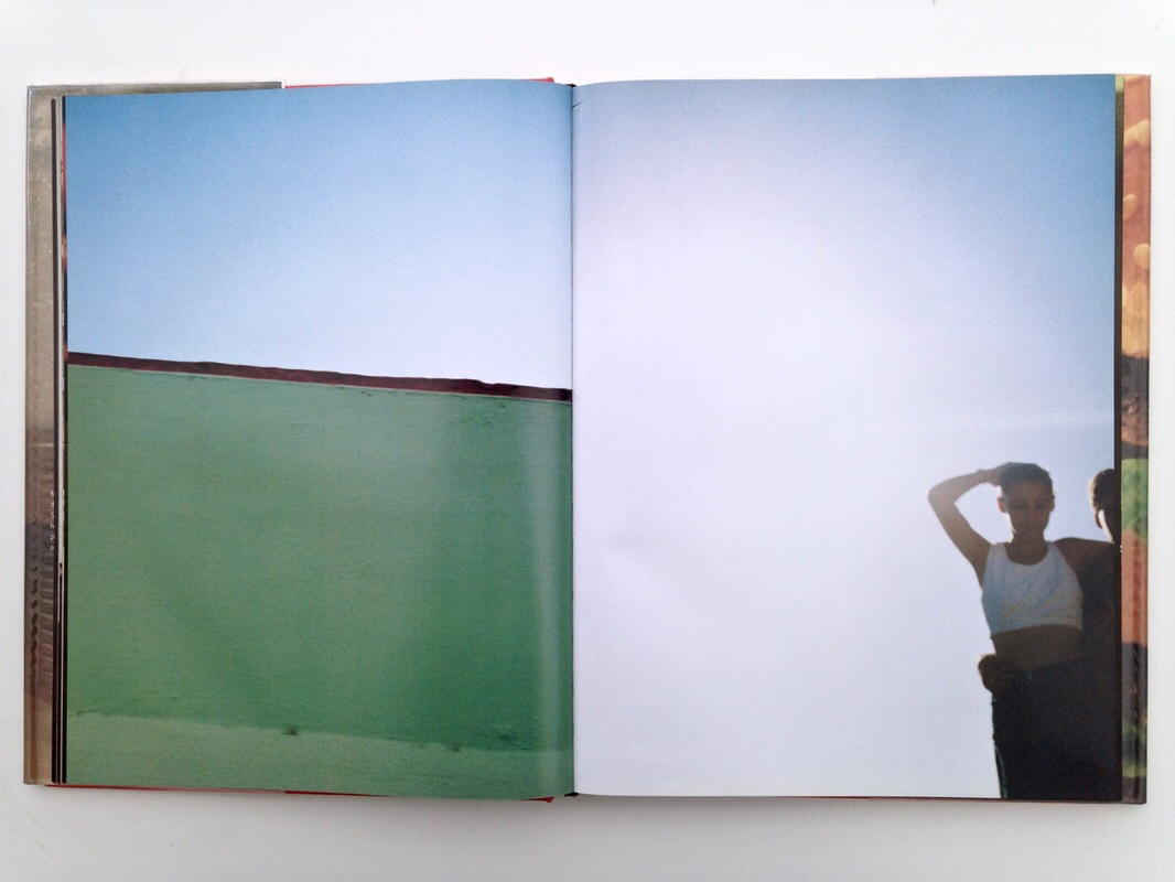
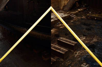
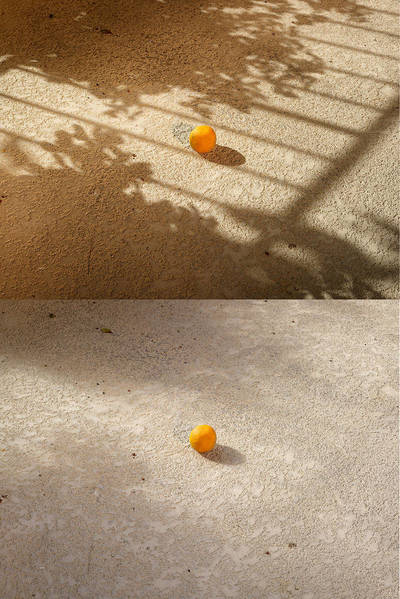
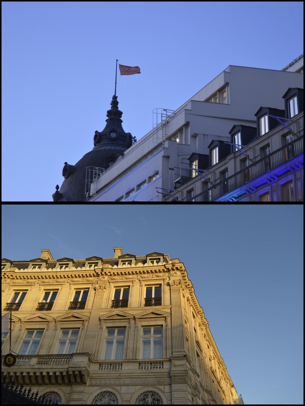
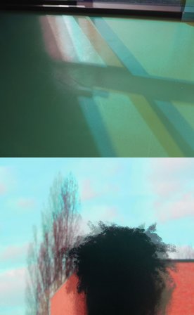
Similarities: Both images are views form windows, frosted glass and a frosty look on top of the mountains.
Differences: The image on the left is a wide open space and the one on the right is a claustrophobic space as it has been taken inside. The left image is natural and the right is very urban which creates a contrast. The left image has a horizon line whereas the right one doesn't. The image on the right has very straight lines and mostly geometric shapes whereas the left image has very natural shapes and lines.
Differences: The image on the left is a wide open space and the one on the right is a claustrophobic space as it has been taken inside. The left image is natural and the right is very urban which creates a contrast. The left image has a horizon line whereas the right one doesn't. The image on the right has very straight lines and mostly geometric shapes whereas the left image has very natural shapes and lines.
My Diptychs
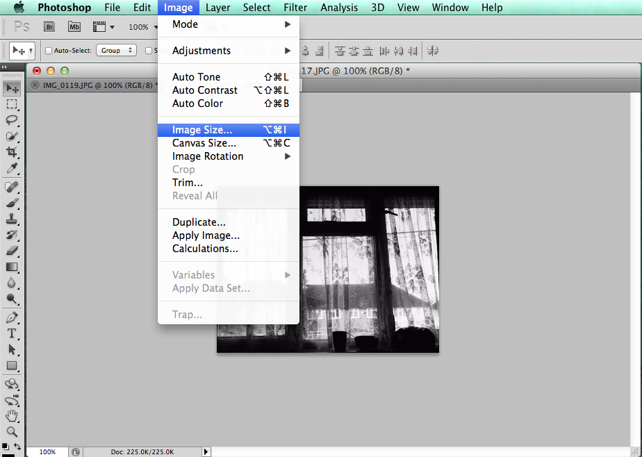
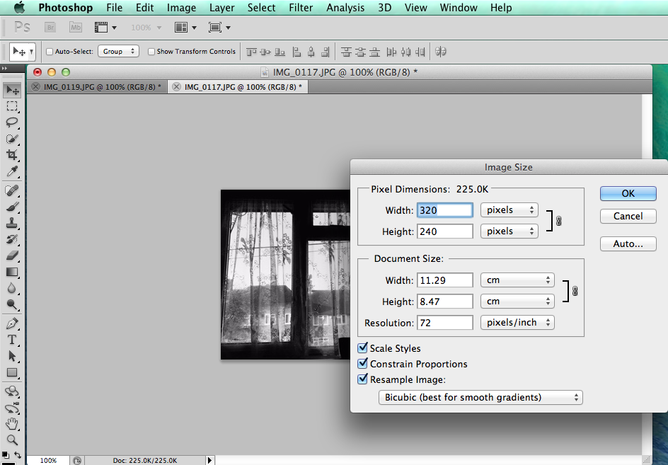
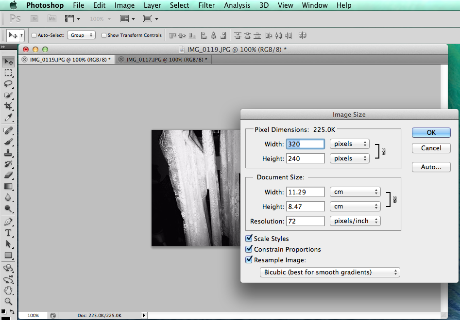
Once both images have been opened in Photoshop the size of the images need to be checked to make sure they are the same size. If the images aren't the same size they wont be able to go next or on top of each other properly. To check go to Image>Image Size...
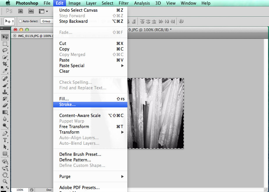
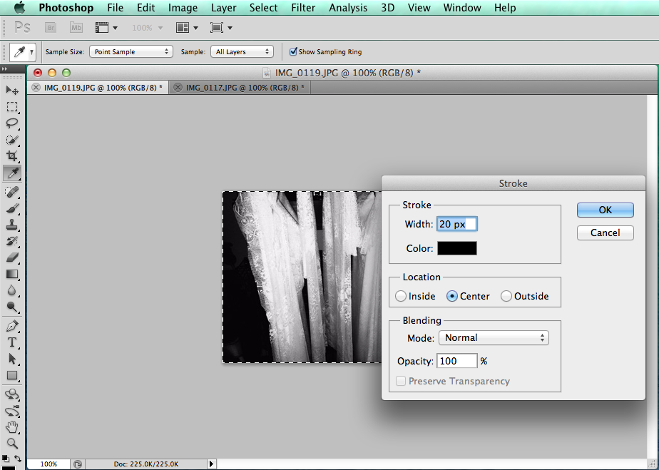
I wanted my images to have a black border around them so they looked as if they were made with a half-frame camera. To create the border I used ⌘A to select all of the image (this can also be done by going Select>All) then I went to Edit>Stroke and decided to have it as 20 pixels so it would be a thick line.
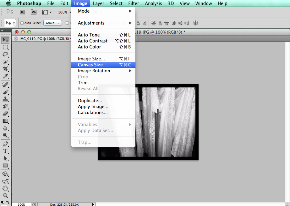
Then to make the actual diptych I went to Image>Canvas Size...


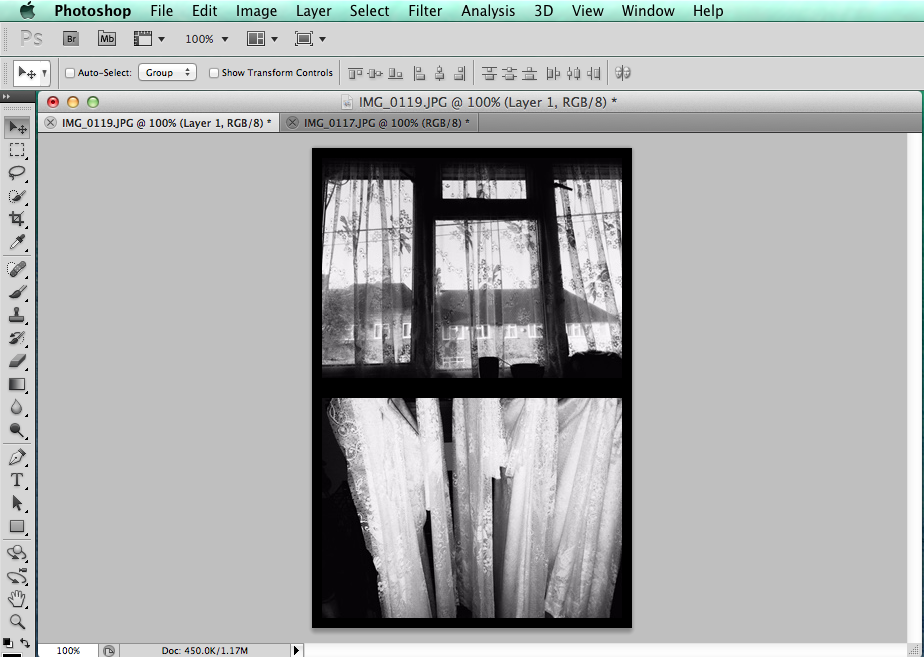
I changed the settings from cm to percent so it would be easier to change the height. I changed the height to 200% so I could put the images on top of each other. I copied and pasted the other image so I could have them both on one background. To finish I went to Layer>Flatten Image to have both images on one layer.
NICK WAPLINGTON
These diptychs are from Waplington's 1998 book 'The Indecisive Memento'.
|
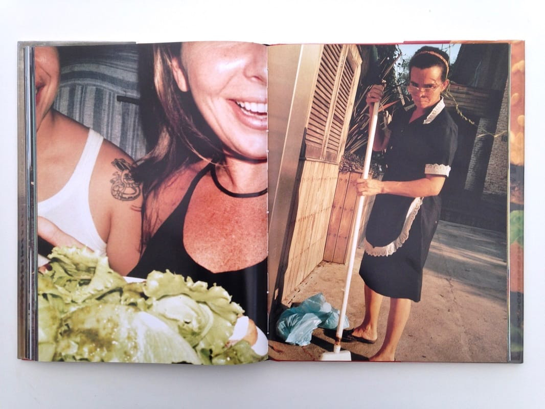
Left: Both look very happy, in a car or on a sofa, relaxing and enjoying doing nothing, very close up and cropped (was this on purpose or by accident?).
Right: Doesn't look happy, cleaning up/ doing work, only one person, image taken at an angle, image is strange as he is wearing a maids outfit. Similar tones - the lady's chest and the colour of the bricks is similar. |
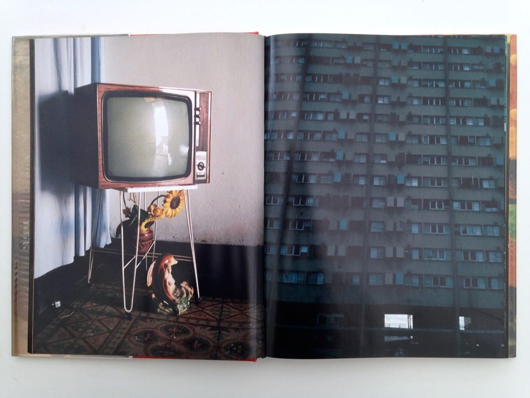
Left: A lot of empty space as the subject is in the middle, looks a little bit vintage, obviously taken inside.
Right: Lots of lines, lots of windows, obviously taken outside. Similar: Repetition of the rectangle shape, repetition of the reflection. Different: Colours, amount of repeated shapes. |
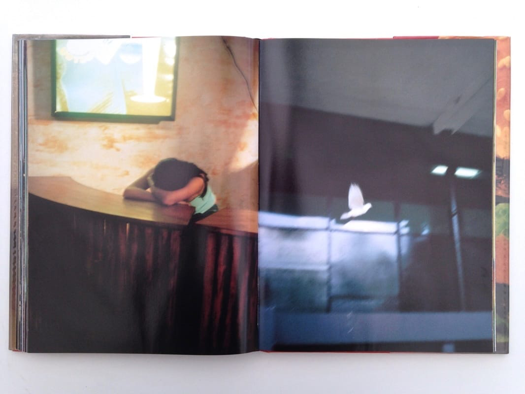
Left: She looks like she is sad or that she has been crying, taken inside, has very warm tones.
Right: The bird is the main subject, taken outside, has very cool tones. Mirror images? There looks like there is a line going through the image where the counter top is and the start of the window. Both subjects are almost in the middle of the image. |
Left: Very plain, clear split between the images, contrasting colours.
Right: Very plain again, looks to be overexposed. Similar: The colour of the sky. Very faint line above the boys head. |
Mike Terry

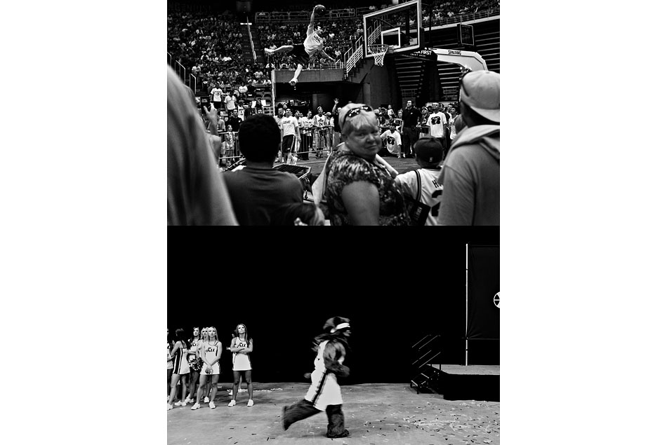
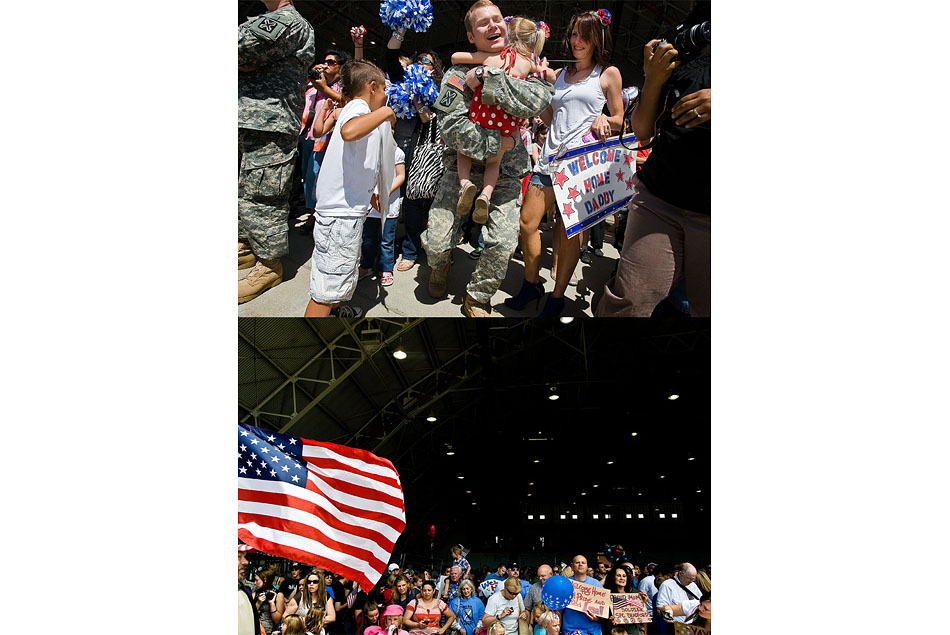
Mike Terry is a photographer from Berlin who has created a series of varying diptychs using different lightings, colours and perspectives. The images look to show realistic events from completely different perspectives, making the images look like they are unrelated. This technique makes the viewers wonder where the images are from and why they are related until they notice that they are the of the same subject or event.
John Maclean
Two pictures made at the same scene and printed together (next to eachother). The images might be separated by seconds, minutes or a few hours. His starting point or inspiration is Robert Rauschenberg's twin paintings 'Factum I' and 'Factum II'.
"Doubling is purely photographic" - He will reframe or move the camera a few feet to create entirely different image of the exact same thing.
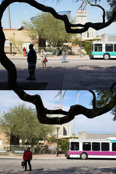
British photographer John Maclean published a book called two and two. His images/diptychs seem to be before and after images as some aspects of the images are the same (this could be subject matter or camera angle etc). I think that the images are interesting as the images are too similar to be taken at completely different times. The photographer might have taken one image then either waited for someone to come along or something to change in the scene, or he may have changed the camera angle so that the image looks almost identical but really different.
"Doubling is purely photographic" - He will reframe or move the camera a few feet to create entirely different image of the exact same thing.
British photographer John Maclean published a book called two and two. His images/diptychs seem to be before and after images as some aspects of the images are the same (this could be subject matter or camera angle etc). I think that the images are interesting as the images are too similar to be taken at completely different times. The photographer might have taken one image then either waited for someone to come along or something to change in the scene, or he may have changed the camera angle so that the image looks almost identical but really different.
"Two and Two asserts that there is more than one way to take every photograph, and that two different photographs of the same subject represent two distinct choices"
My Diptychs
|
|
|
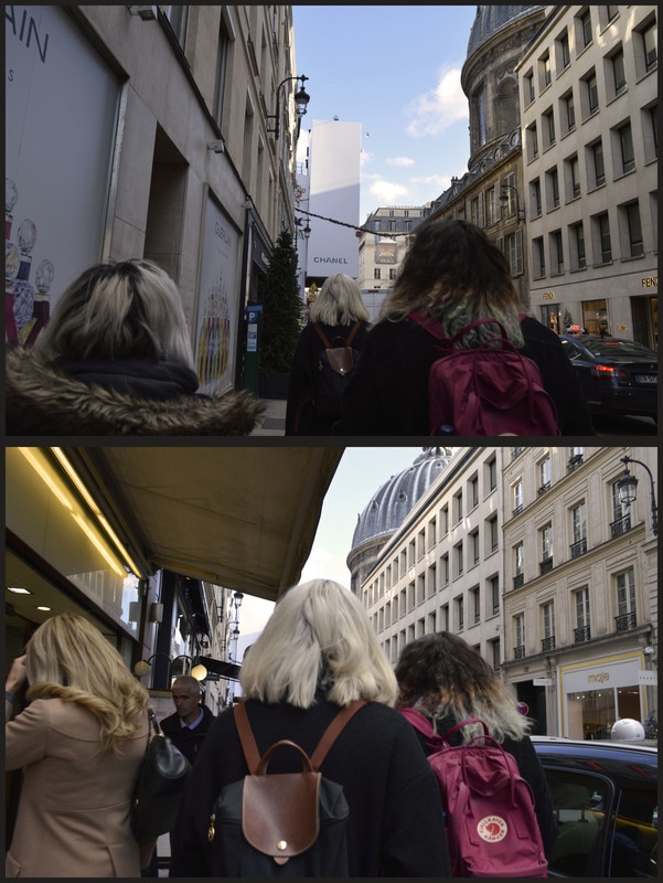
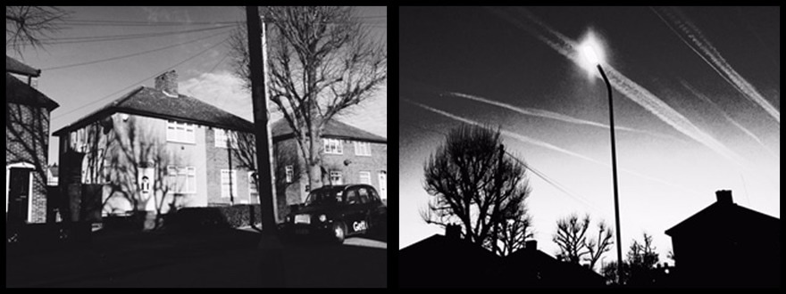
I think that these two images go well together as they show a journey. However, I have arranged the images as if they are going backwards as I thought it would make my work look more interesting.
The top image seems to be calmer, has cooler tones and less chaotic and the bottom image is busier, has warmer tines and more chaotic. There are many repeated shapes in this diptych, it is mainly the windows of the buildings. I think that the windows make the image look busier as there are so many of them. |
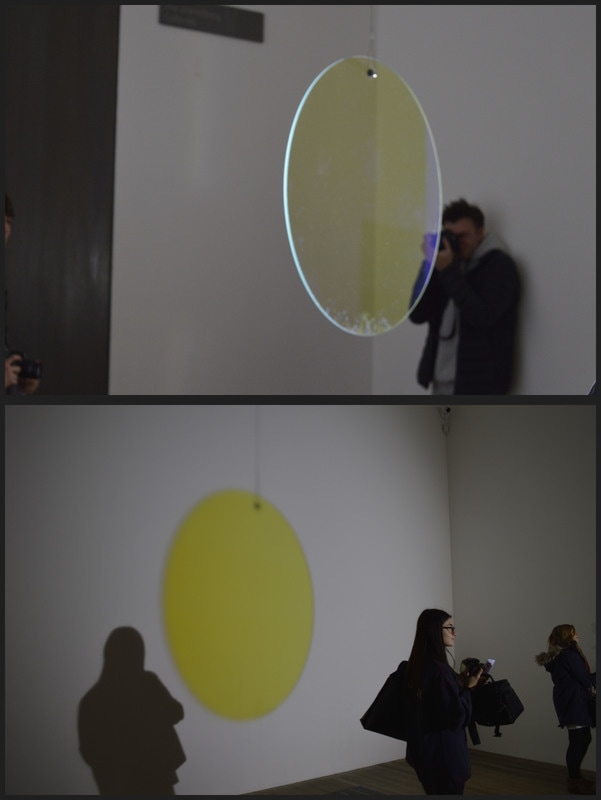
I chose these two images as they are of the same thing but at different viewpoints. The first image is of the shape that was hanging up and the second is of the projection of the shape. I think that these images work well as they were taken a few seconds or minutes apart. I think that these images would have worked better if there was only one person in the bottom image as it would have allowed another connection to be made.
|
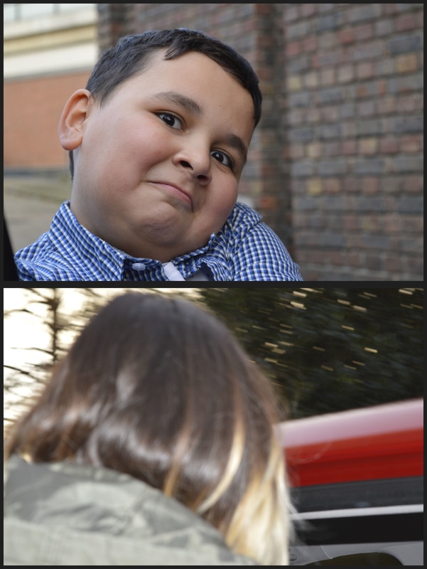
I think that these images work well together because the top image is a front facing portrait that is in focus and the bottom image is of the back of a head that is blurred. I think that these would have worked better if I had edited them more, I could have make them darker or lighter or added a filter to make them more contrasting.
|
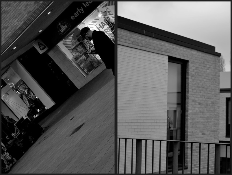
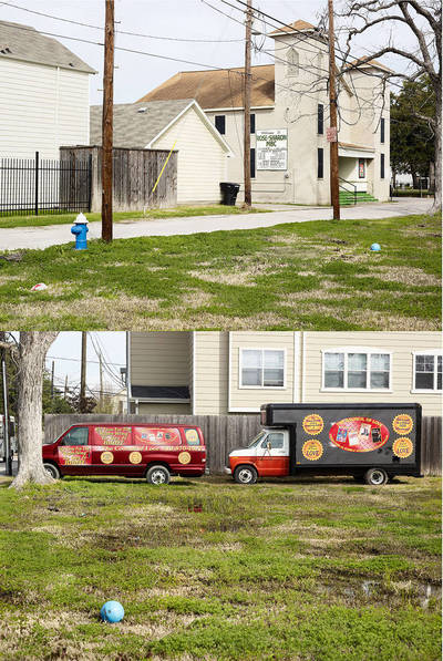
I think that these images work well as they were taken at completely different times and at different places. I think these images work well because they are so completely different.
Both images have similar brickwork, the tones are the same even though they were taken at different times.
I think that having an image that includes people next to one that is just a building is successful because it shows a contrast, it would also make the viewer wonder why they have been put together.
THE PHOTOBOOK
"Many photographers use the photobooks as the most significant vehicle for displaying their work and communication of their vision to the viewer."
Analysing Photobooks
|
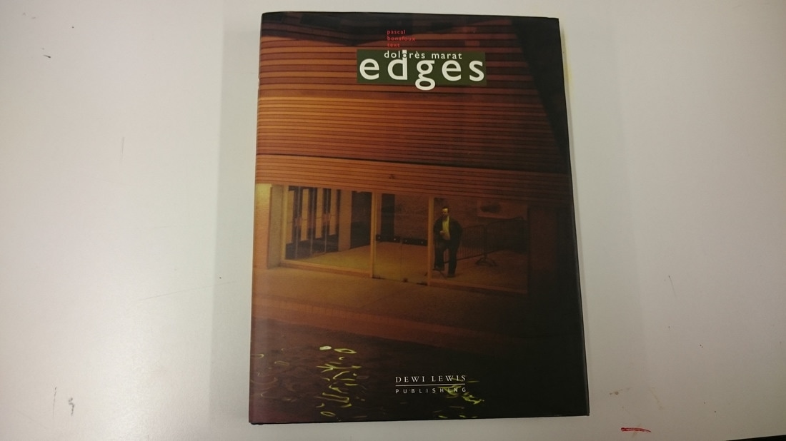
Dolore's Marat - Edges
The book is a rectangular shape with a hardback cover. The cover image is grainy and spreads across both of the covers. There is a bright green box that surrounds the title making it stand out a lot more than the thick black type would've alone. The cover image is grainy and blurry - does this suggest what's in the book? The introduction is 5 pages long and each sentence begins with "there is.." this seems to be describing what is inside the book and on each page/spread. All of the images are different sizes and there is no pattern in the layout. The images are in colour and nearly all of them are blurred. Images containing similar colours are put together. -the images are different sizes -no pattern in the layout -colour images -hardback cover -very few images are blurred, most/all are blurred -images that have similar colours are together -the subjects are completely different or extremely similar -different sized images are placed together -binding, different signatures sewn together -not many images shown alone -contrasting images e.g pg 50 and 51, 58 and 59 -cover image is included (page 96) -first and last images are very different -cover image spreads across the entire cover -thick high quality cartridge paper |
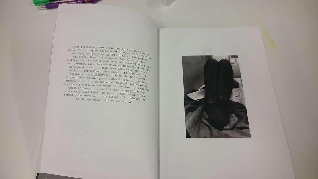
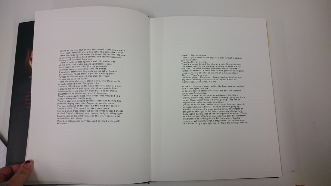
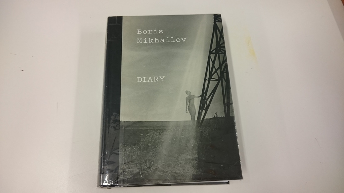
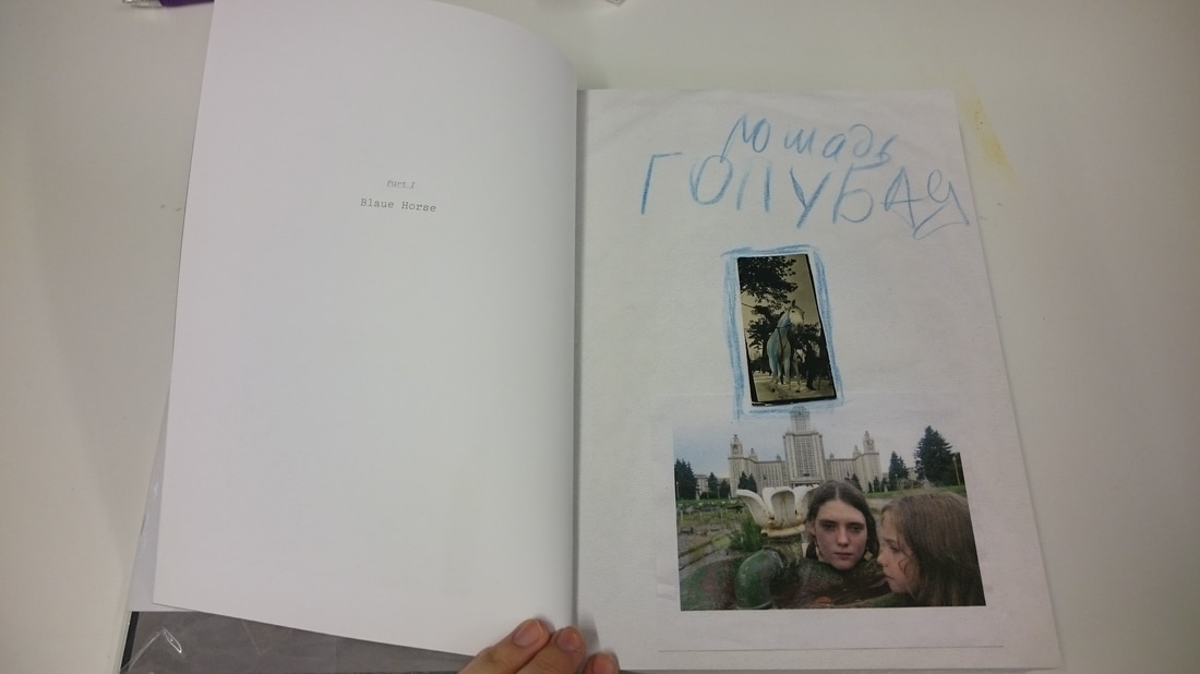
Boris Mikhailov - Diary
-image on the cover, black and white -extra insert inside seems to be explaining the idea of the book -book is separated into different parts -block writing next to the images -layout looks like they have been collaged -handwritten notes -tape can be seen where they have been stuck down -images look intimate -looks like the images have been kept away for a long time -finally being shown -unusual and appealing layout -looks like collages are beginning to be made -images have been drawn over -uneven image size and placement -some pages fold out to create more images -some images show similar colours (e.g pages 22 and 23) -thick and shiny image -high quality images -some images completely unrelated -soft cover -coloured images -whole pages of writing -same subjects -part three most or all images have been drawn over -old photos? -different backgrounds (e.g some have plain white paper and some have grid paper) |
|
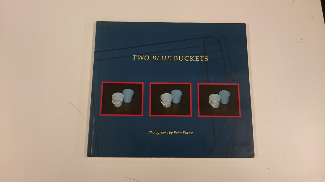
Peter Fraser - Two Blue Buckets
Both covers have a variation of a blue bucket, which is shown a lot throughout Fraser's work. There is a lot of text at the beginning and some in the middle. The binding is stitched in many signatures. There are title pages separating the images. The images are different sizes, and each image is in a different place on each page. The layout was properly designed and includes lots of blank pages. The images are separated into themes. I find the placement of the images is satisfying yet annoying as not all images are the same size. There is no theme or pattern for the layout. Some pages fold out to show more images. Some of the images show similar colours eg page 22 and 23. The paper has a thick and shiny finish. Some unrelated images in colour. |
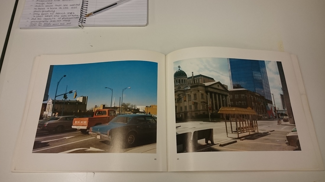
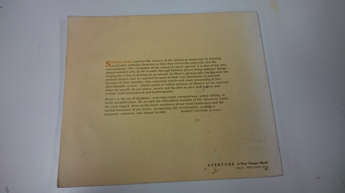
Stephen Shore - Uncommon Places
The book is a soft cover that has a large image on the cover. The back cover has some text written by Robert Venturi, Architect. The inside cover is signed and has some text about what the images inside are about. The first image is bright, colourful and bold. Each spread relates some how, for example, pages 12 and 13 are related by the sky, page 13 is the cover image, pages 14 ans 15 have very contrasting imagers. Some images are shown alone but there is mostly two images put together. The images are printed in high quality on high quality paper. The paper has a shiny or glossy finish.Images are all the same size and some look urban. |
|
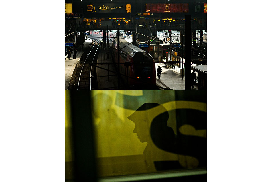
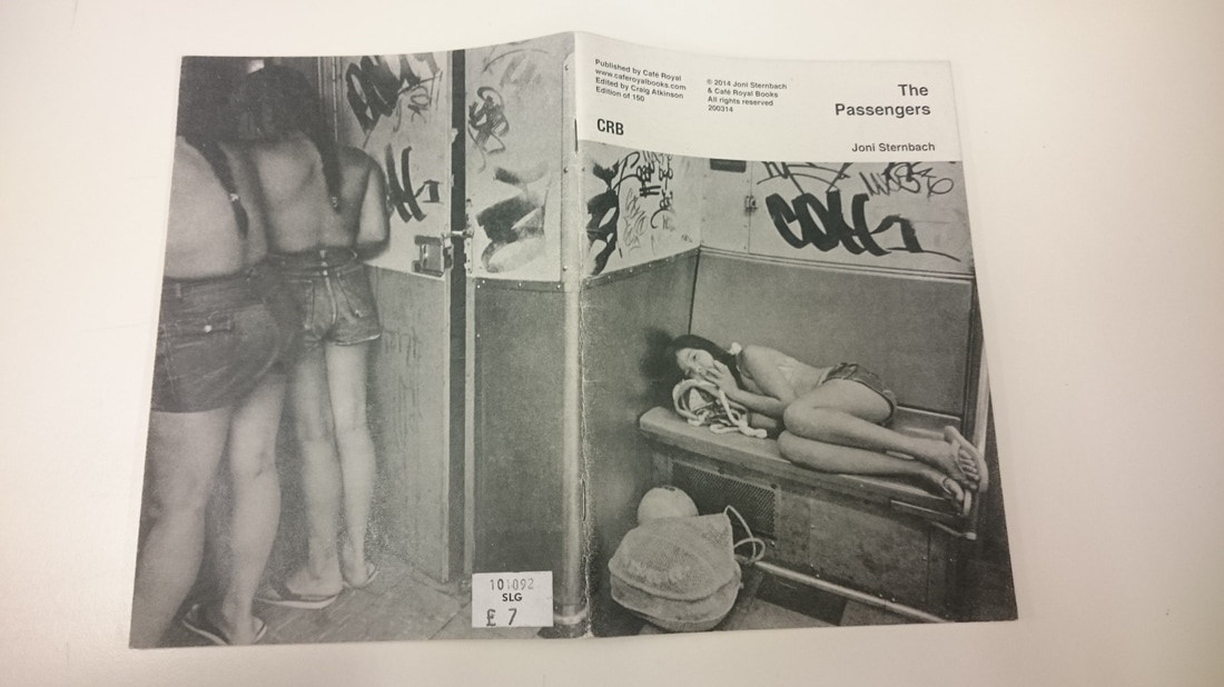
Joni Sternbach - The Passengers
The book has a soft paper cover, it doesn't feel too think and it feels like it has a layer of crayon wax over the top of it. The cover image spreads across the front and back cover. The title is placed on the top right corner and the left side has the publishers details.The first and last images are just single images, not double pages. All other images in the book are double. Not all images are the same size and fill the entire page, this gives the viewrs eyes a break as they get a chance to look at some white space, not just images. There is no text at all, not even any explaining the ideas of the book. Every image is taken on a train or in a train station. The paper that the images are printed on is thicker than the front and back covers. The images are taken in black and white and look a little grainy printed on textured paper. |
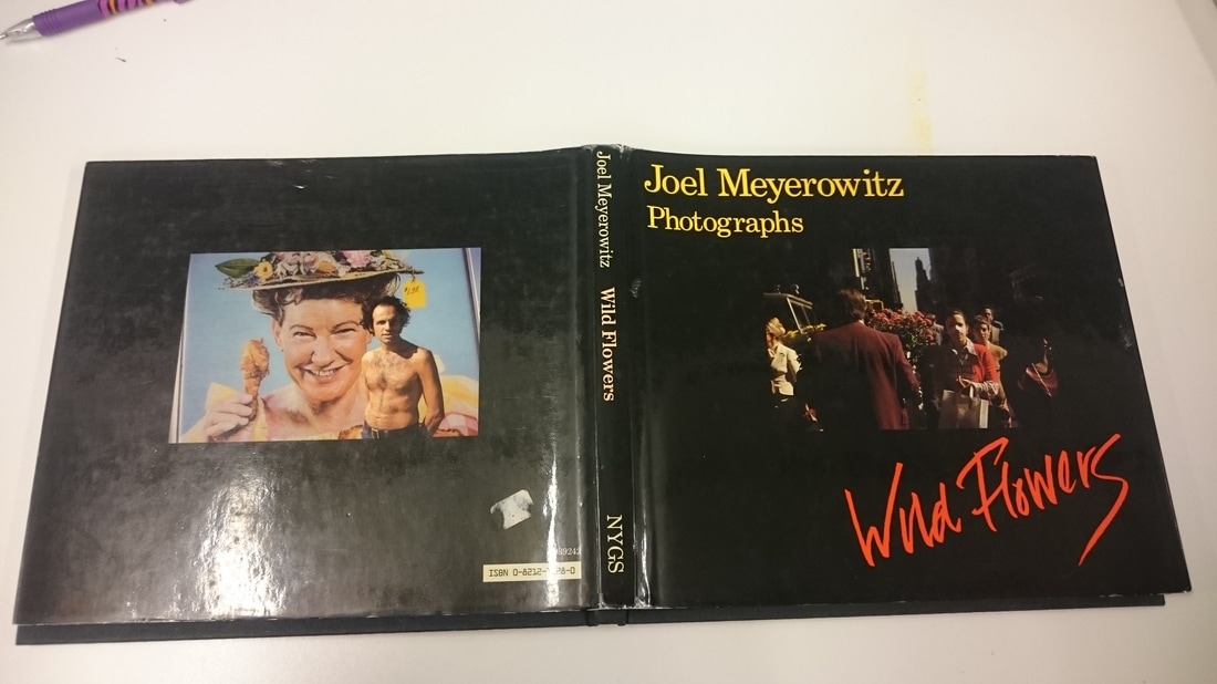
Joel Meyrowitz - Wild Flowers
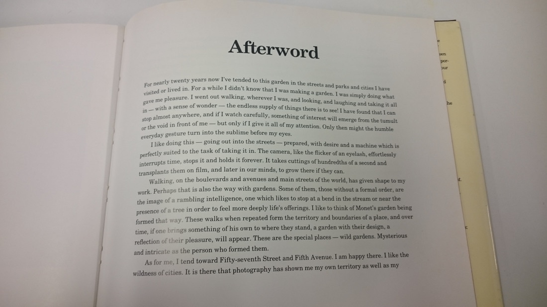
The book is hardback with a dust jacket that can be removed revealing a blank cover. There is a single image on the front cover of someone holding bunch of flowers walking down the street. This image relates to the images that are on the inside as well as the name of the book. The cover smelt like kids crayons and the inside pages like plain printer ink and a little like chemicals. I like the contrast of the image on the back cover as it stands out a lot against the black background of the dust jacket. I don't like the image on the front cover as it blends in too much to the background of the cover. I initially thought that all of the images inside would include flowers but they didn't. I also thought that all images would have real flowers in them but the images that do have flowers some are fake ones. There isn't much text in the beginning of the book but there is an afterword. |
Assessment
As a part of the Photobook sub topic we were asked to take part in a mini assessment where we would "create our own mini narrative from a sequence of photographs". As this was an assessment task we were given a set of rules/instructions to follow. The instructions were:
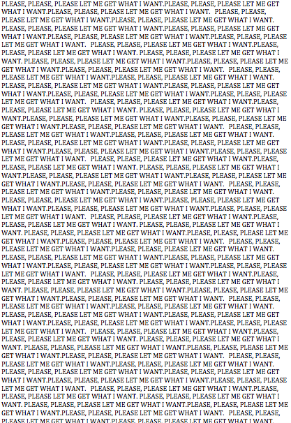
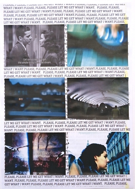
1. The title of your narrative sequence will be ‘Please, please, please let me get what I want.’
2. Your narrative should consist of between 5 and 10 photographs.
3. One of your photographs should be a film still with English subtitles (e.g. a screen grab will do).
4. One of your images should be a scan/photocopy of a found printed image (e.g. from a book or newspaper).
5. One of your images should be a photograph of a photograph.
6. One of your images should be a portrait (it could be a self-portrait).
7. One of your images should be of a blurry or indistinct subject.
8. Each image should connect in some way to those before and after. Each image should help to move the ‘story’ along.
9. Your ‘story’ can be traditional, poetic, abstract, conceptual, personal, philosophical … as long as the images are deliberately and thoughtfully sequenced.
10. You should have as much fun a possible.
At the beginning I found it hard to come up with an idea, but i searched the internet for a film still with english subs and once I had chosen one that sparked ideas in my head for what the other images should look like.
The mini assessment would be testing these skills and habits:
-Ability to work to a tight deadline
-Idea generation
-Tolerance of uncertainty
-Willingness to take risks and work outside comfort zone
-Focus/concentration
-Ability to work efficiently with a range of tools (e.g. cameras, phones, scanners, darkroom, photocopier etc.)
Narative Sequence
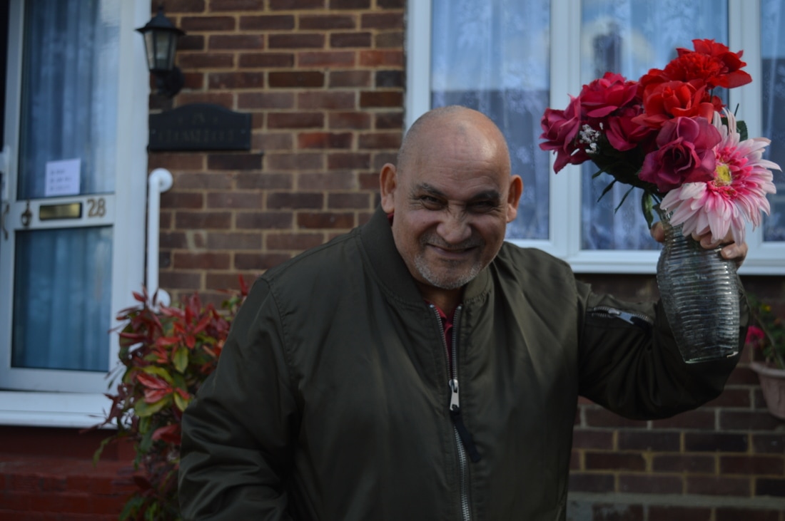
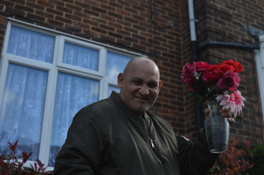
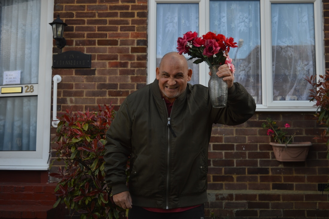
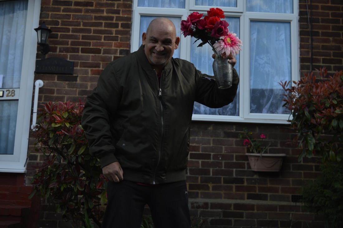
Julian Germain
'FOR EVERY MINUTE YOU ARE ANGRY YOU LOSE SIXTY SECONDS OF HAPPINESS'
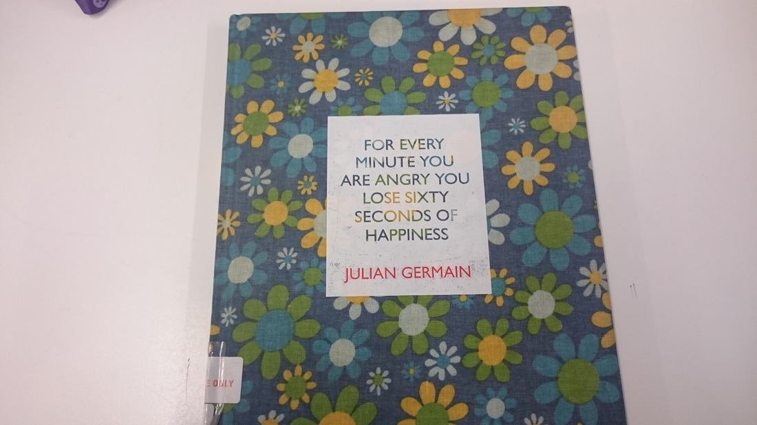
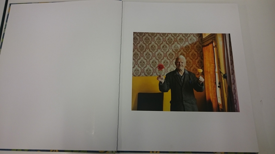
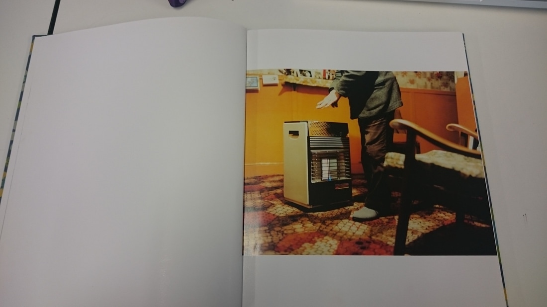
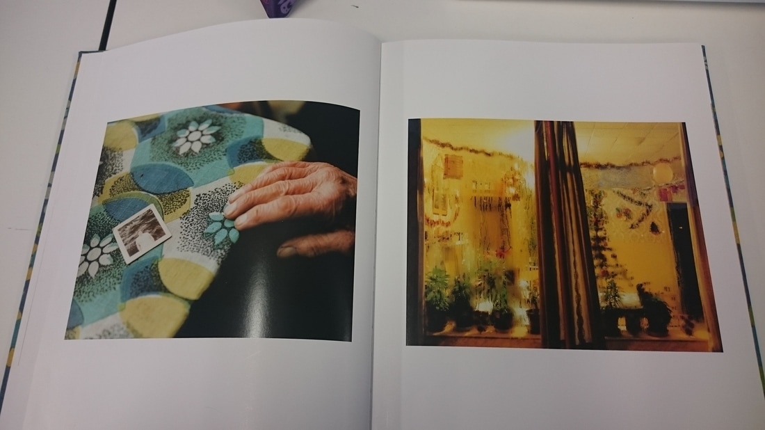
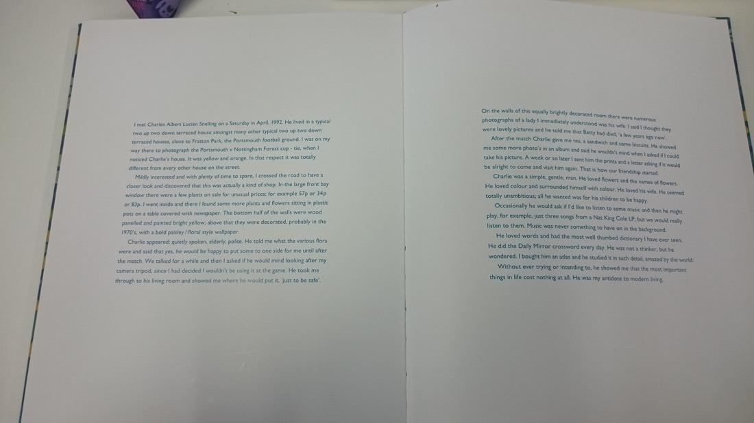
Julian Germain created this photobook from 8 years worth of images documenting the quiet, contemplative existence of Charles Snelling, an elderly man living in a small Portsmouth house. "Charles spent the last years of his life absorbed in the memories of his wife, his children, his love for flowers, music, crosswords and his own photo albums. The photographs are beautiful as they show Charles' love for flowers and colour in his twilight years."
'I met Charles Albert Lucien Snelling on a Saturday in April, 1992. He lived in a typical two up two down terraced house amongst many other two up two down terraced houses… It was yellow and orange. In that respect it was totally different from every other house on the street…. ….Charlie was a simple, gentle, man. He loved flowers and the names of flowers. He loved colour and surrounded himself with colour. He loved his wife. Without ever trying or intending to, he showed me that the most important things in life cost nothing at all. He was my antidote to modern living.’ Julian Germain, from the book ‘For every minute you are angry you lose sixty seconds of happiness’, SteidlMack, 2005
Marta Berens
'Dream Chapter'
Dream Chapter is a smaller part of her work entitled Fairy Tale. Born and raised in Warsow, Marta Berens from a young age she was preoccupied with the need to remember and freeze moments of her life. She decided to do this through the form of photography. She always too the opportunity to look through her grandmothers photo albums as she found it mesmerising and magical. Dream Chapter came about at the beginning of her mentoring program. She chose this as a theme as it was a story she could tell with her daughter.
"Tell us more about "Dream Chapter." |
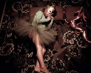
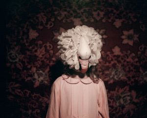
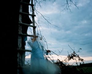
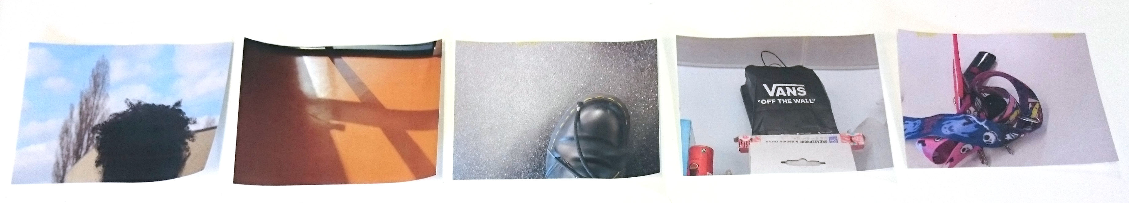
My Photo Sequence
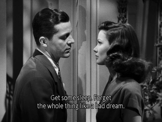
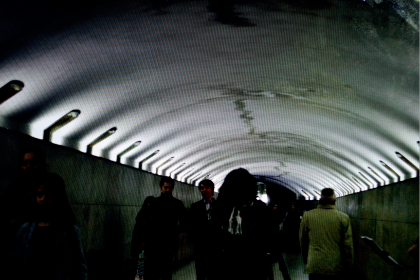
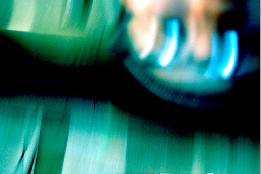
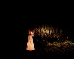
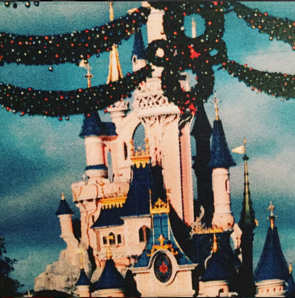
These are the images I have decided to use for my assessment task. To begin with I looked for a film still with English subtitles as I thought it would be easier to figure out an idea after I had chosen the still. I chose the still that said 'Get some sleep. Forget the whole thing like a bad dream.' because I thought that it would be interesting to have my images somewhat dream themed. I decided that instead of taking new images I would use images that I had taken before as there was a 2 hour time limit. I chose images from my album on Flickr 'Paris November 2016' https://www.flickr.com/photos/chloeghafur/albums/72157673574229173 . I have decided to use images from that album because I thought that they would have been most suitable for a dreamy/hazy theme or feeling because the majority of the images were busy and crowded. I wish that I had thought about the order of my images more and weather or not they told a clear story because I think that it is a little confusing. If I were to do this again I would think about the images i choose and how they relate.
|
How I Displayed My Sequence
|
|
I decided to use this as the background for my images because I thought that it would make the images stand out more than they would if they were on plain paper.
|
I am actually really happy with the way that this sequence/narrative turned out however I don't think that they tell a clear dreamy/hazy journey.
|
Narrative Photobook
Here is another sequence I have made but I have decided to display it in the style of a photobook rather than in a line or in columns. I think that the images work well in the photobook but they might have looked better in a sequence as I think this set of images tells a clearer story than the other one.
What Kind Of Photographer Am I?
Filling this chart out allowed me to almost fully understand what type of photographer I am. This has actually helped me understand where I could start changing the way that I photograph, I don't want to completely change the way in which I take images, I think it would be good to experiment going out of my comfort zone as I may actually find that I enjoy other ways of photographing.
Photo Sequence Task
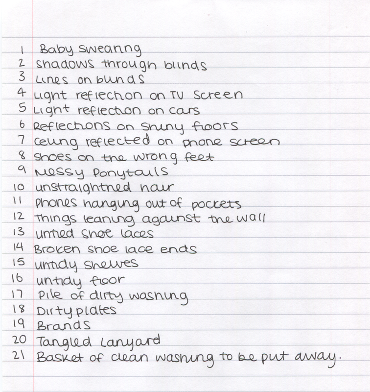
This is another photo sequence task I had been given where I had to write a list of 15+ things that I had thought about or taken particular notice of on that day. I found this task really hard as I've never thought more about simple things I have thought about before. Unaware that I was going to have to photograph these things after I had written them, I was unable to photograph most things as I has spent the morning at home so most things weren't around me.
Choosing Images To Sequence
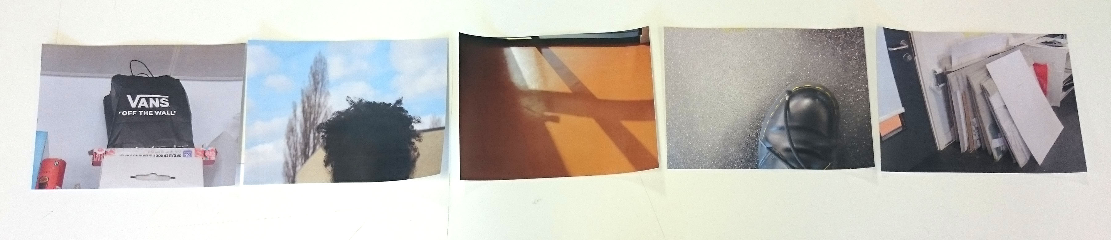
Here are 5 images I have chosen from a set of 15 images that were inspired by a list I have written about what I have noticed throughout the day. I really like the sequence of the first five images but I wish that I had taken more images that had colour in them so they would relate more. I also think that I could have had a sequence of one image that was taken outside and one inside then another outside etc. I think that this would have looked good because it would show a contrast of the lighting and it would just vary the sequence more.
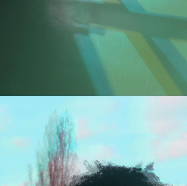
Making Diptychs
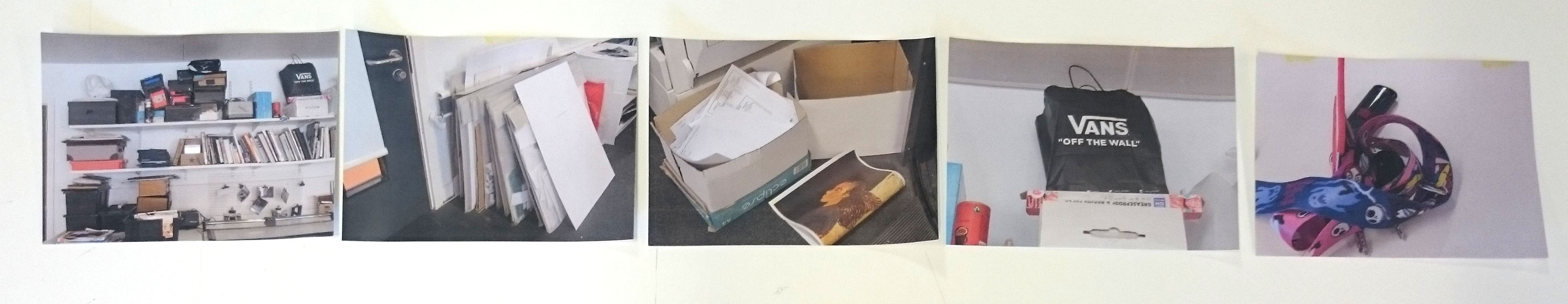
Using the images I had taken for the photo sequence task I have created some diptychs that I think work really well:
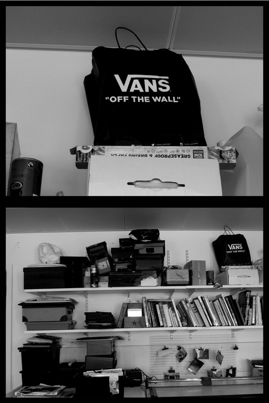
Here I have made a high contrast diptych taken from the previous set of images I had taken. I think that these images work well together because the top one is very plain and quite minimalistic and the bottom is very busy and messy.
|
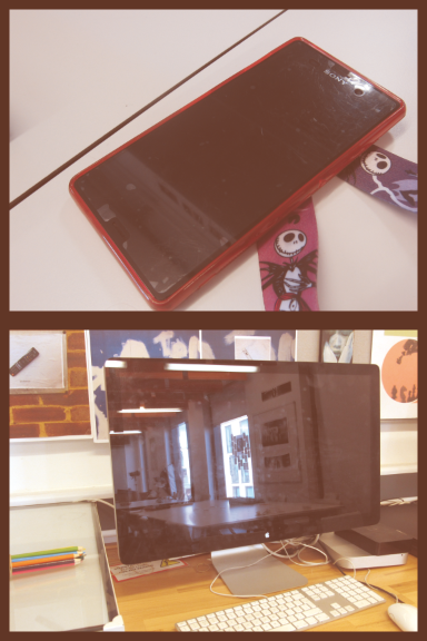
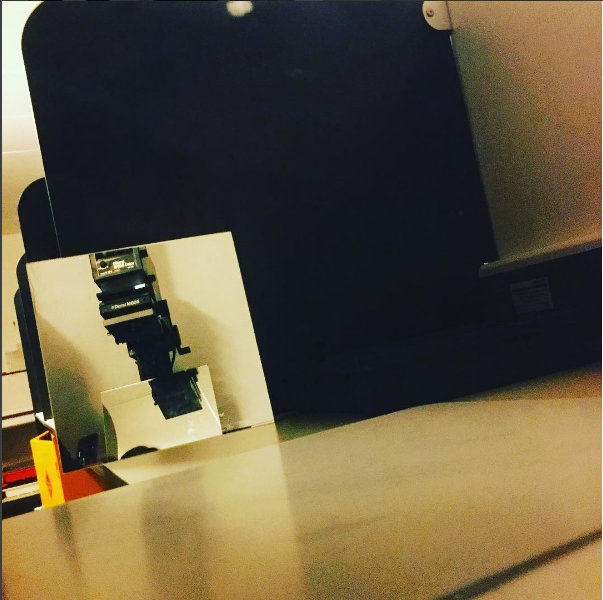
Here I have decided put these two images together because they are both screens and both have reflections. Again i think that these images go well together because one is tidy and one is slightly messy/crowded.
|
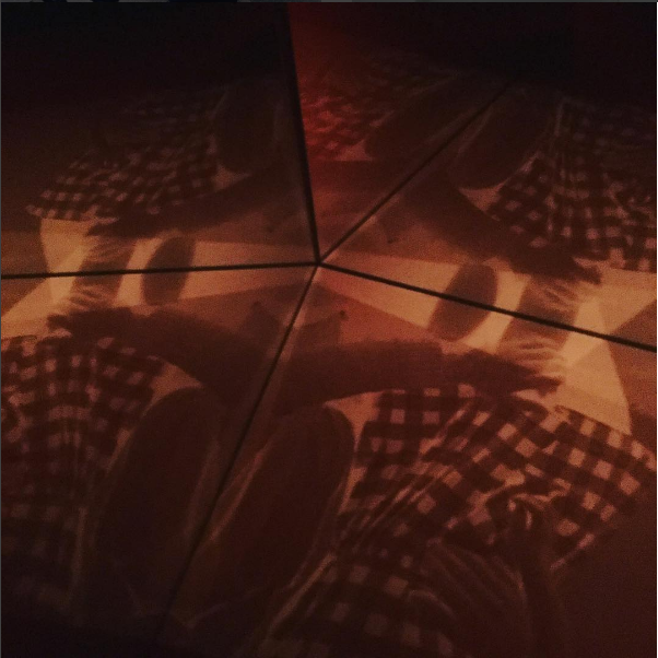
I have decided to make these images look 3D because I wanted this diptych to look dramatically different to the other two I have created.
|
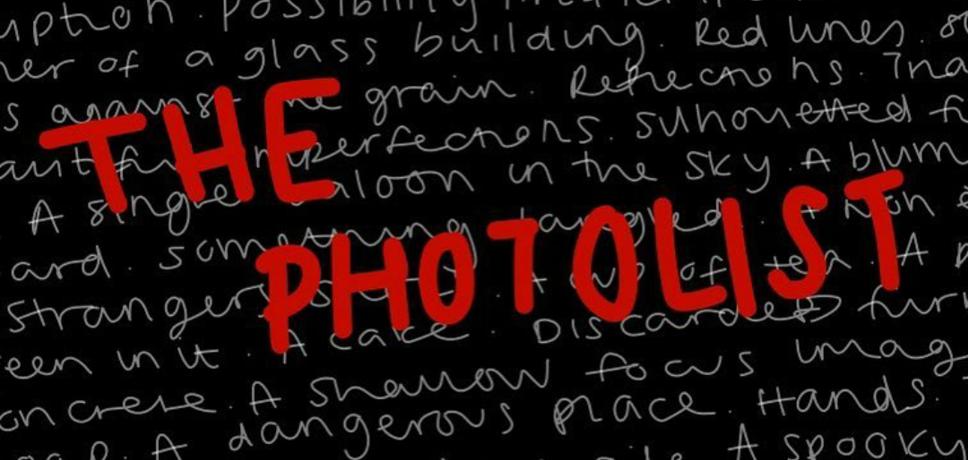
- Corruption
- Possibility
- Artificial colour
- A little one
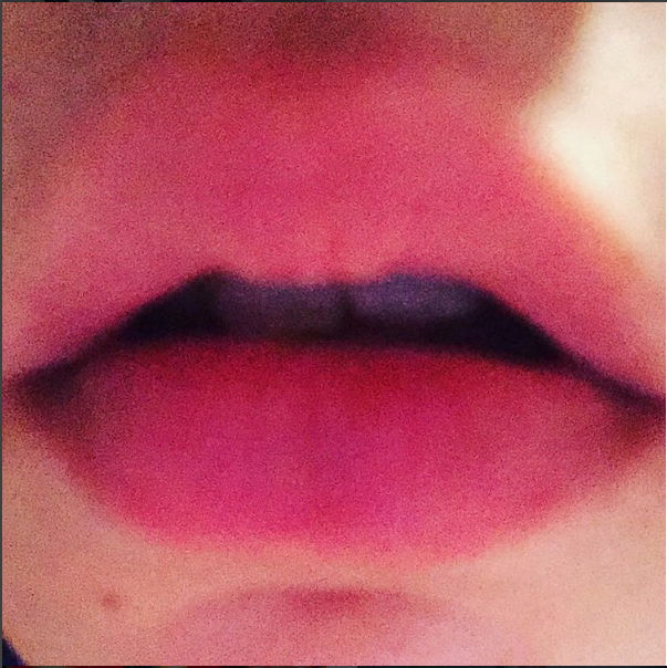
- Lips
- Top corner of a glass building
- Red lines
- Something that goes against the grain
- Reflections
- Triangles
- Kaleidoscope
- Beautiful imperfections
- Silhouetted figures
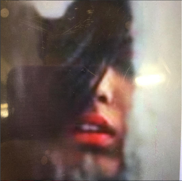
- A smile, close-up
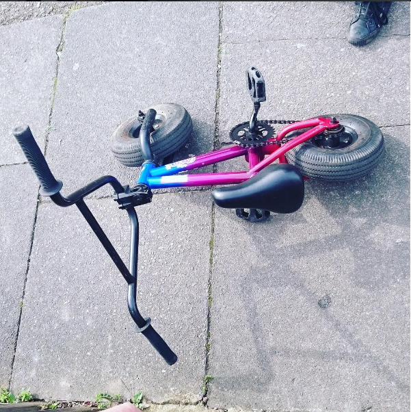
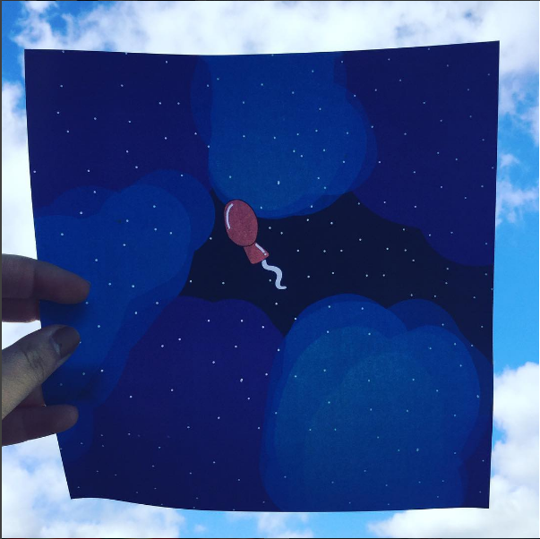
- A single balloon in the sky
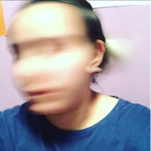
- A blurry portrait
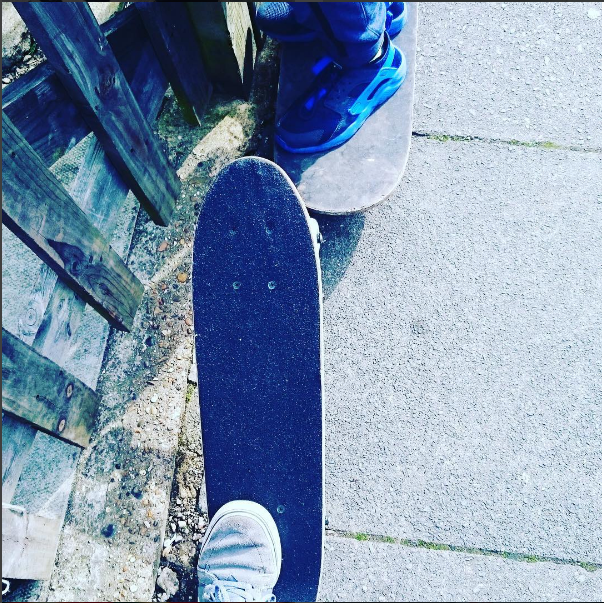
- A skateboard
- Something tangled
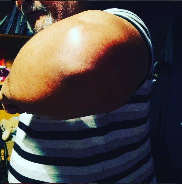
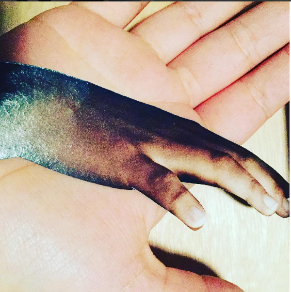
- A non-erotic body part
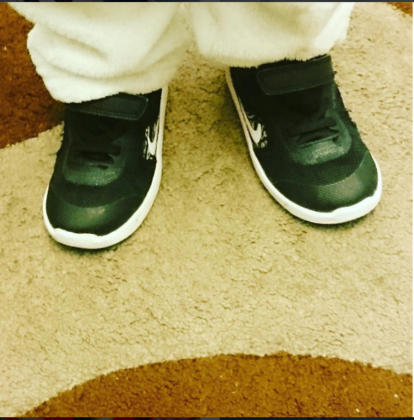
- A stranger’s shoes
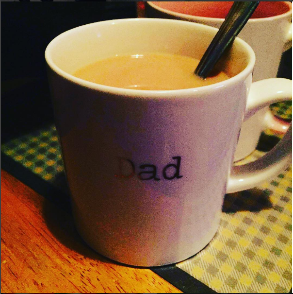
- A cup of tea
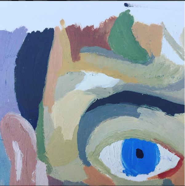
- A painting with green in it
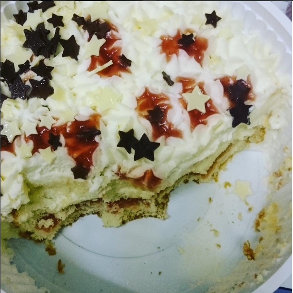
- A cake
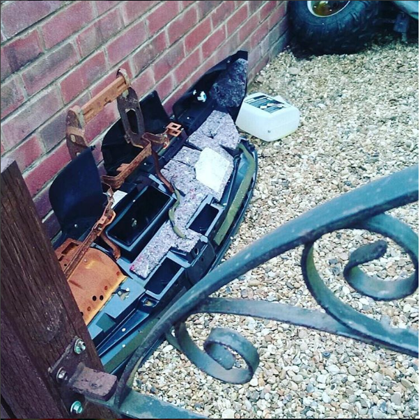
- Discarded furniture
- Desire
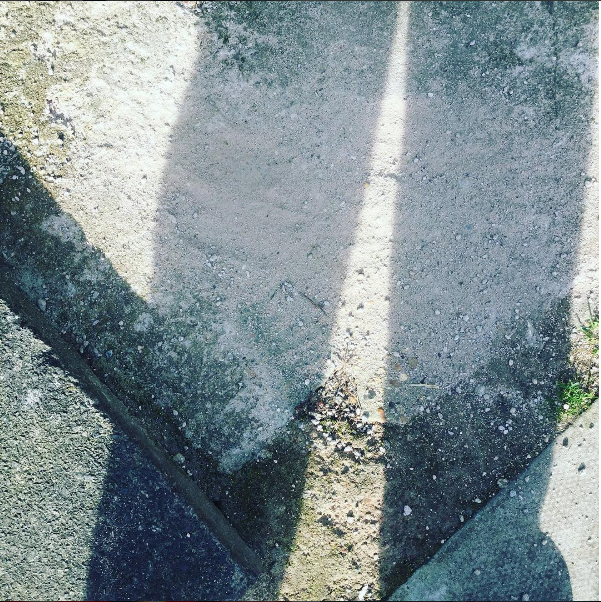
- Concrete
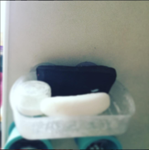
- A shallow focus image of a bar of soap
- A dangerous place
- Hands
- The sound of silence
- A building site
- A spooky space
- Something old
- Smoke
- Something rotten
- Electricity
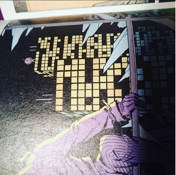

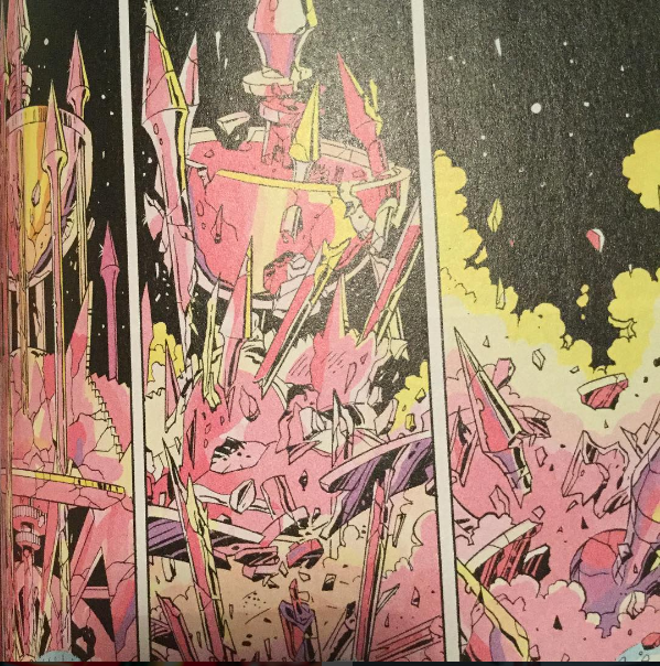
This project was to produce 36 images, each one representing one of the things on the list. The list was created by my class as we were requested to each contribute two or three items to photograph. We were given a week in order to complete all of the images on the list and stick them up on the wall in out classroom. I initially thought this would be easier than it was as the things on the list seemed to be things we would usually see over time. I found the time limit hard. I think that if we were given more time, such as two weeks to complete this my images would have turned out better as I would've been able to find things that were actually there. For example for 'smoke' I ended up using an illustration from a page in the graphic novel Watchmen, as it was all I could find to photograph in such a short amount of time. I think that it would be interesting to recreate these images, taking as long as I need to create a gallery of images that I am really happy with and wouldn't be embarrassed to show the rest of the class or anyone else that may see them.
Instruction Based Art
Yoko Ono
"ACORN"
"Acorn" is a book of one hundred haiku-like instructions that originated as an online project in 1996. Acorn is described as a 'sequel' to her earlier book Grapefruit (1964). Arriving in New York Ono was embraced by the art world, making sculptures, drawings, pieces of music, all inspired by Zen Buddhism.
Does Ono think people today are more narcissistic and self-centered than in the sixties? Her response is koan-like. “I never thought of that,” she says. “I don’t think about the future. I don’t think about the past. I just think of what comes into my head at the time. So that might be about the past, that might be about the future. Or, the present.” |
Erwin Wurm
'One Minute Sculptures'
'One minute sculptures' is a series created by Erwin Wurm where the viewers are expected to create one minute sculptures. To make the sculptures the viewers are given instructions (sometimes illustrations) and objects in order to create their 'one minute sculpture'. This kind of art making began in the late 1990's where the art would be made using whatever was around, there was no pre-planning. These are documented photographically.
MY INSTRUCTION
Make a series of 6-10 photographs.
Photograph the same type of thing in different ways, at different times etc. So that the viewer feels something different when they look at each image.
Photograph the same type of thing in different ways, at different times etc. So that the viewer feels something different when they look at each image.
MY RESPONSE

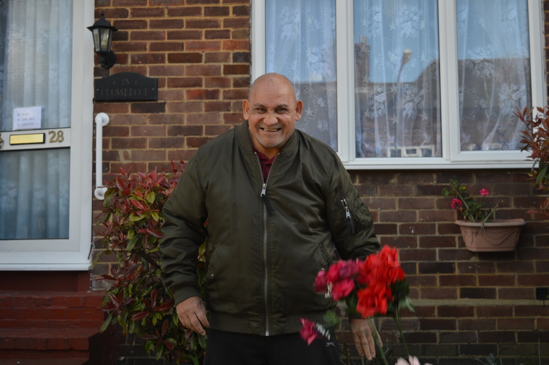
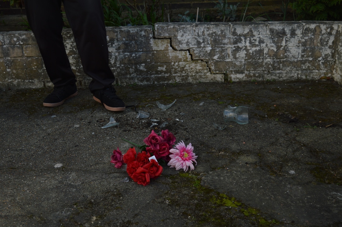
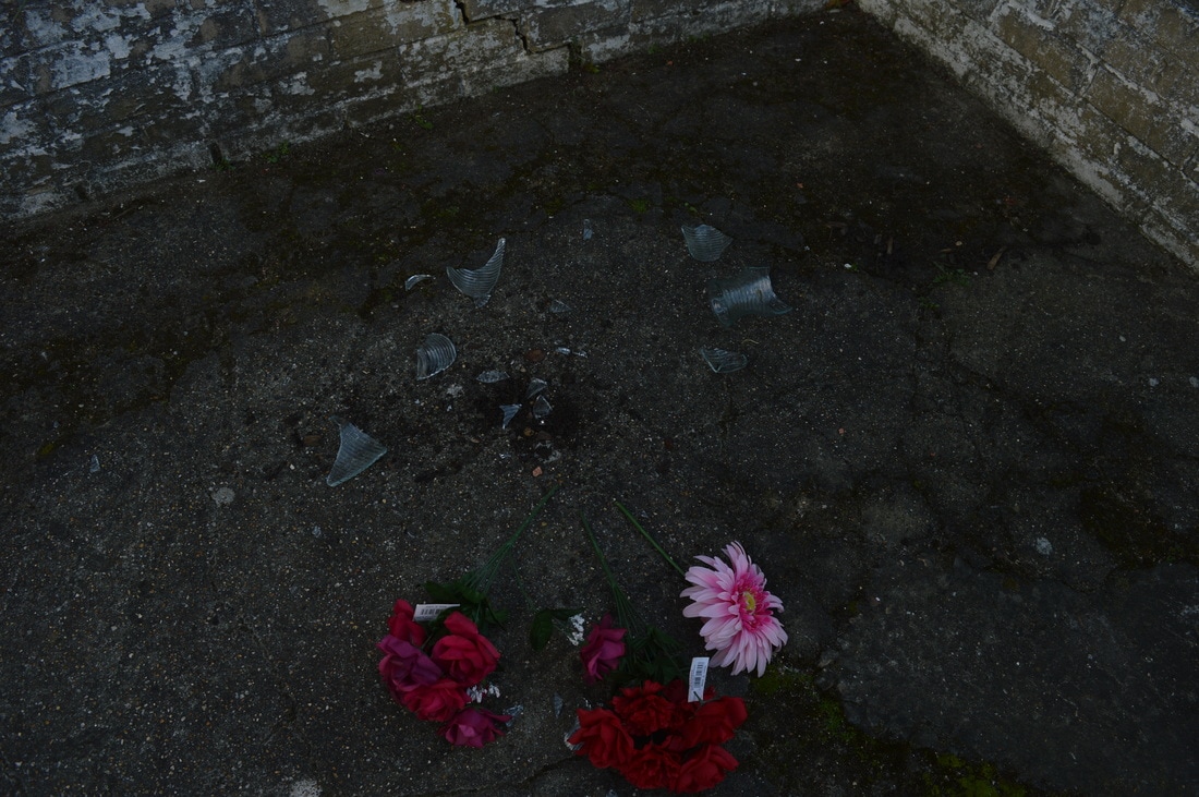
This is my response to the instruction I was given. I have decided to respond in this way as I was at first, unsure of how to go about doing it. As I had to photograph the same type of thing in different ways while making the viewer feel different things, I thought that by breaking something it would most definitely make the viewer feel something different with every image. I feel like I should have made the person have a normal facial expression at the beginning as I then would've been able to shock the viewer as they wouldn't know what was going to happen to the vase. I also wish that I had taken continuous images when the vase was being thrown onto the floor so I could've got a better shot of the vase in the air before it smashed. I photographed the vase as soon as it had smashed then a little while later to see if any of the smashed glass pieces had been moved by the wind.
DIFFERENT WAYS OF MAKING A PHOTOBOOK
MAKING ZINES:
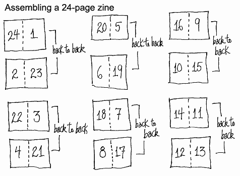
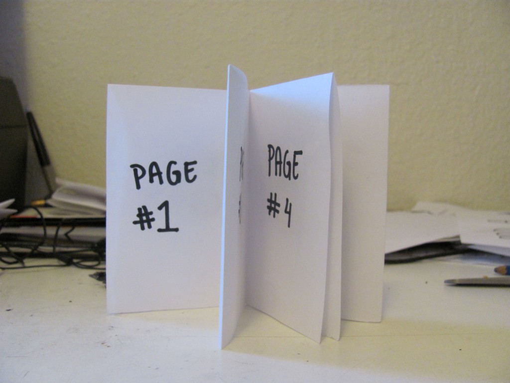
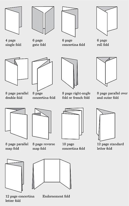
Here are some examples of ways that zines can be made and constructed. Zines come in many shapes and sizes and they are completely customisable to who is making it. The first image shows how to make a simple 24-page zine, the second shows what a 16 page zines looks like (this one has space for 8 on the back side, possibly Zine 2?) and the last shows a simple 8 page zine. The most common way that I have seen zines (this is the way I have used previously) is the third image. This gives the maker 8 spaces internally (one page for the front cover and one for the back cover).
PRINT ON DEMAND:
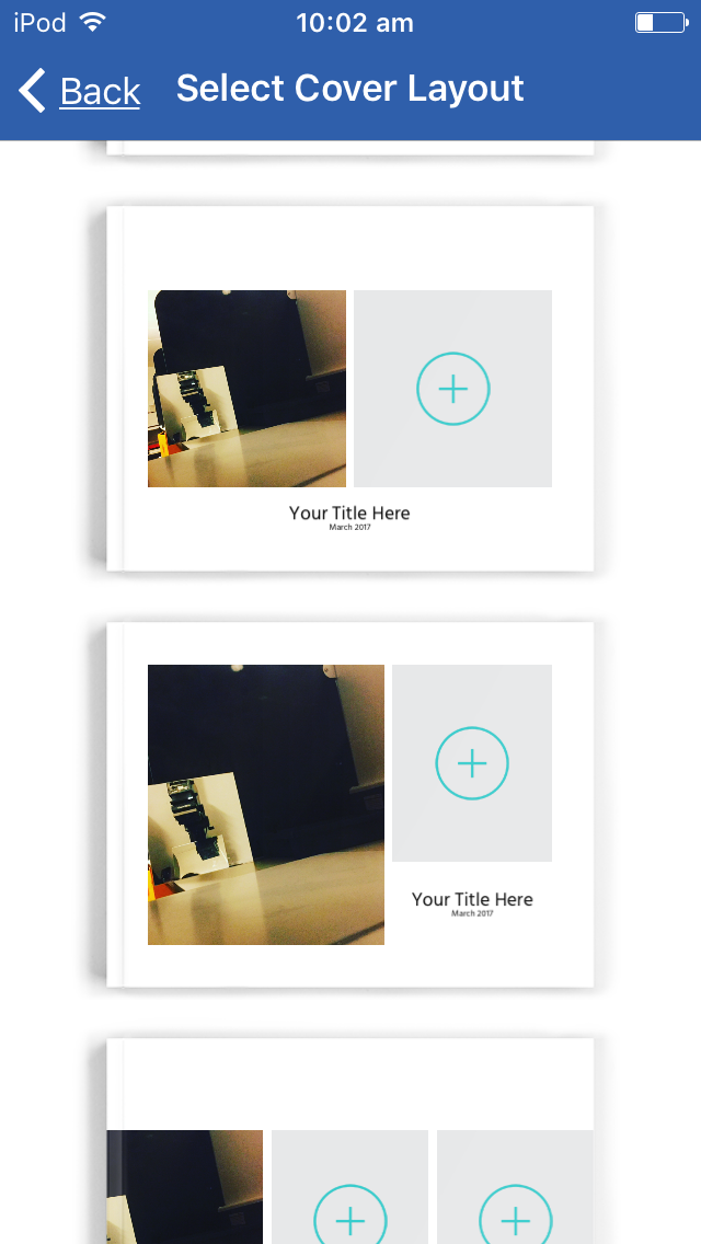
BLURB
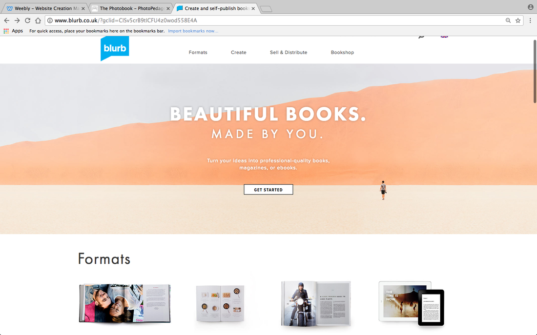
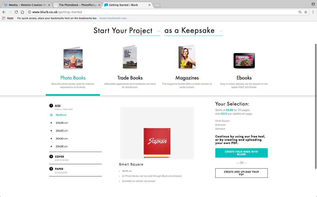
This website allows you to upload your images and edit them freely. This is a good website to do this as it offers some templates that can be slightly edited and it also allows you to design the book yourself. There is also an option to design the book using another programme (InDesign or Illustrator) and upload the pdf file.
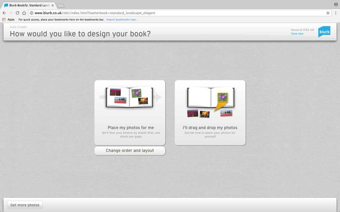
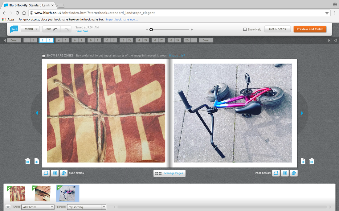
Here I chose to use the "I'll drag and drop photos" option. I actually found this a little bit hard to do as I wasn't sure how to add text etc. Obviously if I were to use this service I would learn how to use it properly. This is the most free and customisable option as it will allow you to put what you want where you want it.
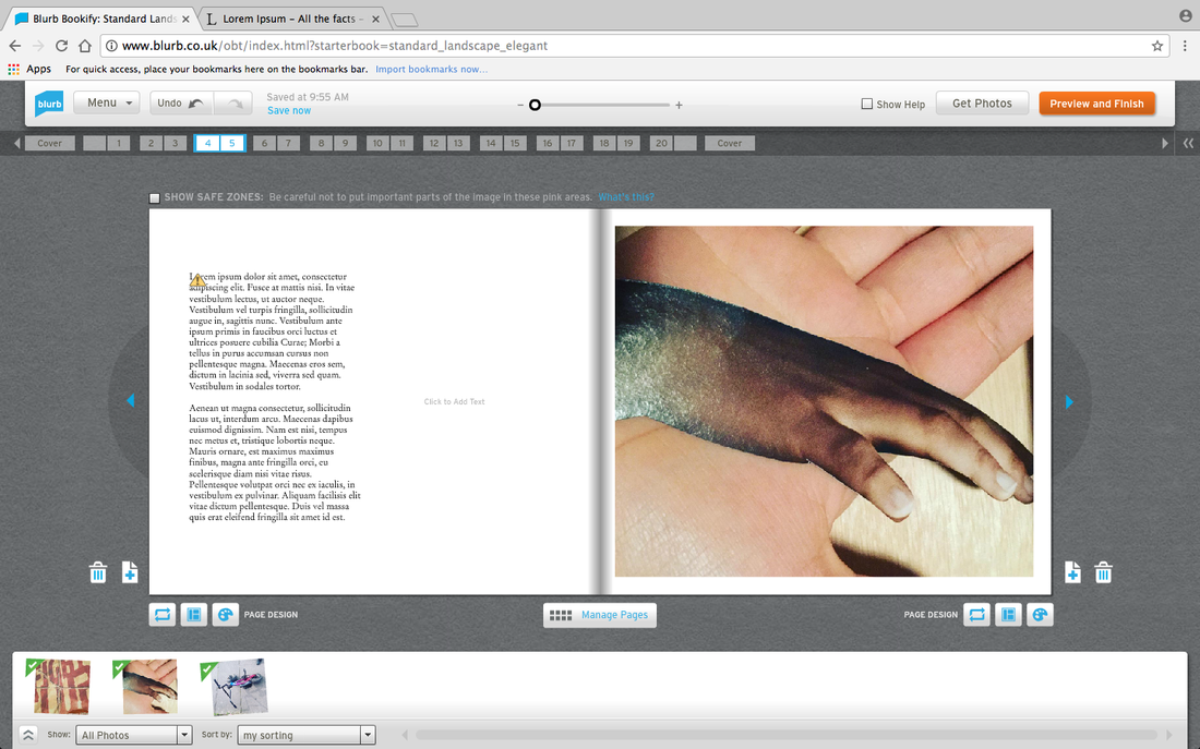
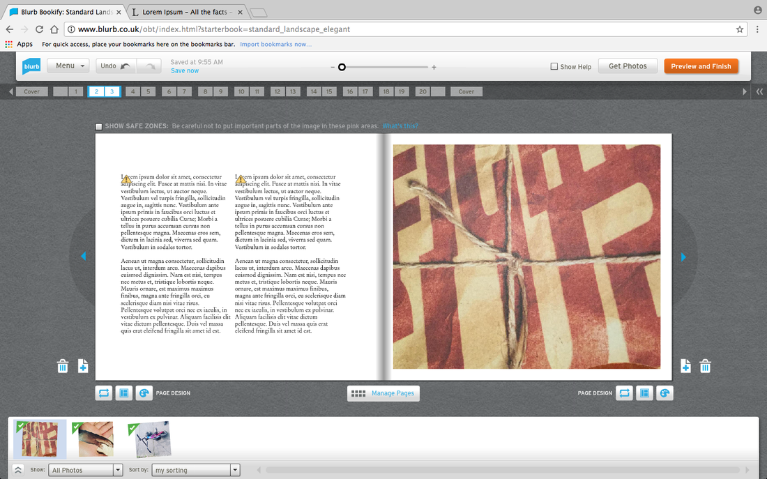
However here I chose to use the "Place my photos for me" option. I think that this was easier for me as it automatically gave spaces for writing. I have inserted Lorem Ipsum as model text so I could kind of see what the images look like next to text. This option is customisable but it does seem to be a little harder to put things exactly where you want them to be.
FREEPRINTS PHOTOBOOKS
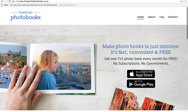
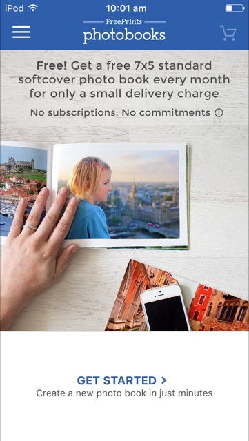
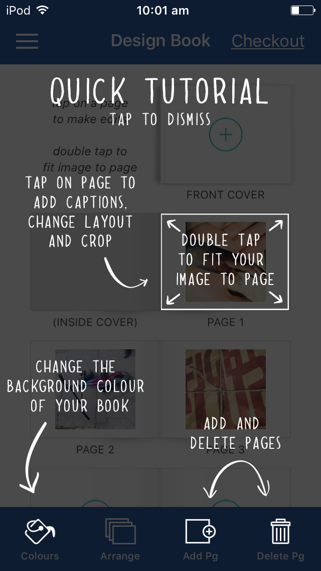
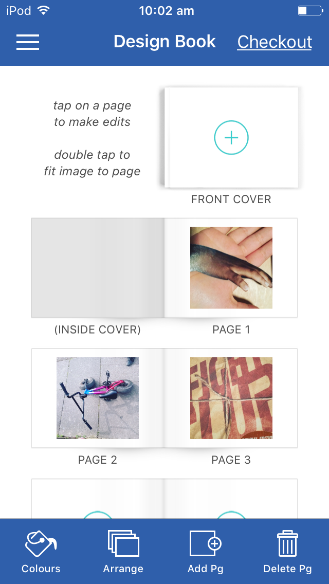

Free prints Photo books is actually an app that can be installed on phones (and other devices) using App Store and Google Play Store. The app free and relatively easy to use. As the photo book is printed for free (you pay postage fees) there is limited customisation available. The front cover is the most customisable part of the photo book as it gives many variations (double pictures, titles at the top, the bottom, the side etc).
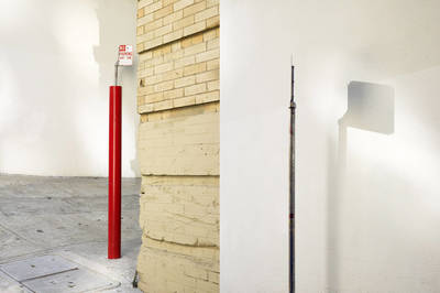
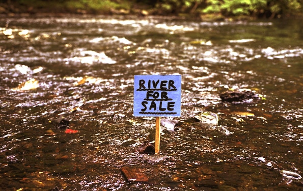
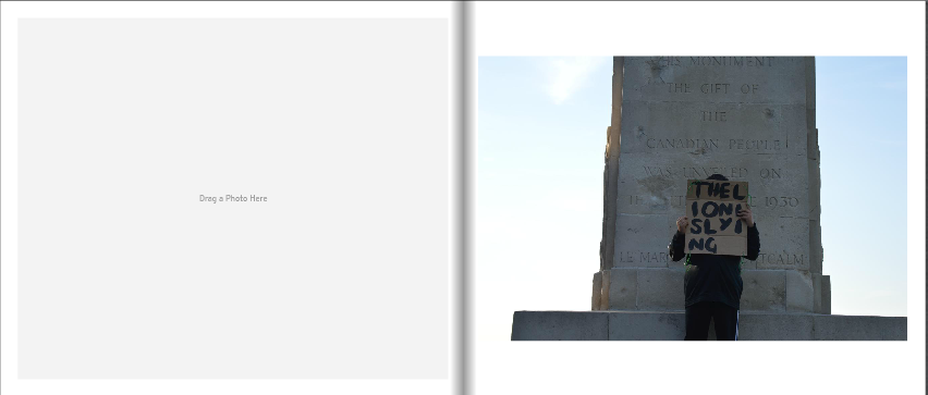
Peter Liversidge

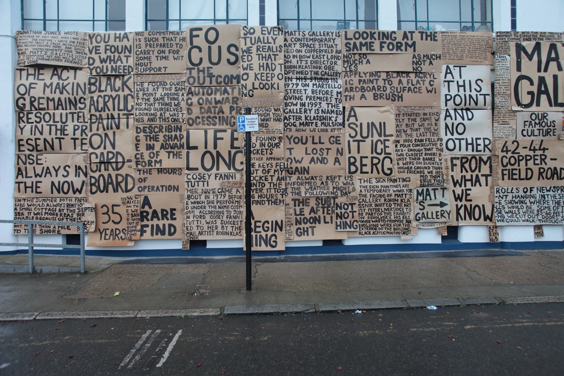
Peter Liversidge's work begins at his kitchen table with a manual typewriter. He sits alone and writes proposals which present an 'array of possible and impossible ideas for performances and artworks in almost every conceivable medium.'
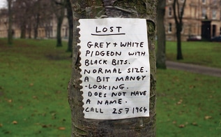
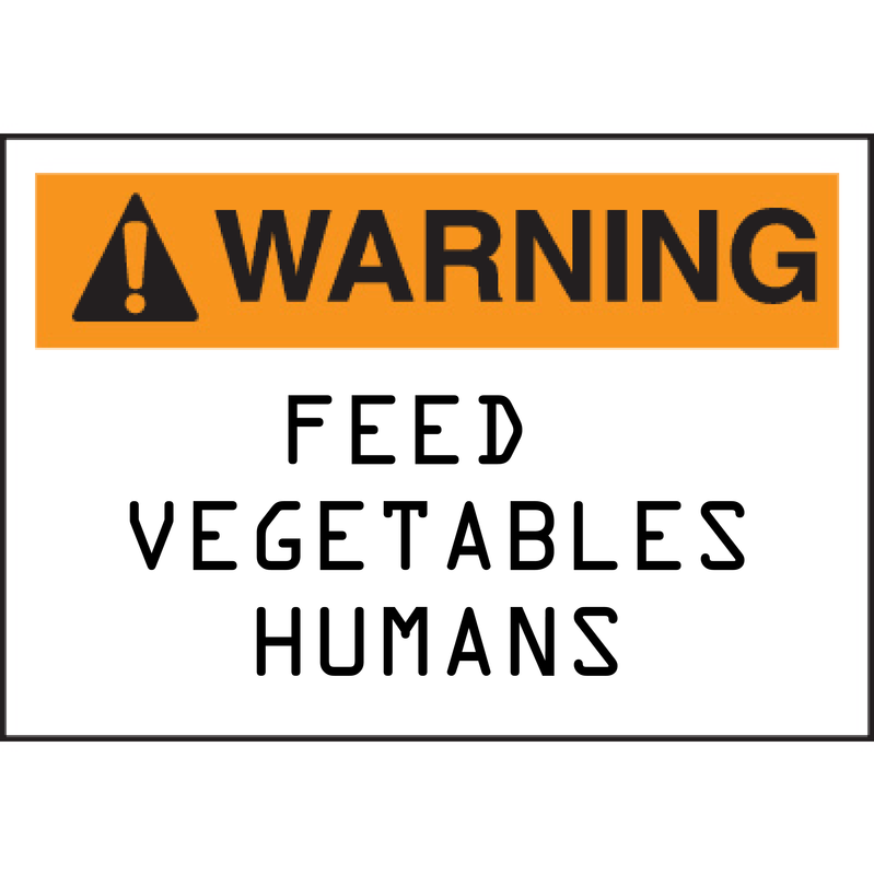
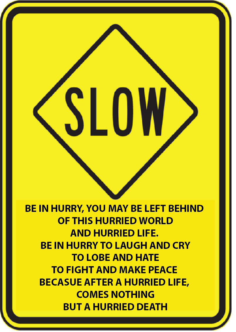
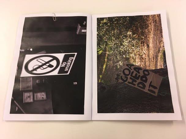
Although he is most known for his work involving his proposals I really like the work that he has done using signs. I prefer these works as I think that they are more interesting as they are really different to the signs that are meant to be up (like the signs that tell you where to go and what to do). I think that these images are interesting because they look really handmade and they really stand out where they are placed.
Although he is most known for his work involving his proposals I really like the work that he has done using signs. I prefer these works as I think that they are more interesting as they are really different to the signs that are meant to be up (like the signs that tell you where to go and what to do). I think that these images are interesting because they look really handmade and they really stand out where they are placed.
As Liversidge has said: “… the process is also about the notion of creativity: it’s important that some of the proposals are actually realized, but no more so that the others that remain only as text on a piece of A4 paper. In a sense they are all possible and the bookwork that collates the proposals allows the reader to curate their own show, and because of its size and scale the bookwork allows an individual to interact with each of the proposals on their own terms, one to one”. |
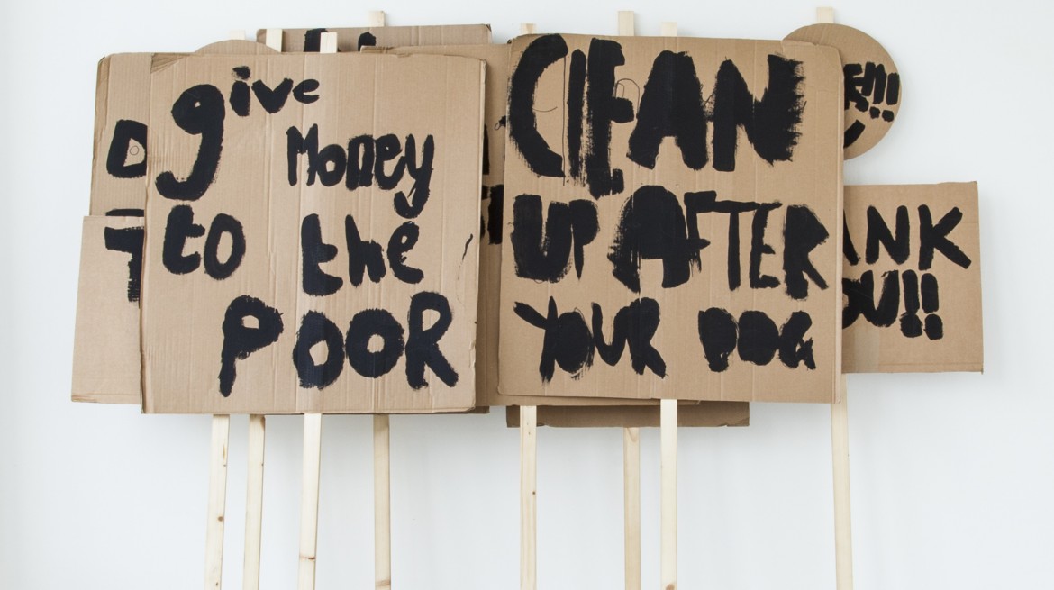
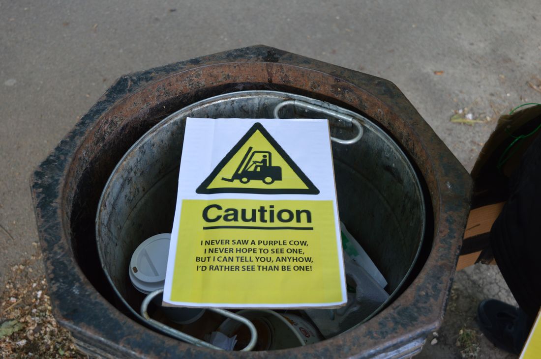
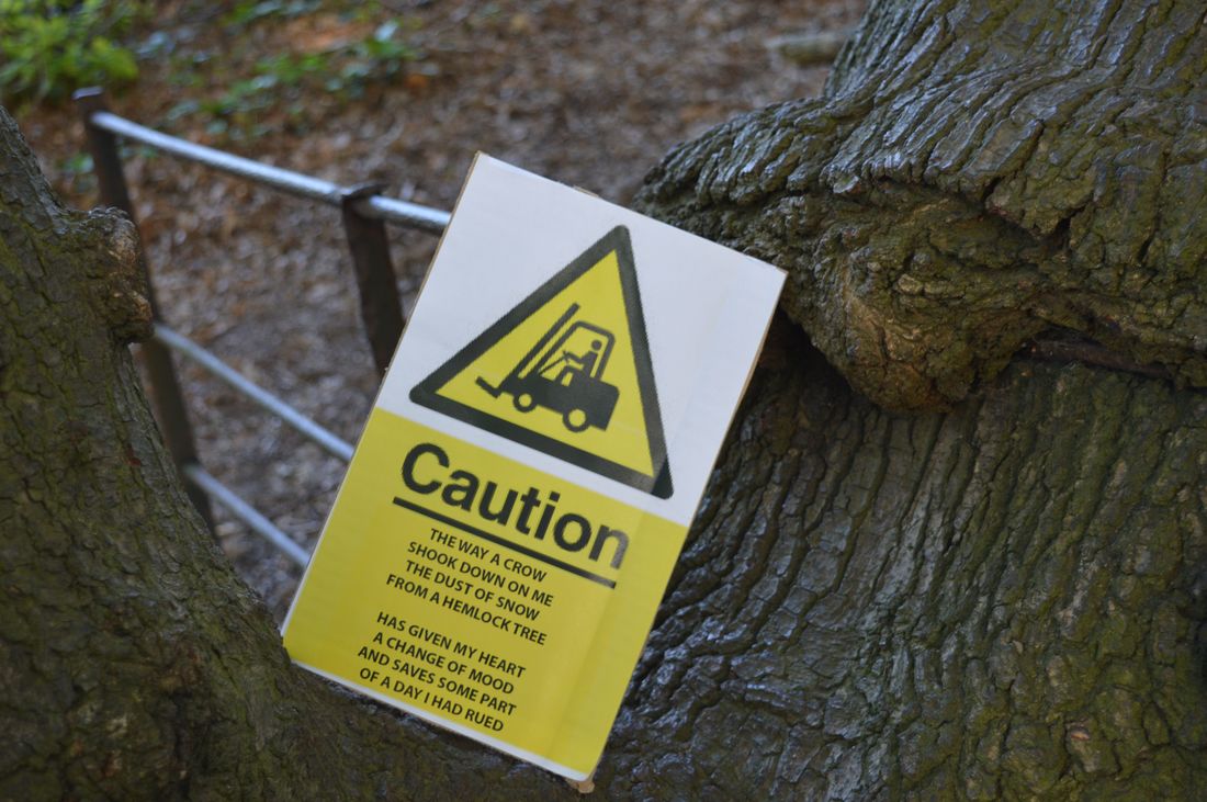
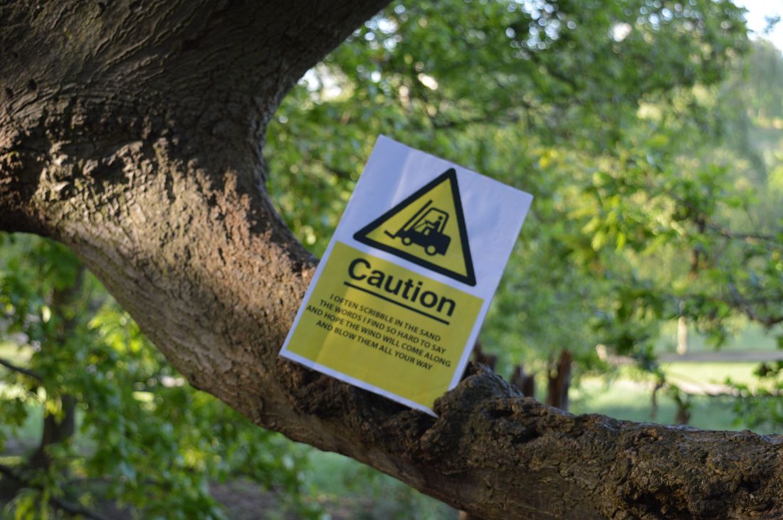
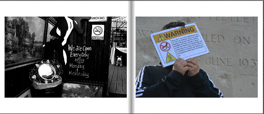
David Shrigley
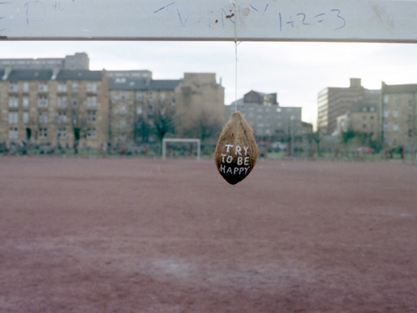
David Shrigley is a british visual artist who works with a range of media including : drawing, photography and sculpture. The images above show some of his works that include signs. These kinds of signs are very different to the ones that Liversidge makes and photographs because Shrigley's work is very comedic and funny, it shows that he has a sense of humour where as the ones that Liversidge makes aren't as funny and a little bit more serious.
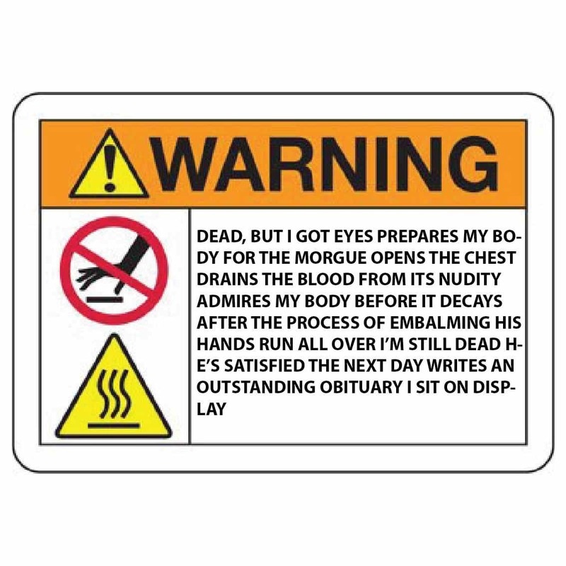
Making My Signs
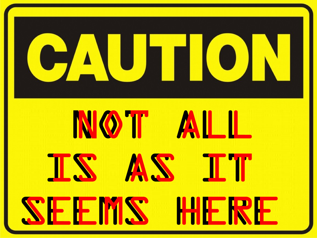
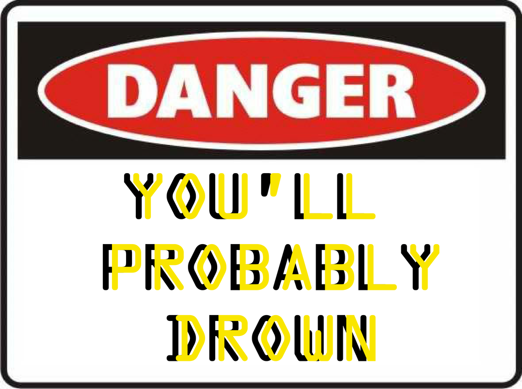
These are some digital signs I am going to use as an experiment before I start painting my own. To make these signs I went to the internet and searched 'blank warning/caution signs' and took them into Illustrator. Once in Illustrator I used the text tool to add writing. I wanted these signs to be a little weird and really different to the regular signs that we come across everyday but I think that they look too similar to the regular ones.
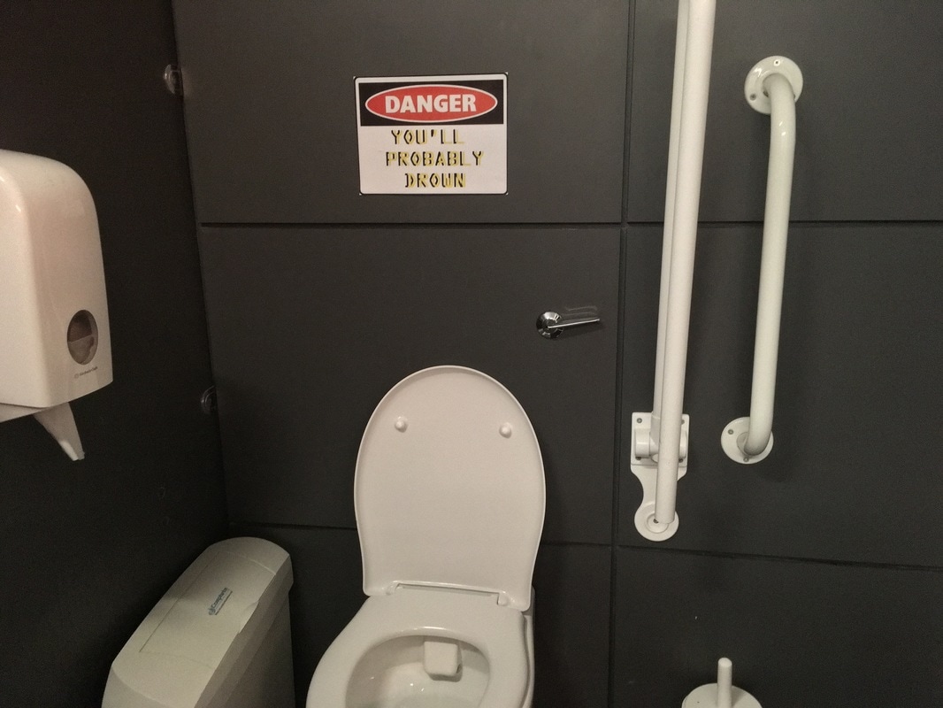
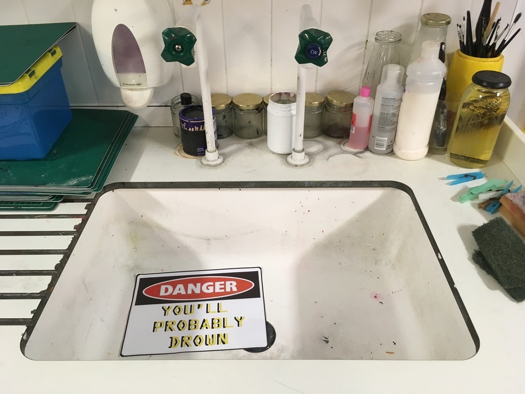
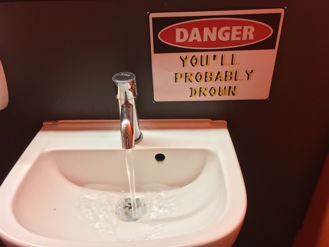
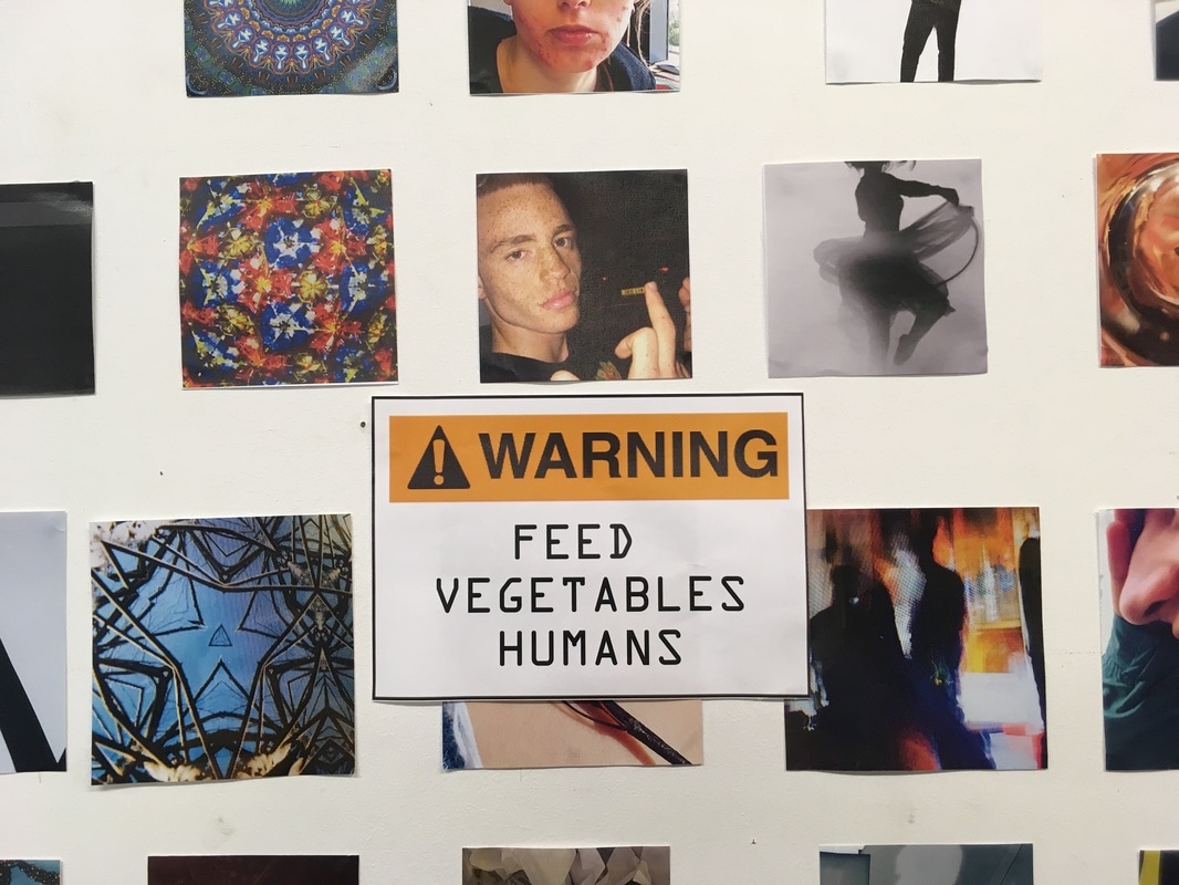
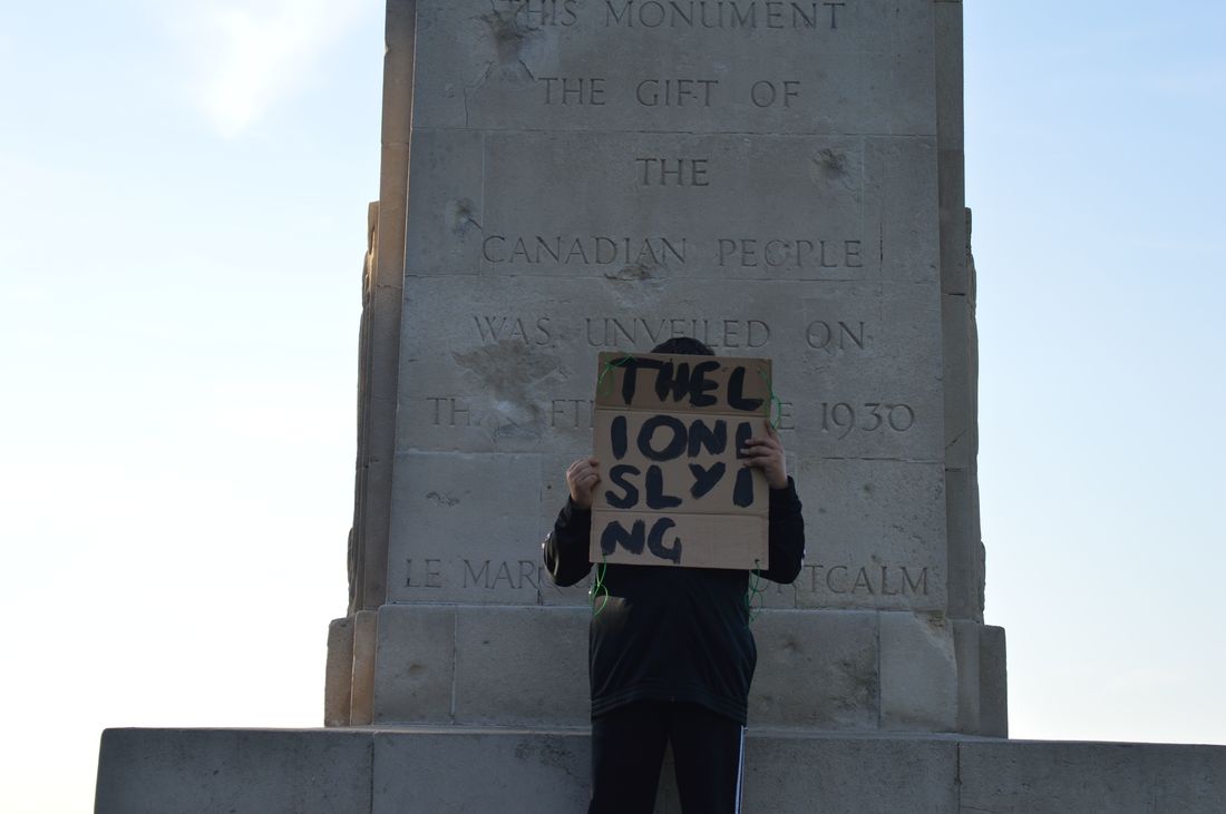
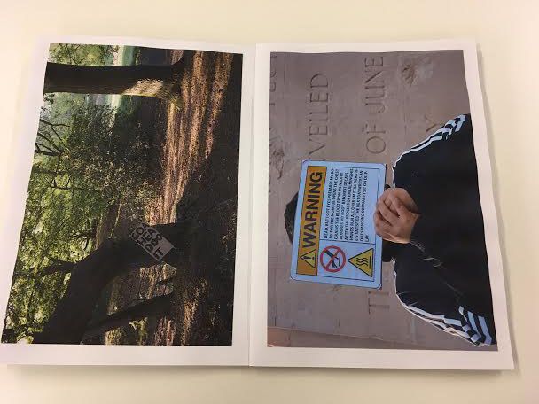
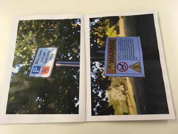
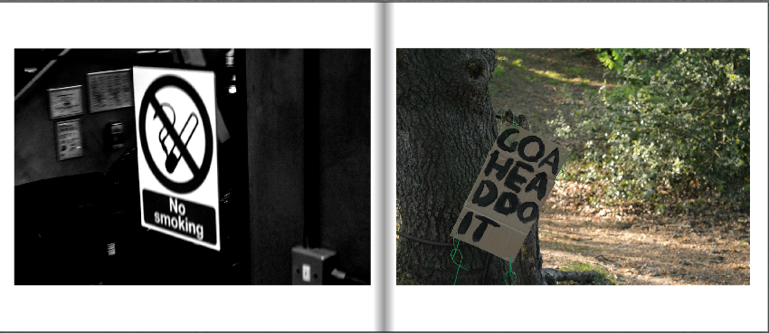
Here I have placed the signs that I have made in different areas around the school. I think that some of the signs work well but I don't really like the way that they look in school. These may look better when they are taken outside of school as they can be placed next to or near similar signs. I want to paint my own signs as I think that this will make the images look more interesting as there will be an obvious difference between my sign and the one that is meant to be there.
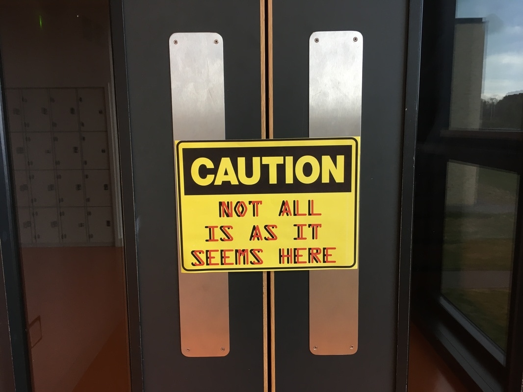
Making My Signs Again
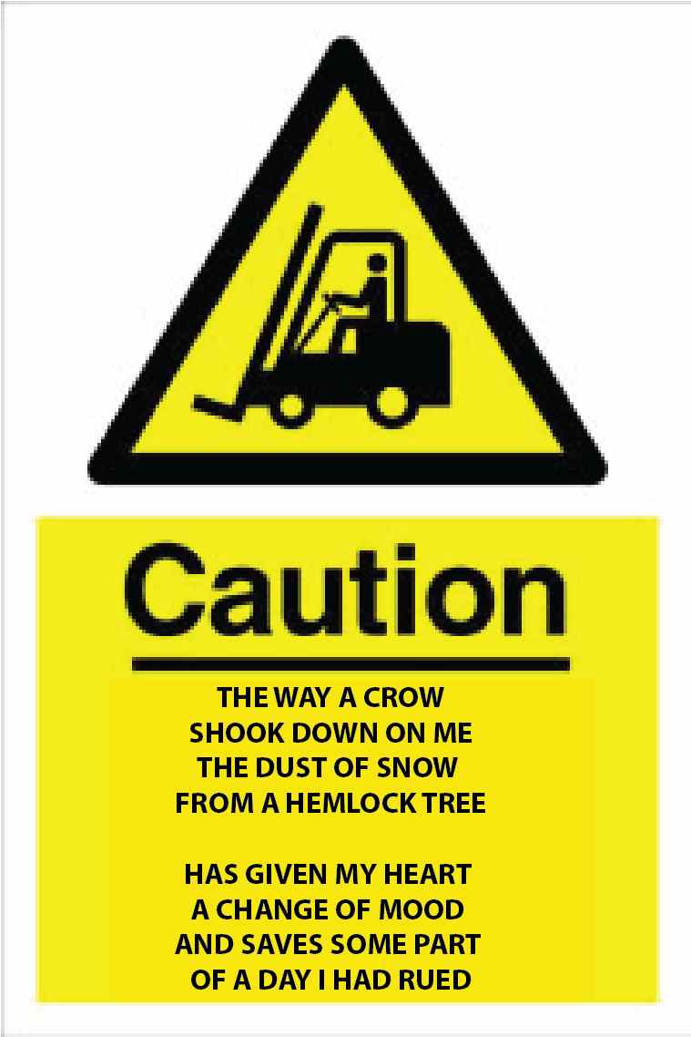
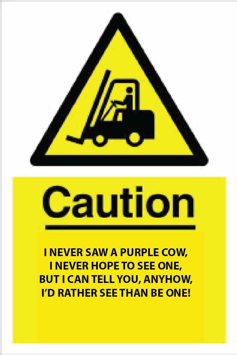
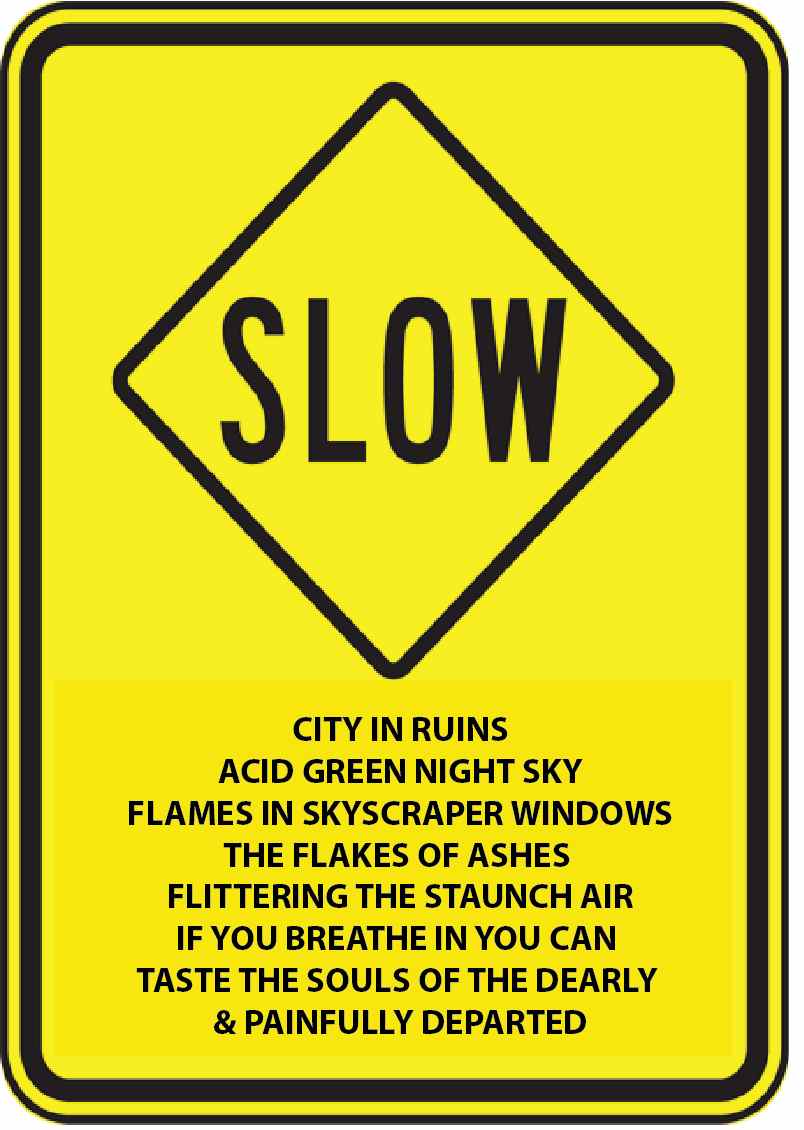
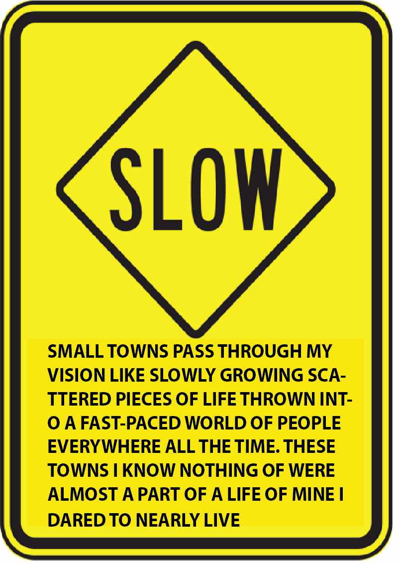
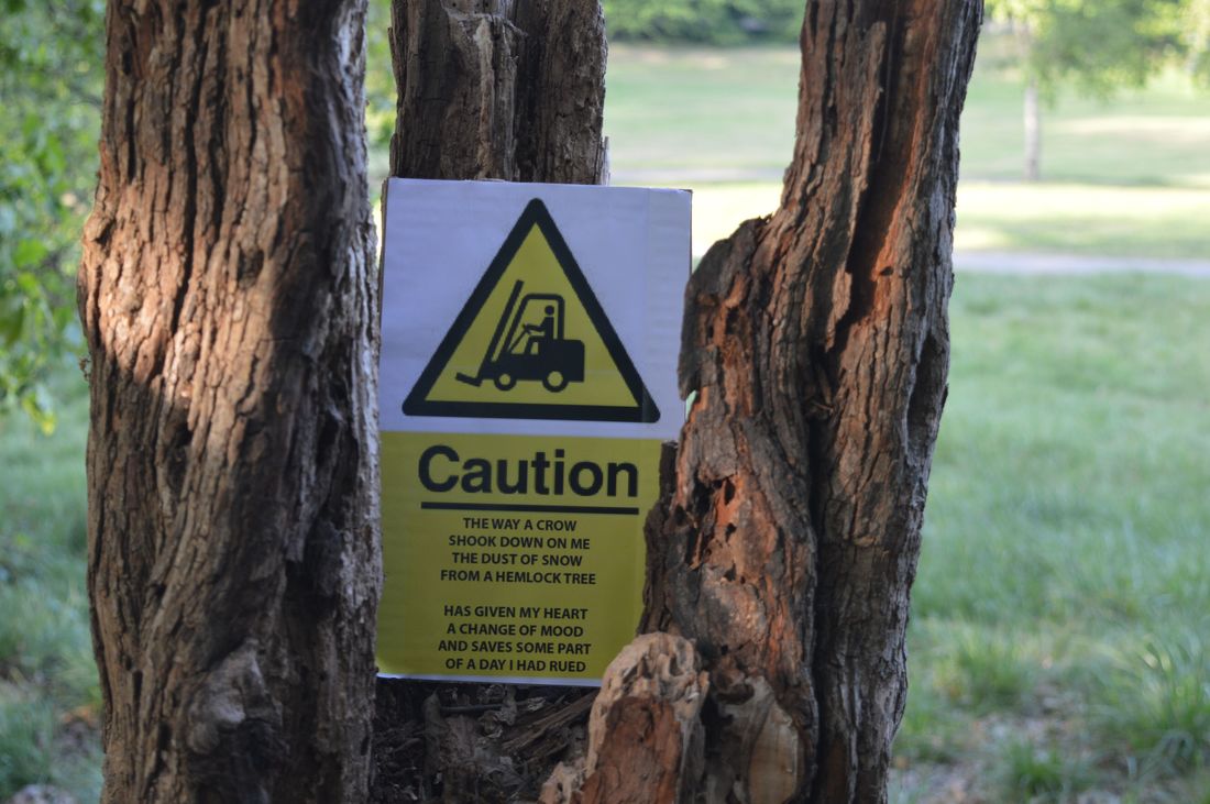
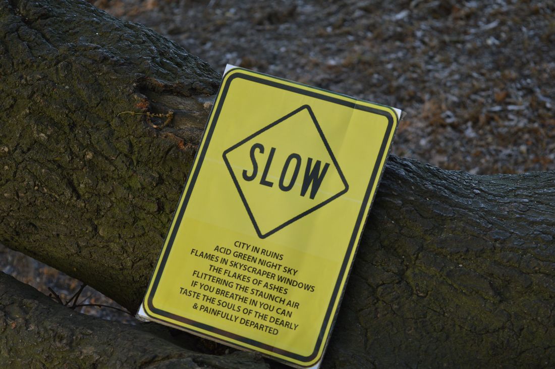
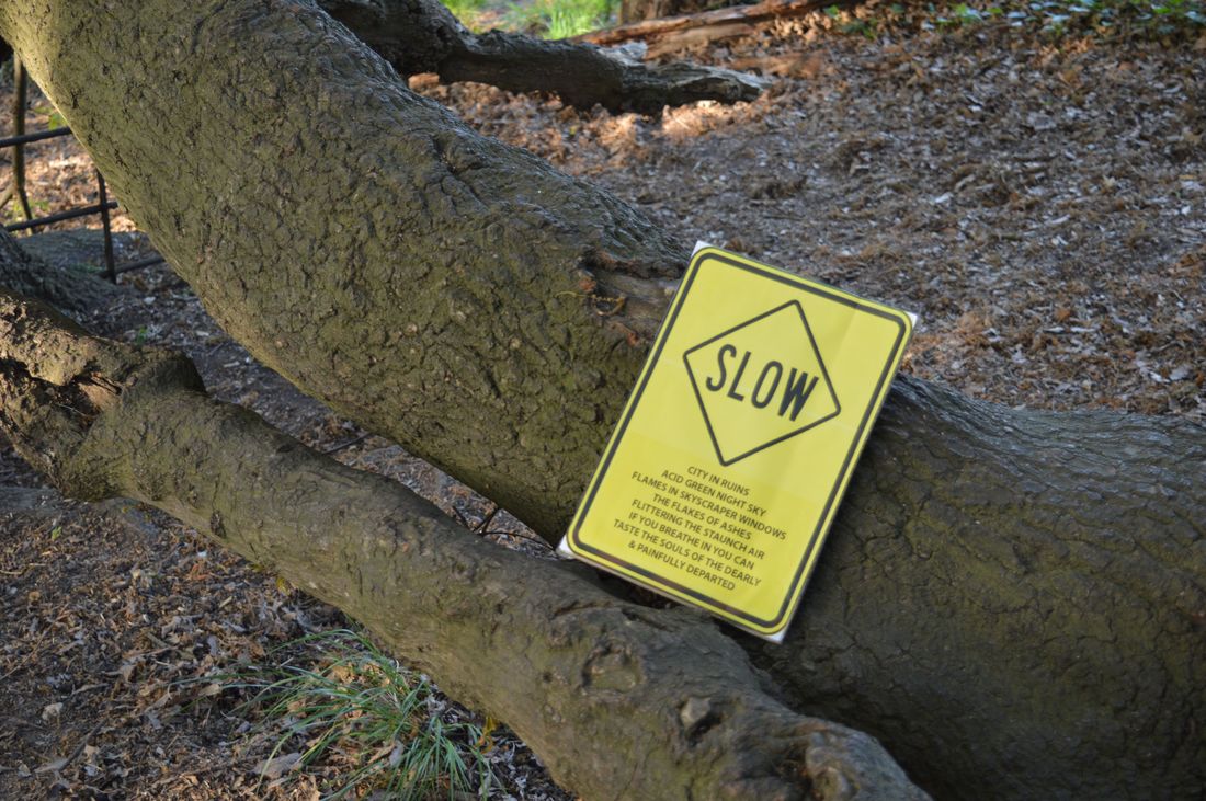
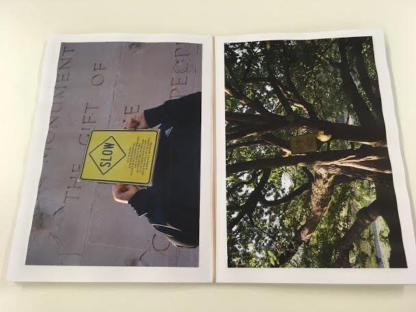
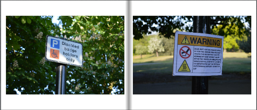
Here is my second attempt at making signs out of templates I found online. I have tried to make these ones look really different to the first ones I had made because I don't think that they worked well enough. To make these signs I searched for short poems and chose ones that were weird and I tried to make the sign different to what poem I chose. I think that these work better because they look like ordinary signs from far away but up close they are obviously very different.
|
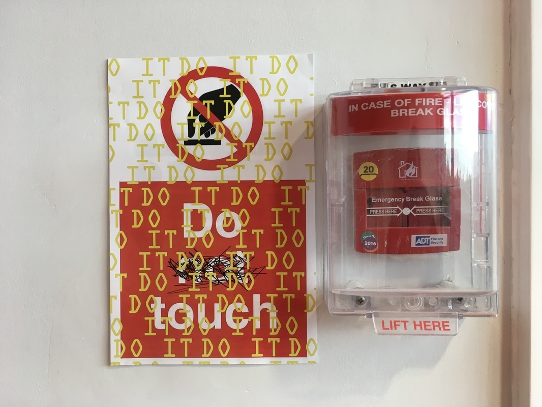
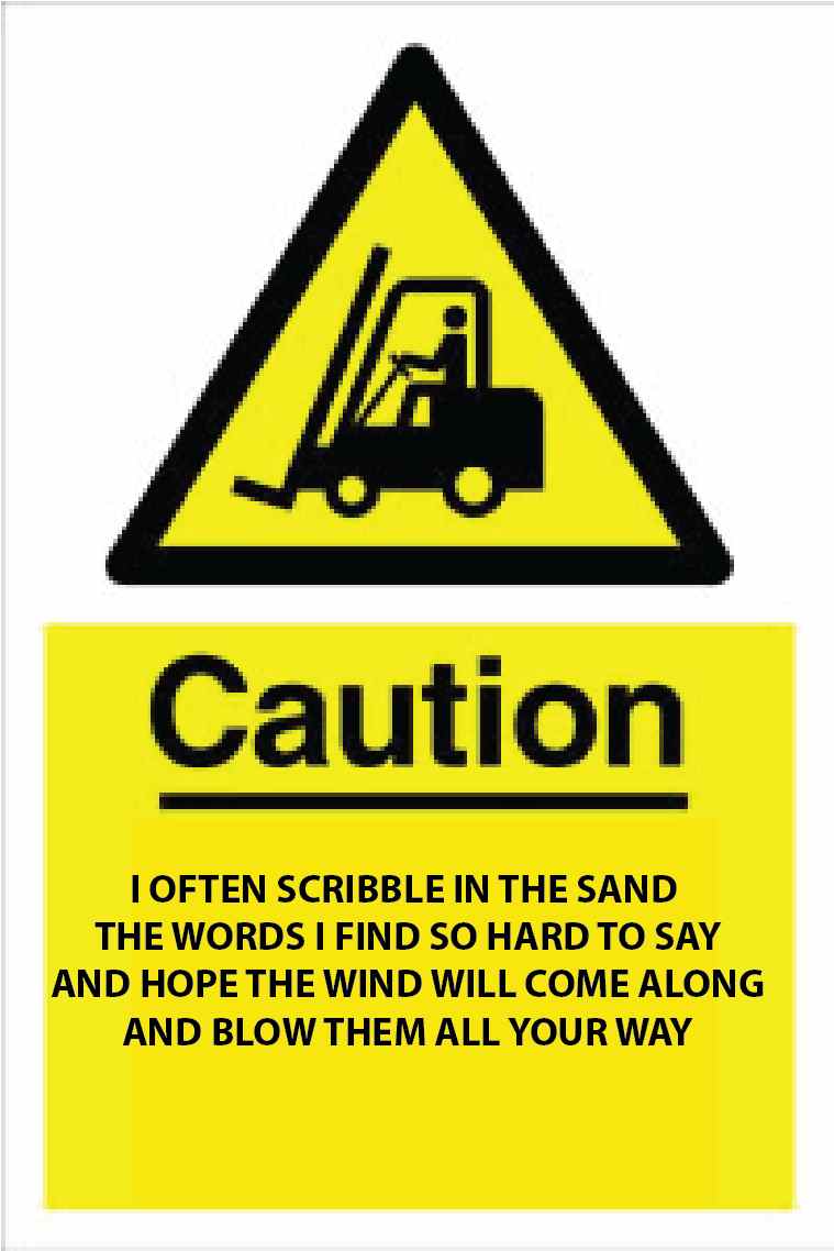
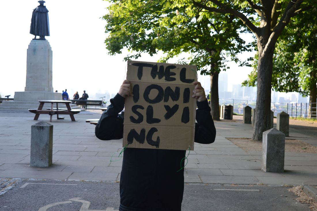
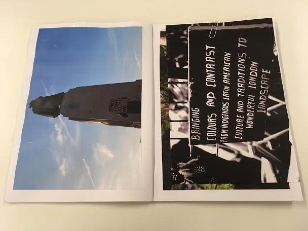
Here are a few images I have taken using the new signs I have made. I think that these work a lot better because they do look similar to actual existing signs. I think that these signs look good because they are in a strange environment for signs like these. If I were to take these images again I would like to take them somewhere really busy like London to make them blend in and maybe confuse people that walk by as I am taking the images.
|
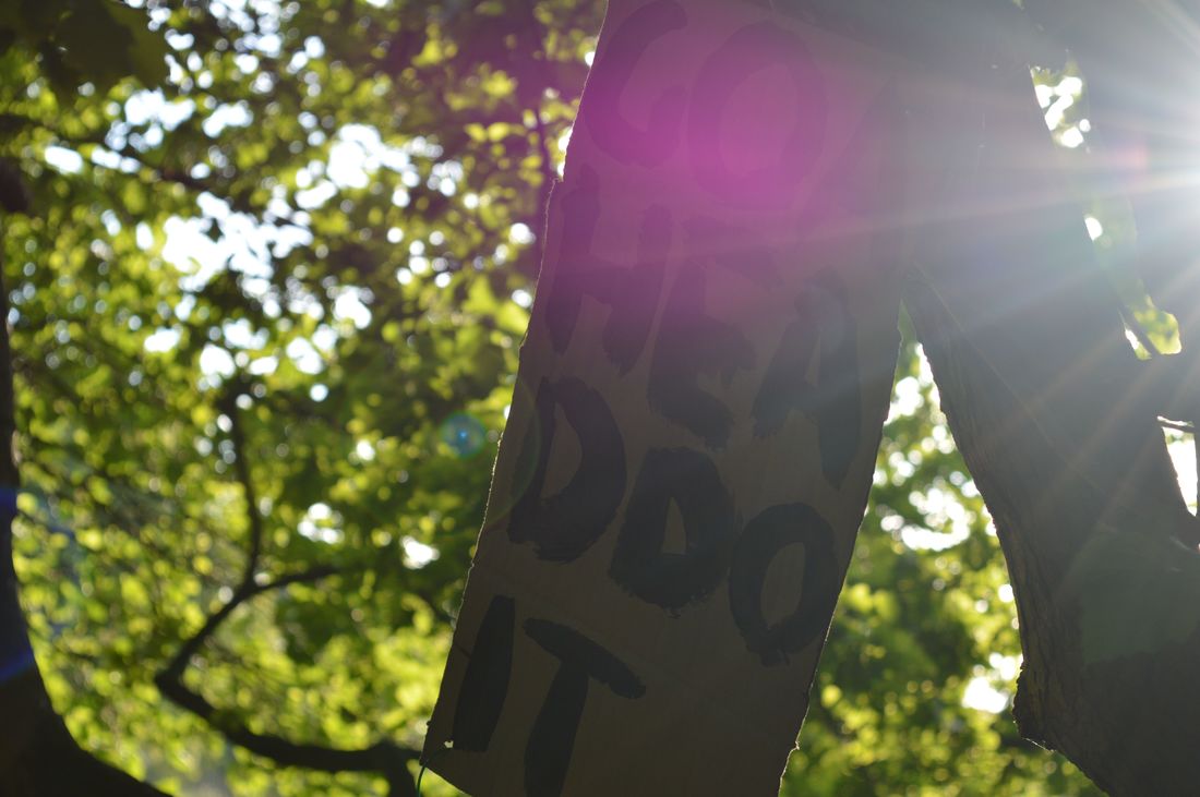
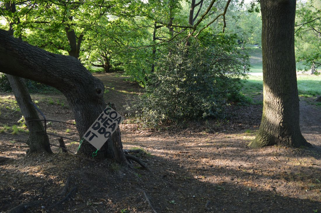
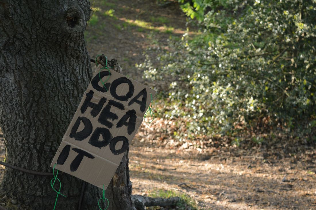
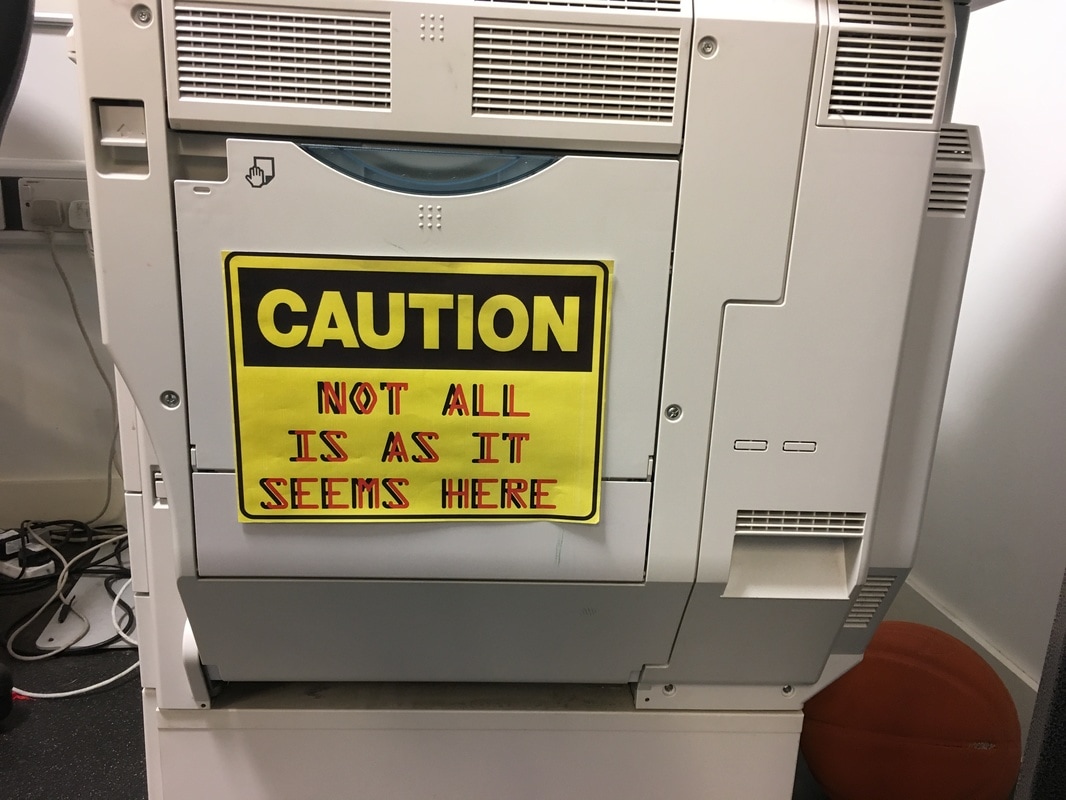
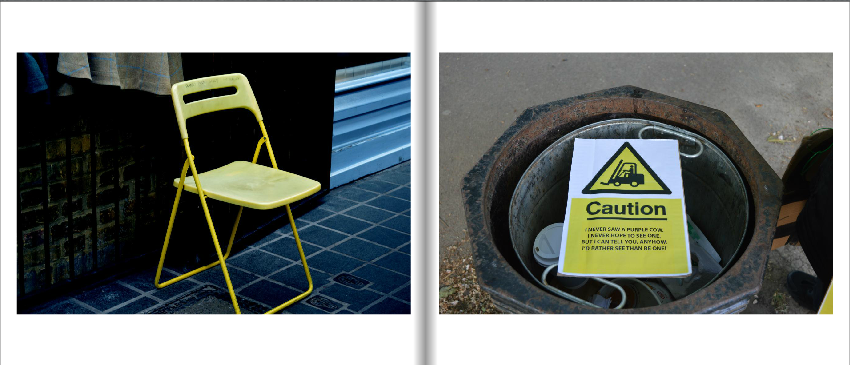
Here I have used the signs that I have hand painted to create these images. I think that these signs work better than the ones I had made digitally because they stand out more and as they are bigger and can be read easier in the image. The other signs were hard to read and were very repetitive as the text was small and I used the same caution signs with different sayings on.
Maquette (handmade)


Maquette (online)


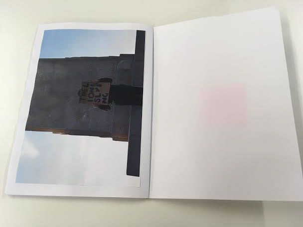
Here are two maquettes I have made of what my photo book could look like and what images I have chosen to use. I think that these both work well but the images I have chosen to use are too similar and the same signs are used too many times so it looks like I am using the same image(s) over and over. I think that I should take some more sign images in different places and make sure that there is either lots of people in them or no one at all.
Some of the images I have paired together look weird because they are completely unrelated. I think that I should change the images that are unedited next to black and white ones because they don't look good together.
I prefer the way that handmade books look but I don't think that I can make one that looks as good as it could so I think I will get it printed online using Blurb.
Second Maquette (Handmade)

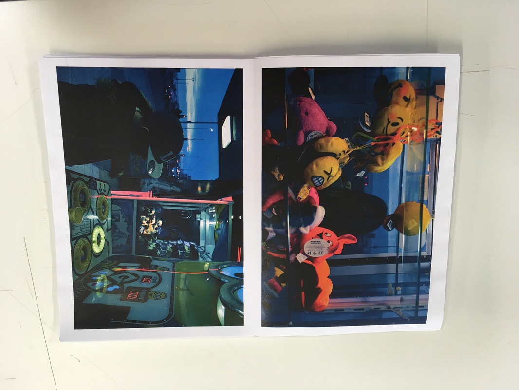

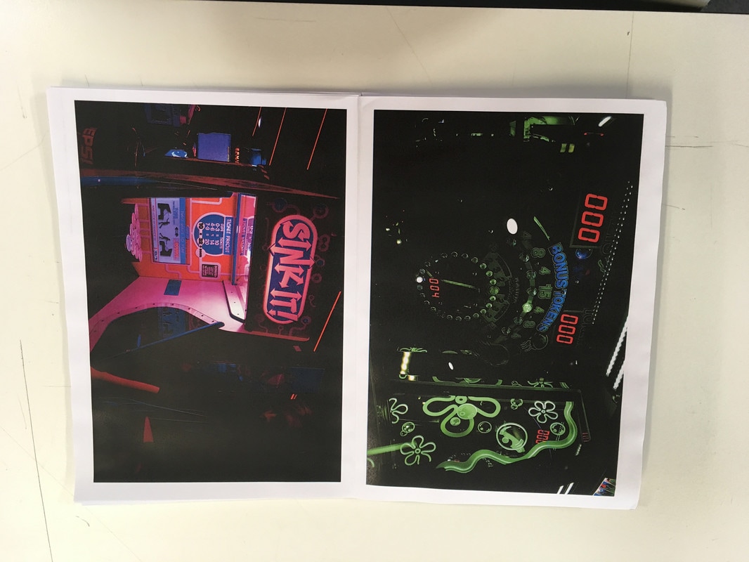
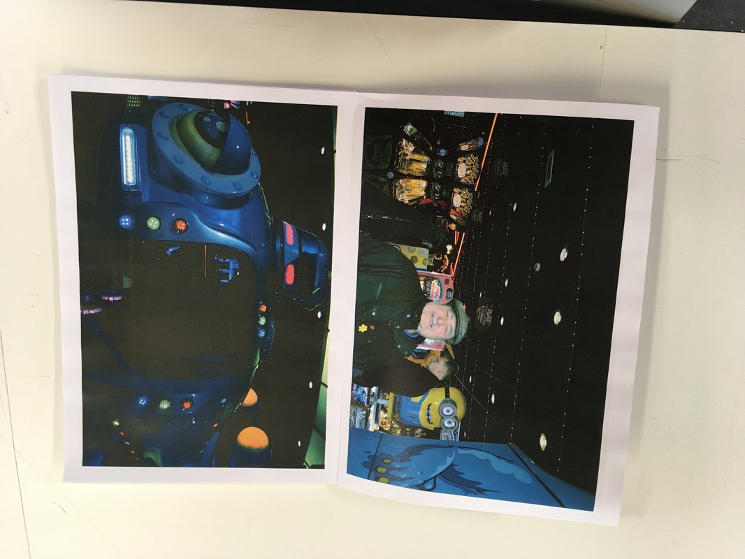
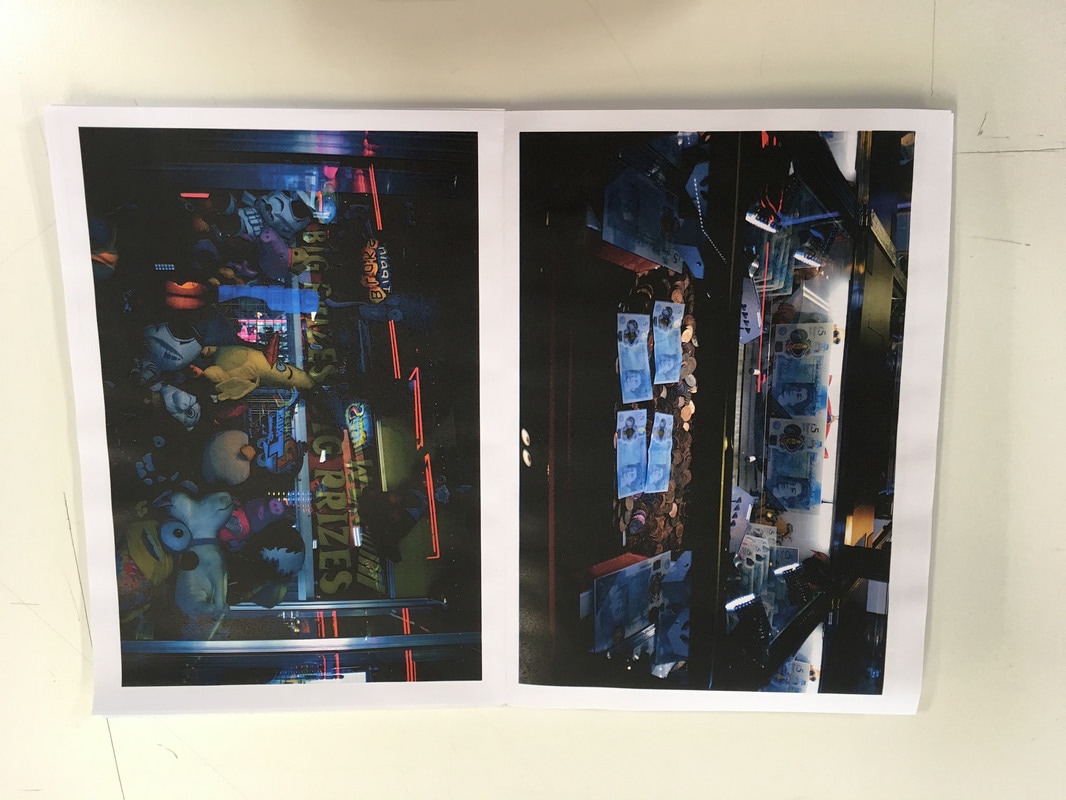
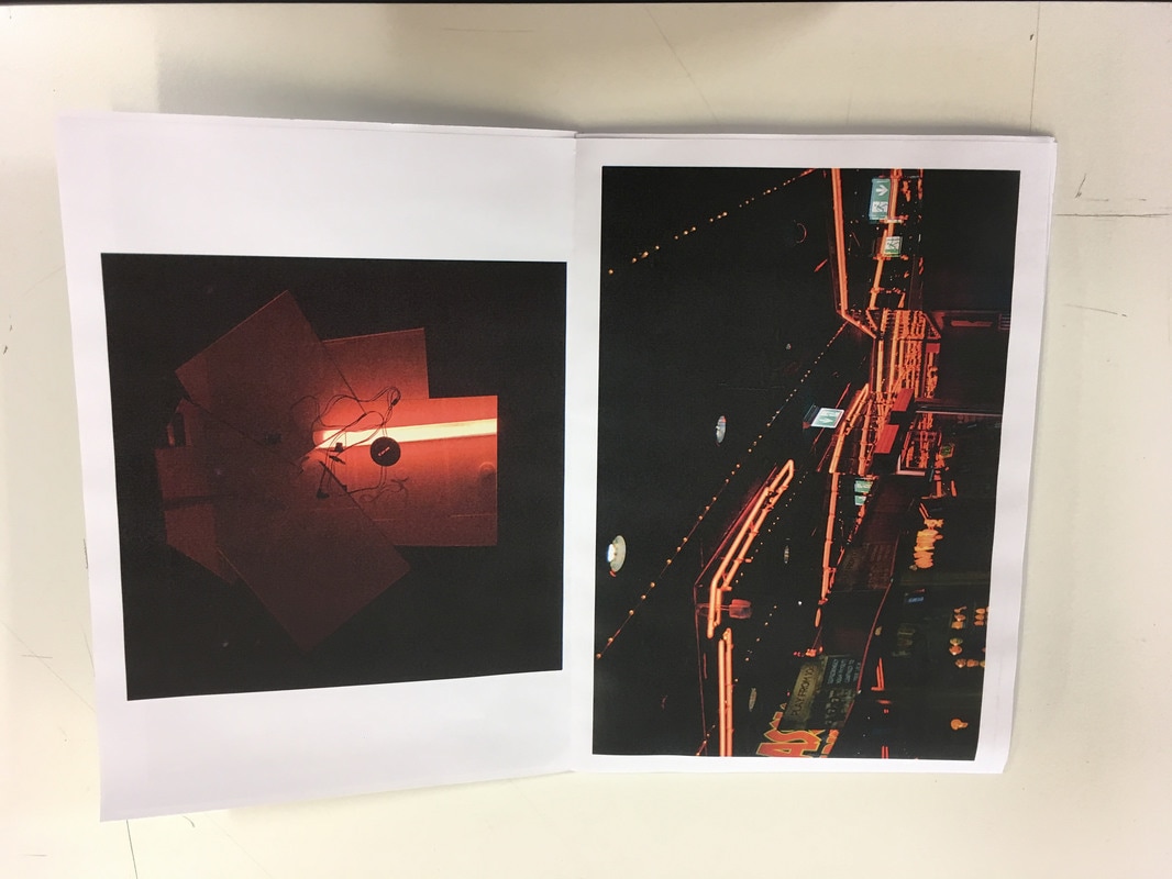
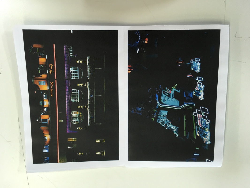
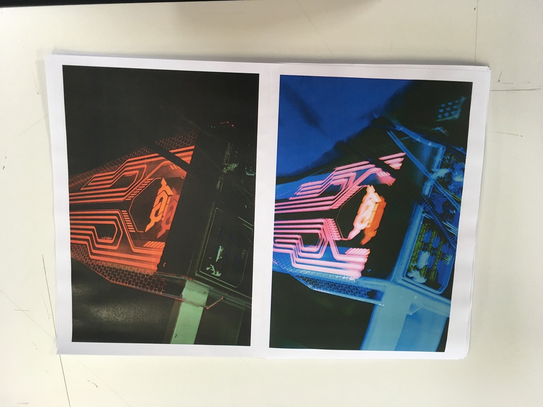
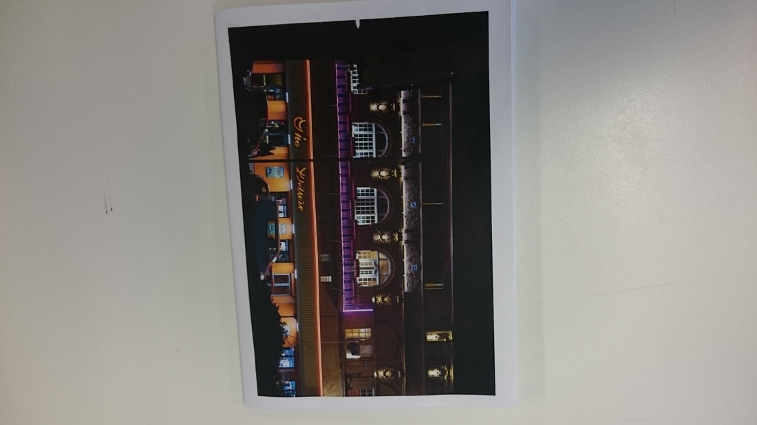
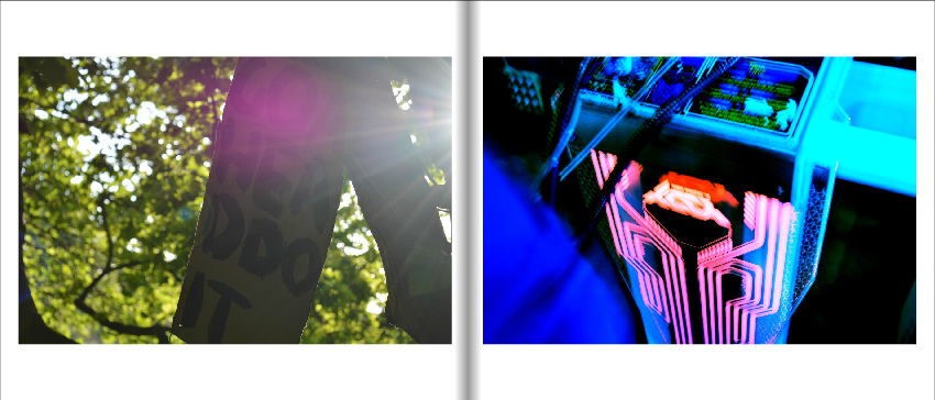
Here is another maquette I have made using images I have previously taken at different arcades. I like these images more than the images I have taken of signs as I think that the bright and neon colours stand out and the overall images look a lot more interesting and intriguing than the sign images made. I also think that the way I have edited them makes a lot of difference as I have made the images have a really high contrast and I tried to make the bright colours stand out as much as I could.
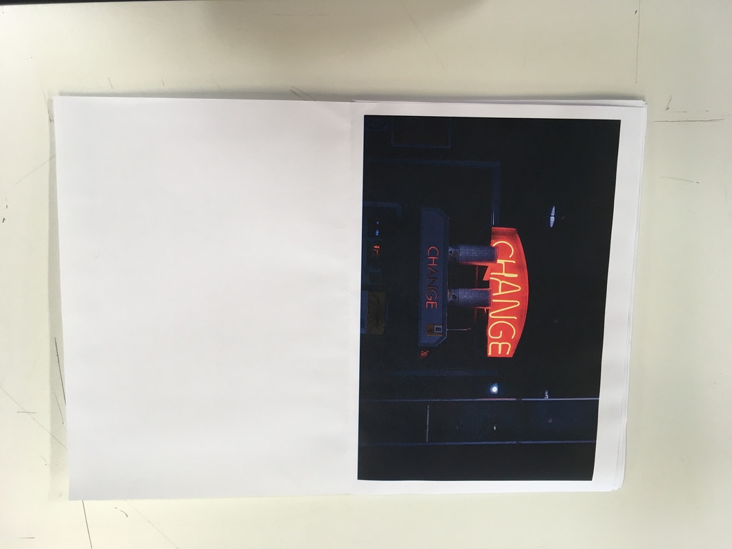
Making My Photobook:
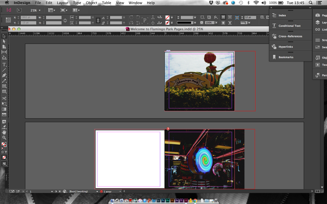
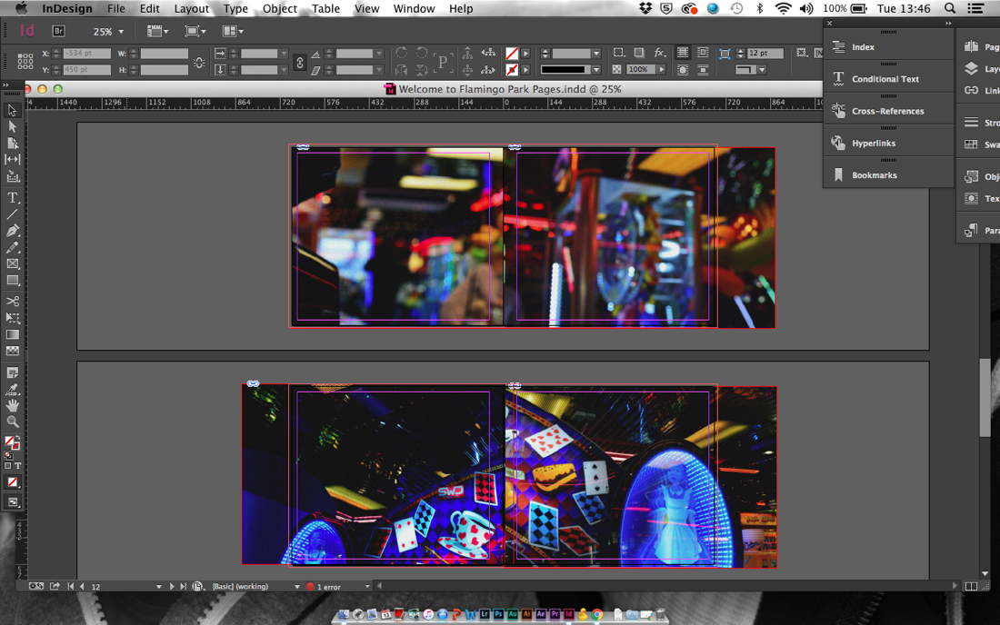
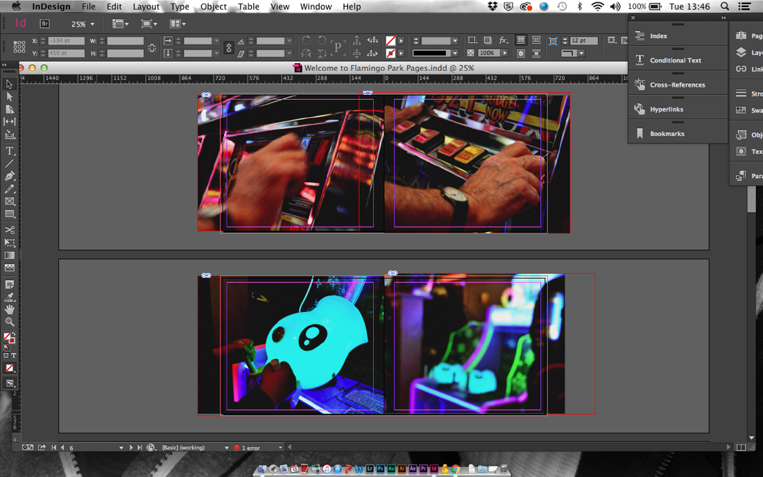
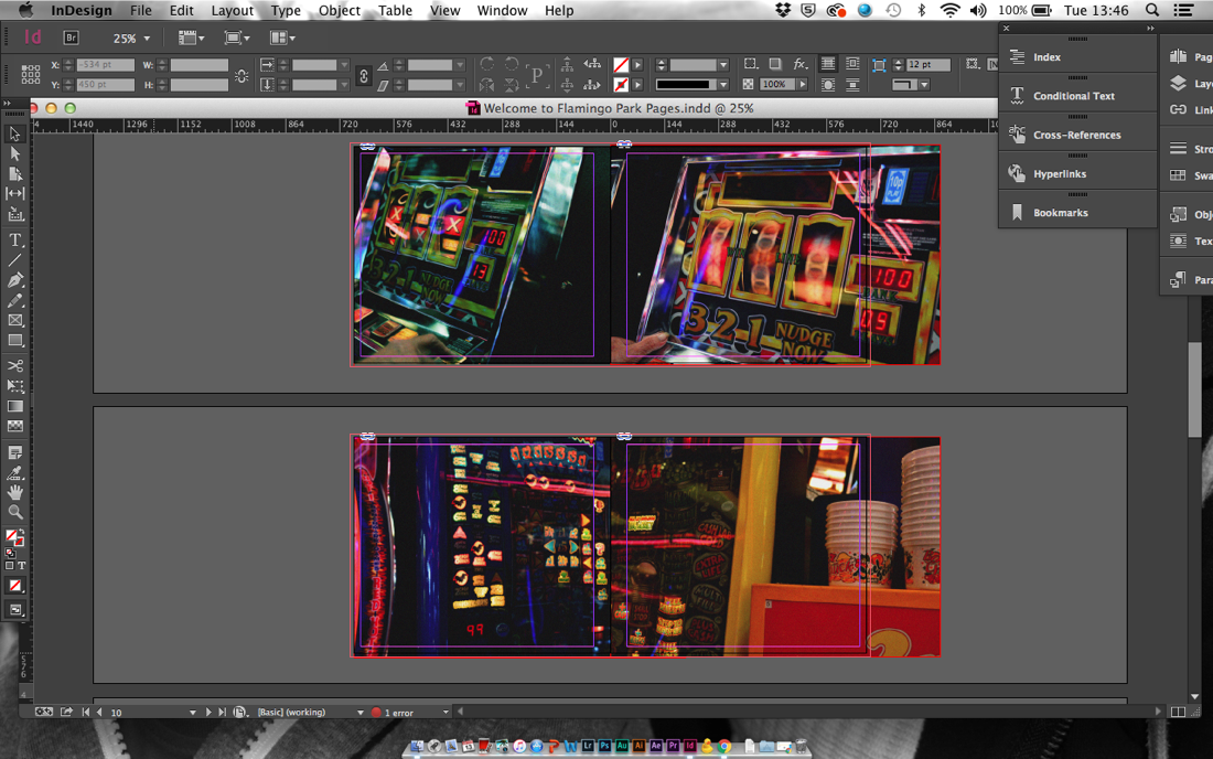
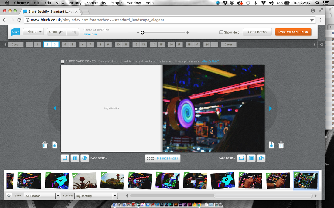
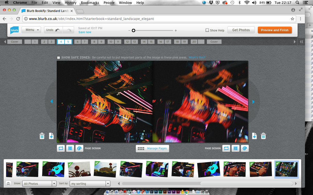
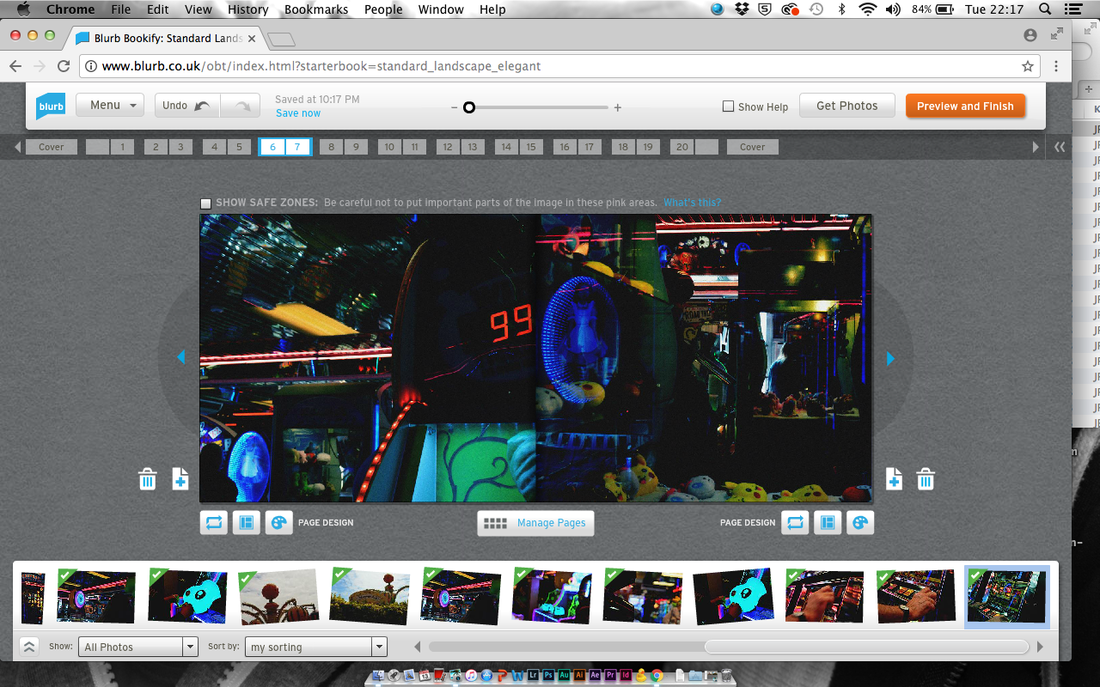
Here are a few screenshot of what the process of designing my photobook was like. I used Adobe InDesign as I thought that it would be the best way for me to completely customise my photobook. I decided on full bleed pages because my images are full of colour and i didn't want the coloured border to distract from the content of the image. I like how some of the images look as though they have been merged together as it makes them look as though it is one image on a double page.
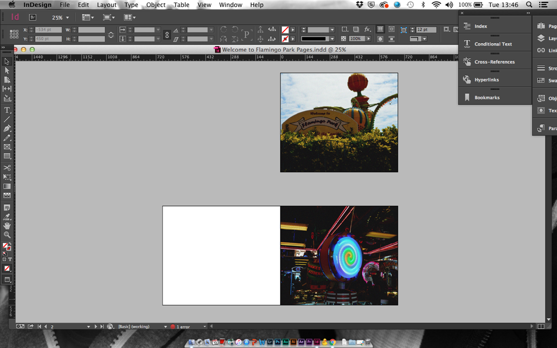
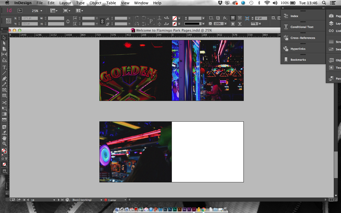
These are two screenshots of what my photobook would look like if I used this file.
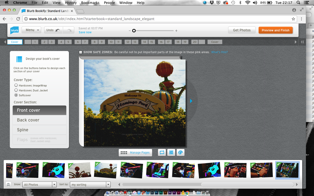
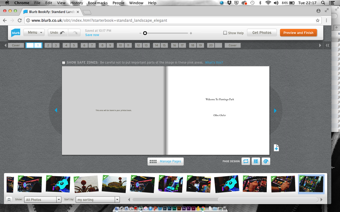
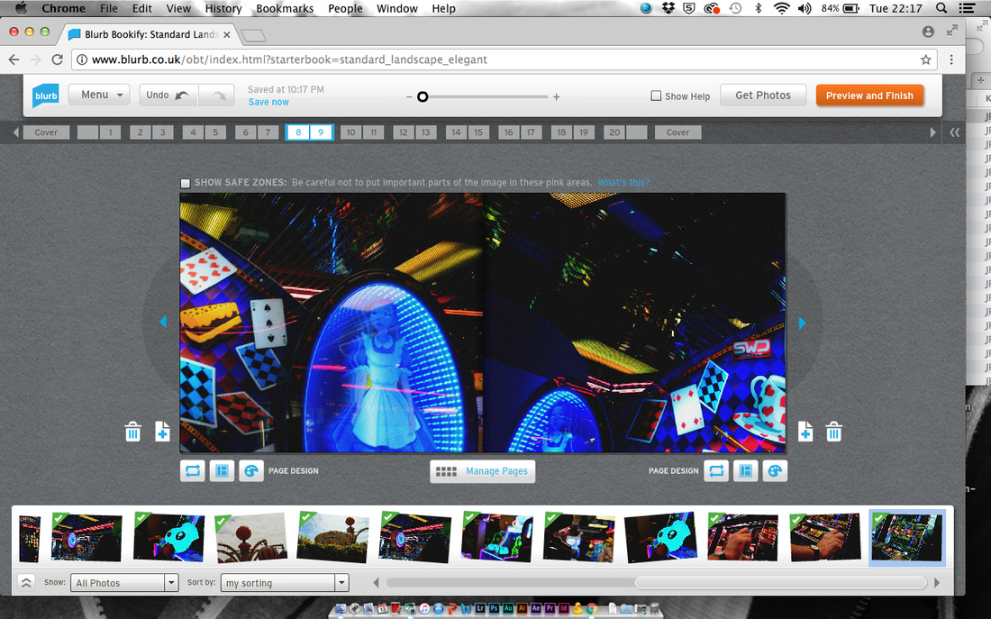
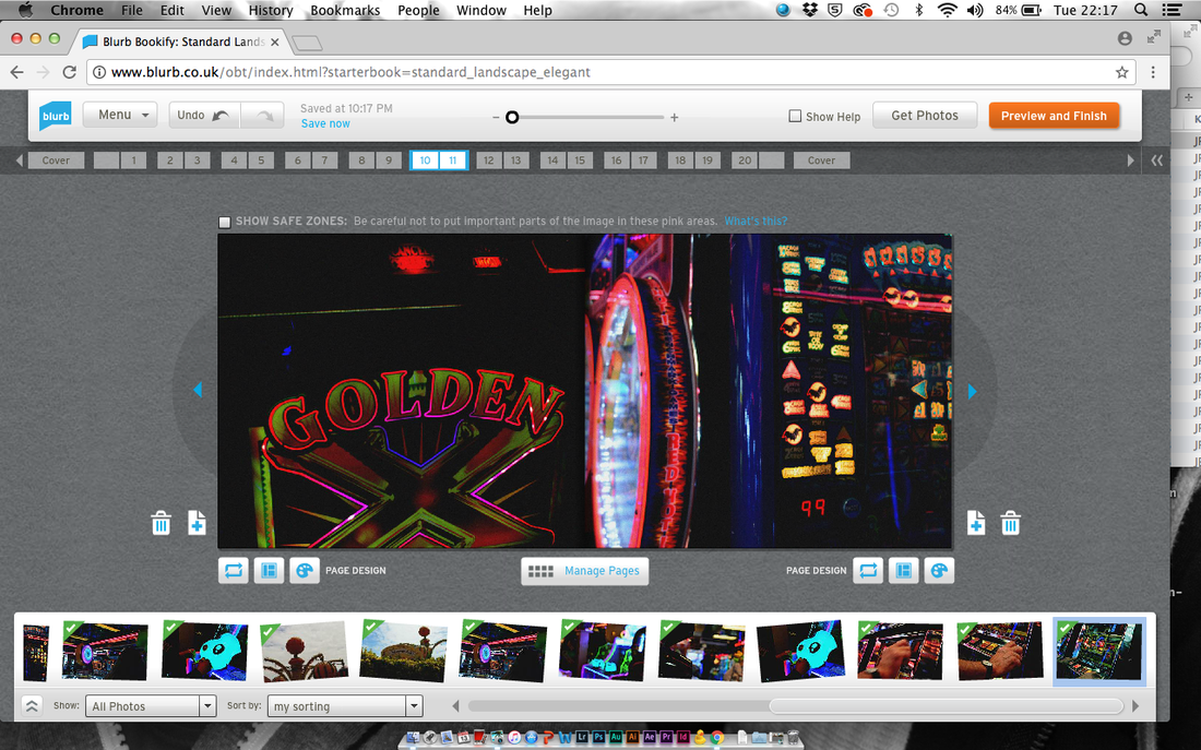
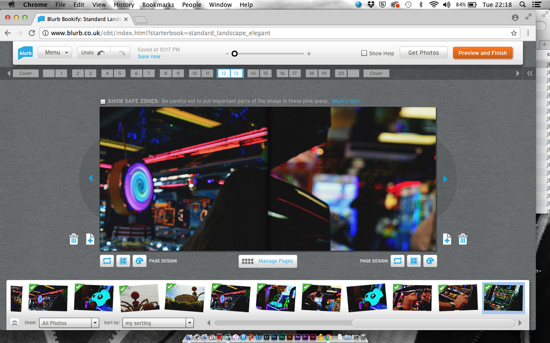
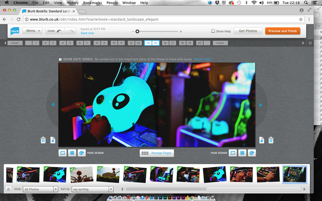
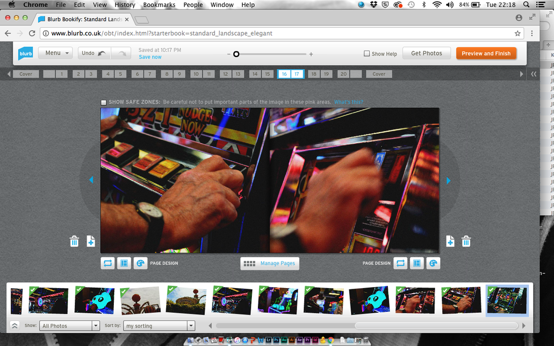
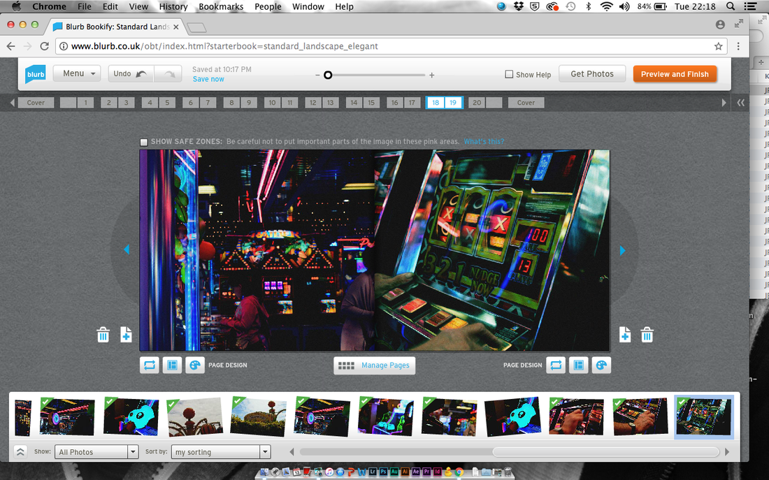
When I had tried to upload my InDesign file with my books layout, Blurb said that there was an error and that I hadn't used the correct file type, so I decided to re-upload all of the images to the Blurb creator. The images took about two hours to upload so this was a long process. I think that I have managed to make my photobook look almost the same as my InDesign file but I actually like the different layout I have chosen.
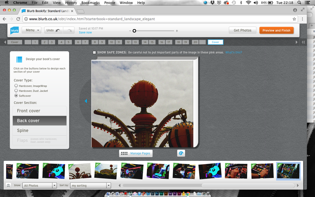
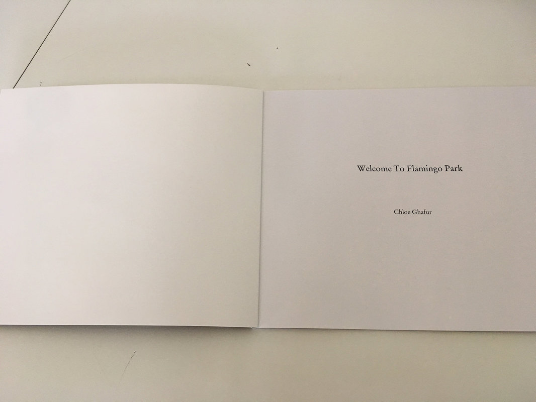
My Finished Photobook
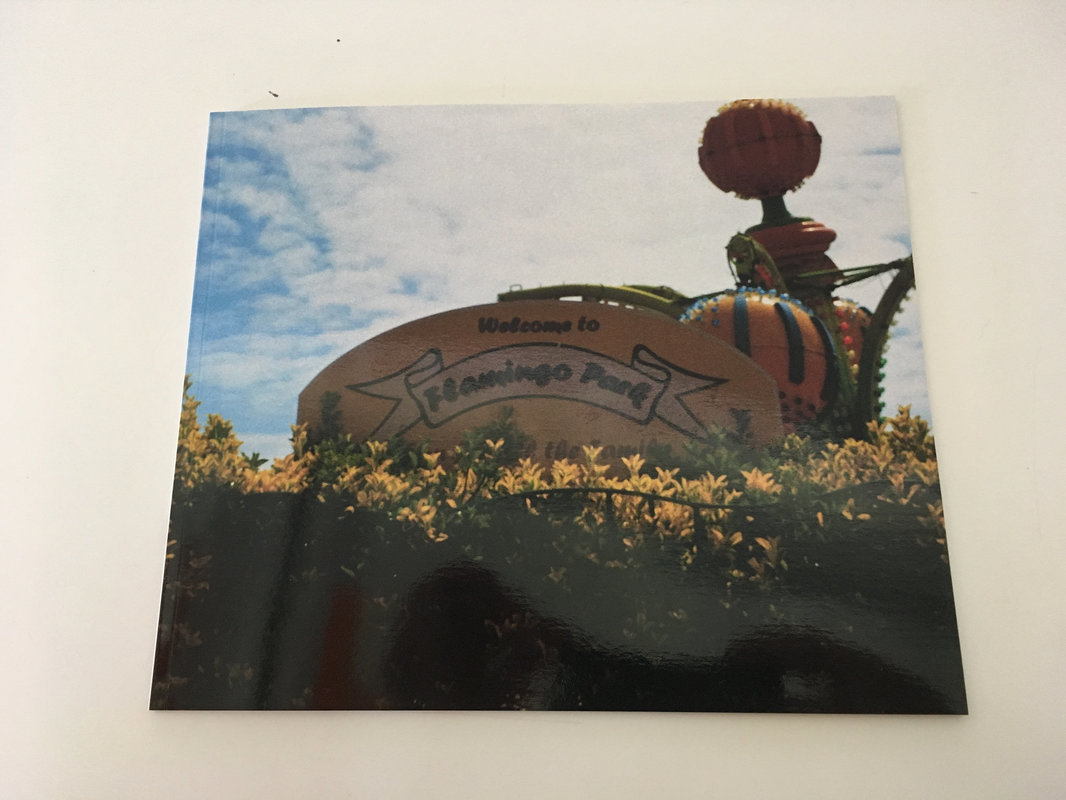
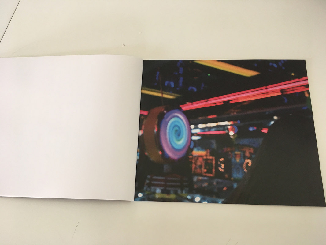
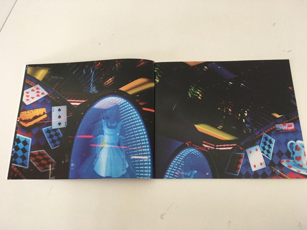
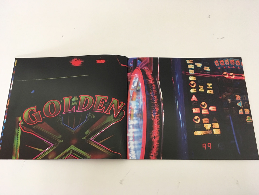
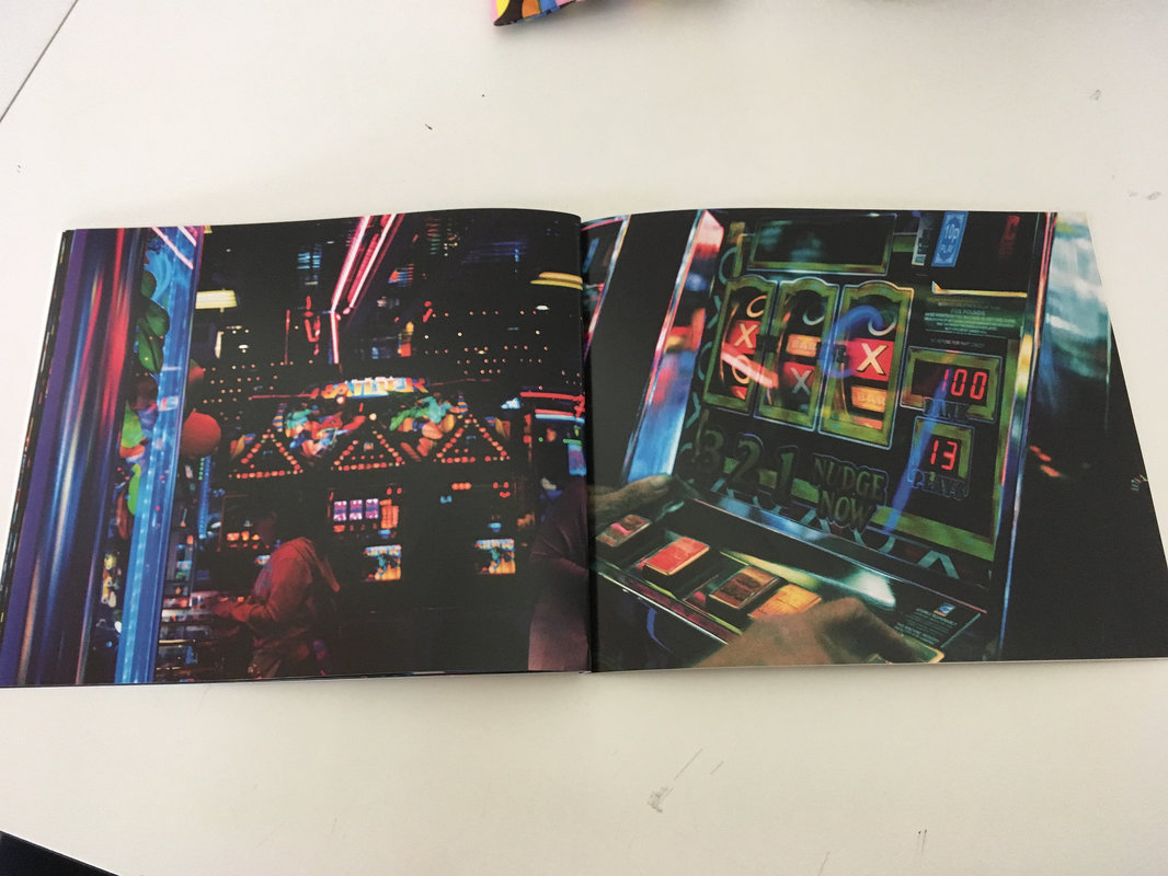

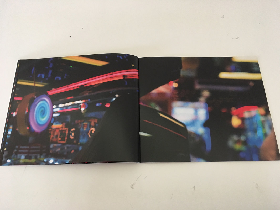
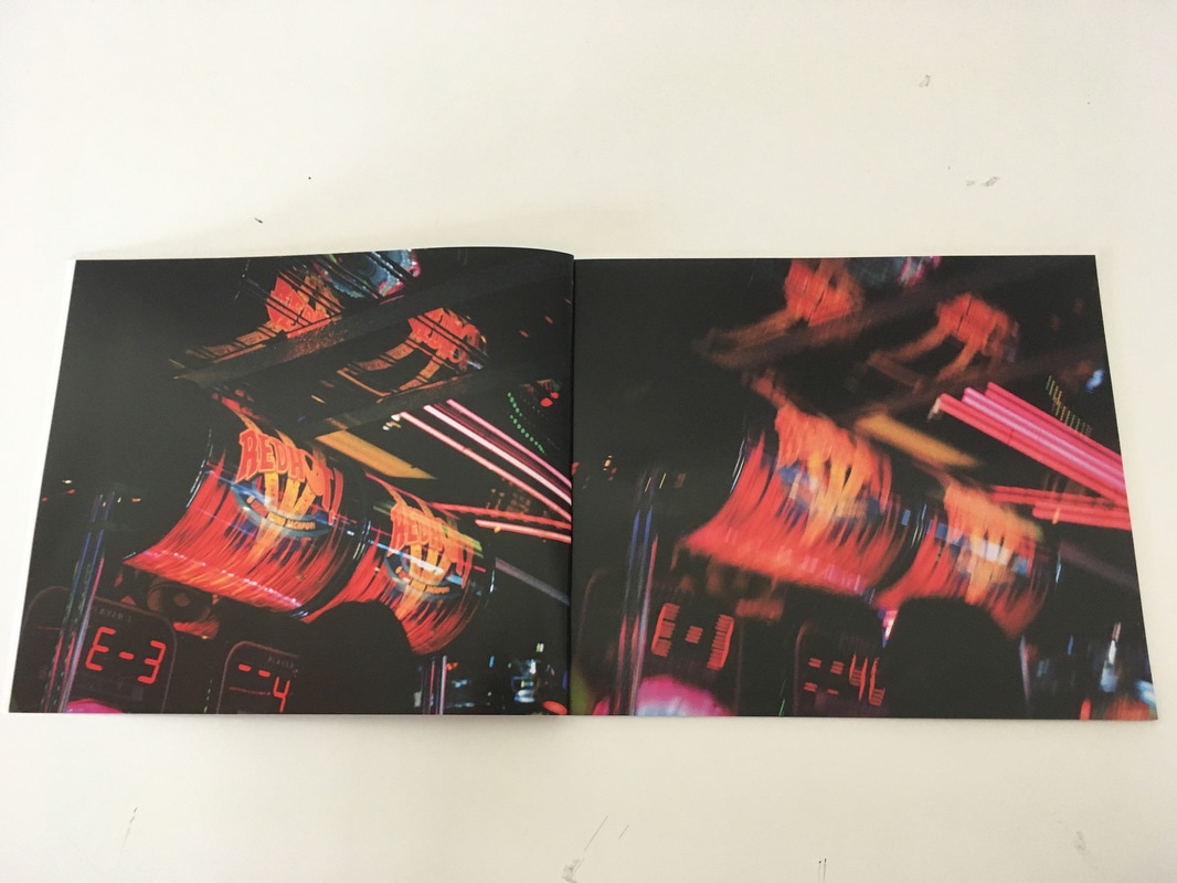
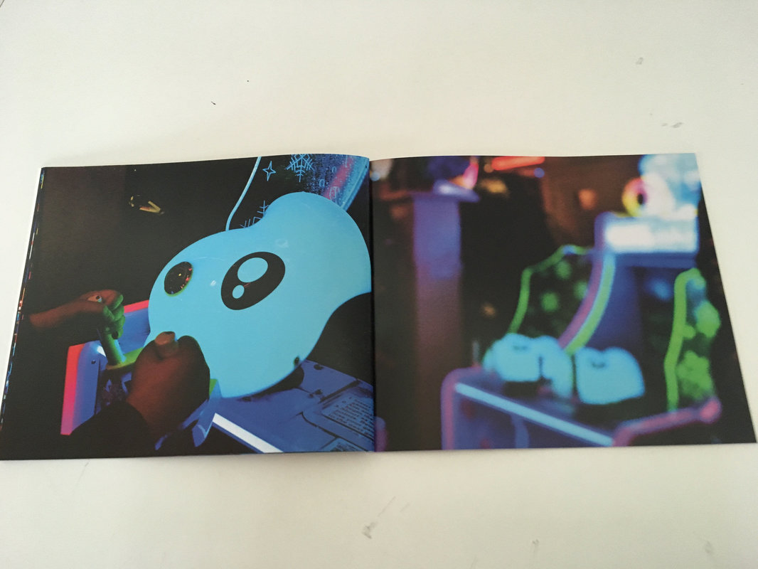
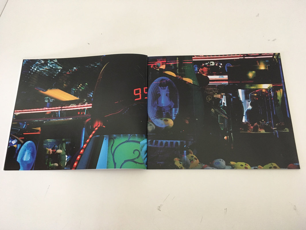
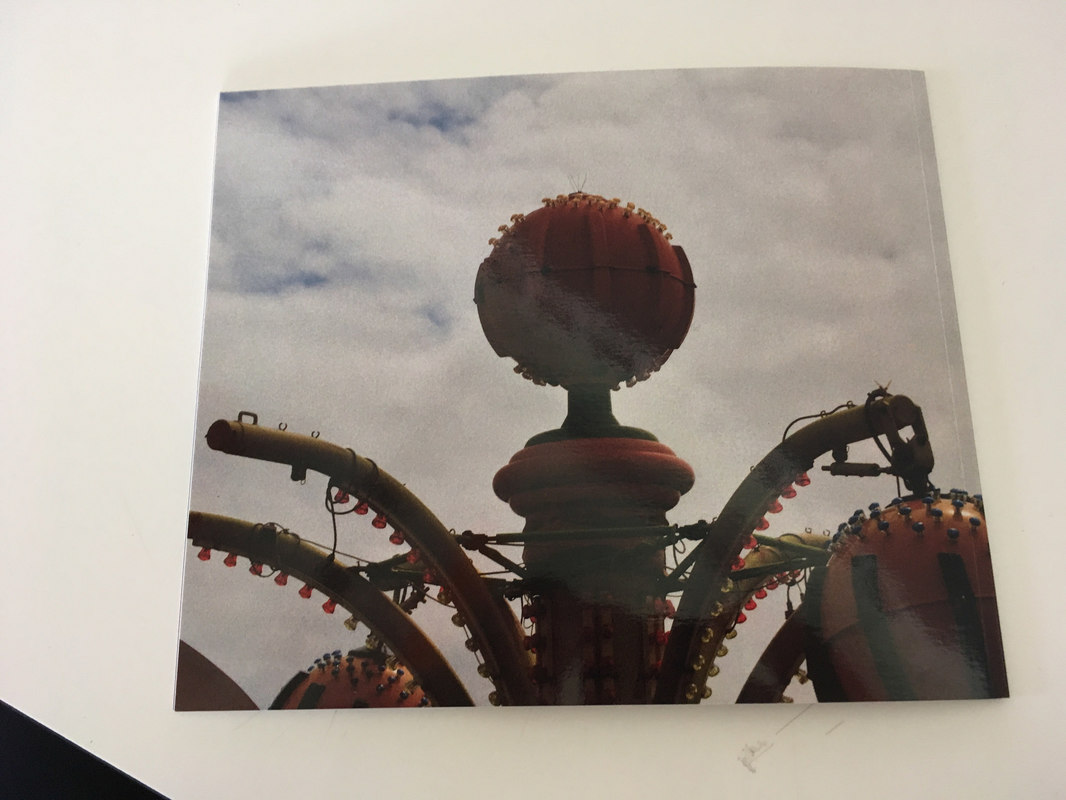
"I really like the contrast between the summery, outdoors cover image and the artificially lit relative darkness of the interior pictures. You manage to capture the combination of seediness, excitement and artificiality of an amusement arcade. It feels rather like a dreamworld, indistinct and over-saturated. Some of the image combinations are great - a hint of repetition but often with one longer shutter speed - and the full bleed images work well. They make the experience that little bit more claustophobic. My favourite images are the abstractions caused by long shutter speeds and defocusing. I wonder whether you could have even more experimental with these? This is a really interesting experiment and a successful 'product'. Well done. I'm intrigued to see how you develop these lines of enquiry in your personal investigation."
